Tag Archive for 'books'

The original Alice

Alice by John Tenniel
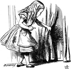
Say “Alice in wonderland”, and the image that comes to mind (well, at least in the generations that used to read books) is a little girl in a tidy Victorian knee-length puffed sleeve dress with a pinafore, and long blond hair – the girl in the image at right. This comes from the famous illustrations by John Tenniel, a successful professional illustrator that Carroll retained to illustrate the book. The illustrations by Tenniel became iconic, although they bear no resemblance to Alice Liddell, the lead character’s namesake, who was not blonde in the least.

Alice by John Tenniel
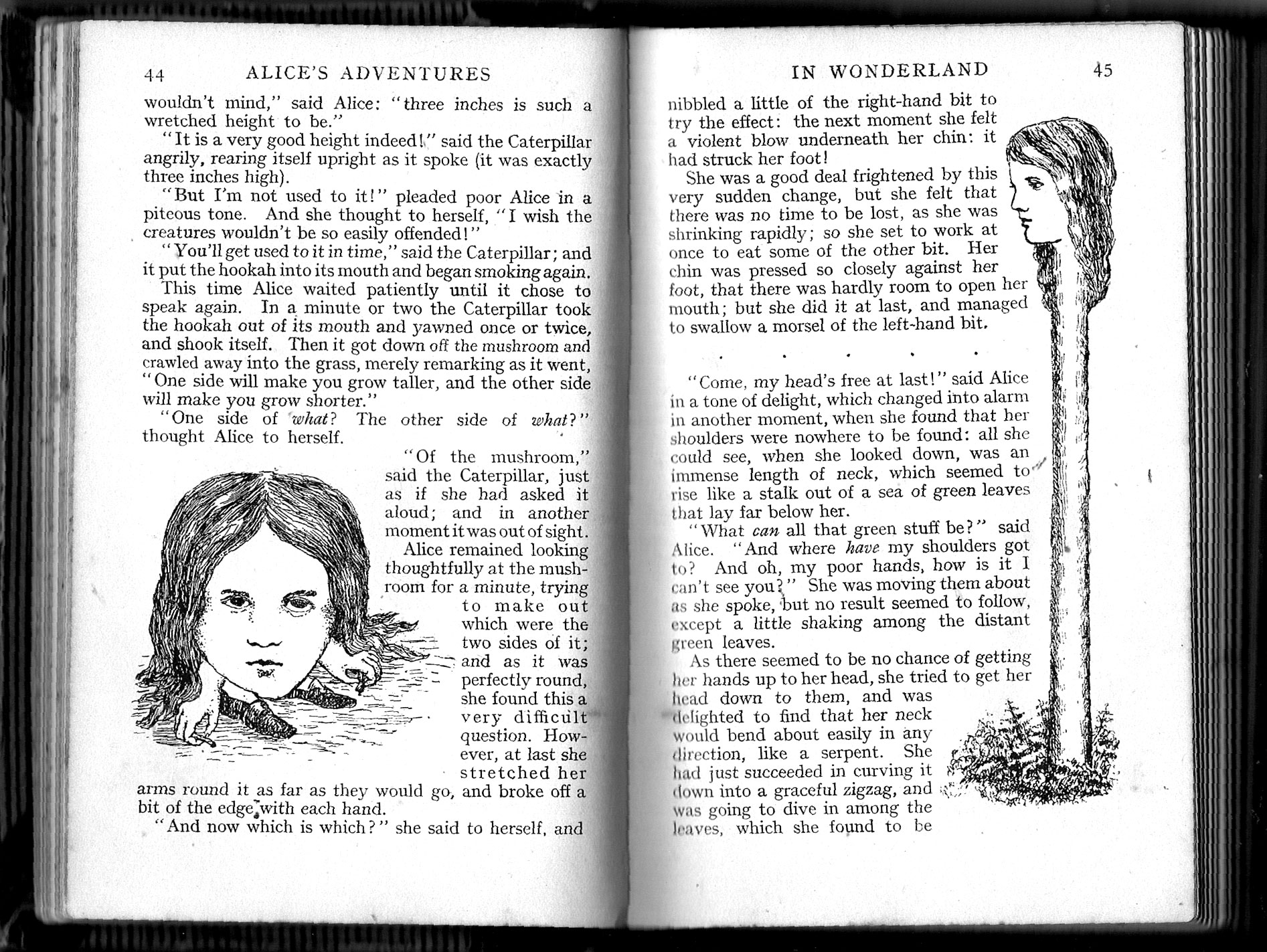
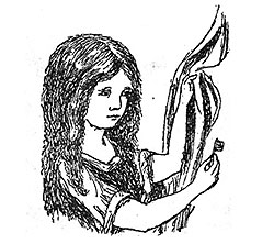
And then there is a different Alice altogether, the one envisioned by Carroll himself and found in the illustrations he drew by his own hand for the handwritten draft of the book, “Alice’s adventures underground”. I have a book showing these, and the comparison is interesting. Here, for example, is the same picture of Alice holding the golden key to the tiny door behind the curtain at the bottom of the rabbit hole. No blond hair, no fancy clothing.

So here, for your enjoyment, are some comparisons of the Carroll and Tenniel realizations of some scenes in the book:

Alice and Caterpillar

Alice and puppy

Gardener playing cards

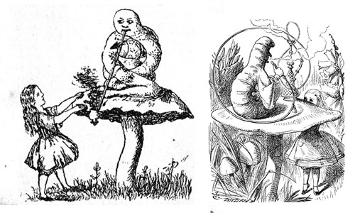
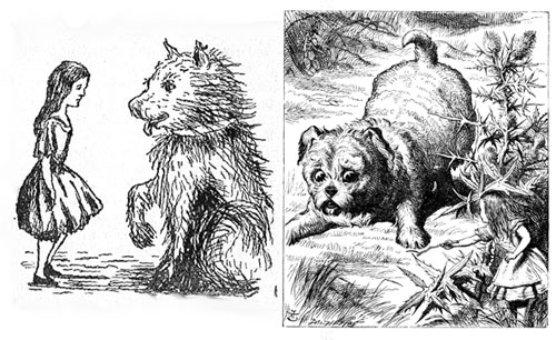
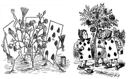
As we can see, Tenniel was definitely a more capable illustrator; but he followed Carroll’s lead — indeed, Carroll supervised him closely, since he was paying him a hefty fee.

And although most of the Tenniel drawings are based on Carroll’s, there are some of the latter that did not make it into the printed book. Like these two:

Alice images from Carroll's original drawings

Grace Hopper as Susan Calvin

Rear Admiral Grace Hopper (1906-1992) was one of the legendary pioneers of computing in the 20th century; among other achievements she had written the first compiler. Here is a well-known photo of her with some colleagues at the console of a Univac-1 computer back in 1957.

Grace Hopper next to Univac 1 console,1957

And whenever I see this photo, I am reminded vividly of Dr. Susan Calvin, Robopsychologist at U.S. Robots and Mechanical Men Corporation, as featured in Isaac Asimov’s I, Robot. I don’t mean the silly action movie starring Will Smith; that had Dr. Calvin as a sexy young chick. In the book (which is much different and way better) Calvin is a strict, prim, spinsterish lady who clearly feels more at home with robots than among humans, whom she treats with a dispassionate aloofness most of the time. She is also the smartest human in the book, by a large margin; an ultimate Geek, in fact.

There are those who claim that Hopper was Asimov’s model for his heroine; be that as it may, if I had to imagine Susan Calvin (the real one, so to speak), I would go no farther than Grace Hopper in this picture. There she sits, the only woman in a male-dominated environment, professional and intelligent and focused on her technological specialty.

Hats off to both these grand ladies of Geekdom, past and future!

Shrinking print magazines

I discussed the growing obesity of our paperbacks before… and now, a look at our print magazines, with show the exact opposite trend.

This trend is visible in many magazines (Fast Company is a good example), but I illustrate it with an old favorite, Scientific American. Here are three issues from my shelves. See the difference?

Scientific American issues from 1969, 1983 and 2009
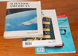
The issues shown are from September 1969, June 1983, and October 2009. The difference in thickness is striking indeed: 10.6, 5.3 and 2.2 millimeters respectively. As far as pages go, the counts are 288, 156 and 72. What happened??

One difference is article length: a typical article in 1969 would run to some 20 pages long, including about 8 pages of advertisements. In 1983 it would have 11 pages including 1 page of ads. In 2009, 8 pages with no ads at all. The number of articles (“features”, in today’s terminology) has also changed, going down from 10 to 8 to 7.

In other words, in the merry Sixties readers were treated to ten 12-page-long (net) articles and lots of ads; in the eighties, they had eight ten-pagers and fewer ads; and today we can read a paltry seven articles with 8 pages each, and almost no advertising.

Scientific American issues from 1969, 1983, and 2009Is this good or bad? Admittedly there’s some attractiveness in ad-free reading; on the other hand, clearly it’s bad for the publisher, and may explain the paucity of real content. It may also explain the cost per page: issue price rose from $1 to $2.50 to $5.99, which is almost constant in normalized present day dollars; but we get less and less pages and articles for this investment.

For my part, I miss the fat issues… and even some of the old ads, which in this particular publication could be fairly interesting themselves (e.g. see the ad here).

The growing obesity of our Science Fiction

I was putting in order our bookcase of Science Fiction, and noticed an interesting fact best illustrated by the two piles of books in the photo.
One pile has three books, all written after 1980. The other has eight books written in the fifties, the later part of the “Golden Age” of Science Fiction. And the two piles are the same height.

Science Fiction books

Fact is, most paperbacks published recently tend to be much longer than the “Pocket books” of the fifties. They can easily exceed 400 pages, where their predecessors ran happily to 200 or so. And the sad thing is, this does not make them better. The three fat books in the pile at left are certainly good – but the other pile contains absolute classics like Bradbury’s The illustrated man, Clarke’s Childhood’s end, and Asimov’s I, Robot (the wonderful short story collection, not the silly movie); the others, by such masters as Sturgeon, Heinlein, Blish and Wyndham were likewise influential and a joy to read.

Two Science Fiction books

Here, go read Footfall (1985), all 700 pages of it, and Wolfbane (1959), with a mere 160; both are wildly imaginative works, good SciFi indeed, but the GPP (goodness density per page) is on the skinny tome’s side. In fact, it makes me wonder, why did authors become so much more verbose of late? Any ideas?

Schizophrenic books

See the book on the left. It’s been around for centuries, issued by countless publishers, translated into many tongues… and no one ever doubted what it was, because it has a name: Macbeth.

Macbeth and Edison's Eve

Now see the book on the right. This is Edison’s Eve: a magical history of the quest for mechanical life, by Gaby Wood, published in New York by Alfred A. Knopf. An interesting book, actually; but it has one strange aspect: the first half of the book is about the history of lifelike automata – Vaucanson’s duck, the Turk chess player, Edison’s speaking dolls and so on; just as the title promises. The second half is all about little people who appeared in circuses and sideshows in times past, such as the Doll family in the 1920s, which seems rather off-topic. The incongruity was resolved for me abruptly when I noticed a line on the copyright and catalog info page at the back of the frontispiece: “Originally published in Great Britain as Living Dolls by Faber and Faber limited, London”. Now that title makes sense and links the two parts of the book correctly.

So, we have the same book sold in two countries under different names: the original name sensible, the later poorly thought out and confusing (amazingly, the Amazon site says people who bought one also bought the other…) Nor is this a unique case: I’ve seen this with non-fiction a number of times.

I’m sure the publishers had weighty reasons for this mutilation of the book’s name: one can envision considerations of marketing, or potential lawsuits, the usual corporate stuff. But these are books; books deserve respect. You don’t rename Macbeth to “Scandal in Dunsinane”, nor to “Blood, sex and sorcery”, just because it may sell more in some country. Leave our books alone!

Why Photoshop and Mapmaking don’t mix

Map making is an ancient art, and a great deal of ingenuity has gone over the years into how you can draw the spherical surface of the Earth on a flat piece of paper in a way that still makes sense. That’s where all those map projections like Mercator’s come into play. More recently, to my dismay, I see in the media a much less sensible practice: drawing flat pieces of terrain onto a sphere.

New Scientist map

Consider this scan from an article in New Scientist, my favorite science magazine. Note the map at the right. Note how it takes you a disorienting moment to put it in context! At first glance, this is a sphere, hence it must be the earth; but what bizarre continent is it showing? Or is this some archaic proto-continent, long obliterated by continental drift?

Close up of New Scientist map

Of course after a second you register that it is Spain; but if so, what is it doing stretched across an entire hemisphere? You might explain the circle as simply a picture frame – nobody said a map must be rectangular – but if so, why the shading in and below the circle, clearly denoting a three-dimensional sphere?

The explanation is simple, and has to do with the ease and irresistible allure of doing special effects in Photoshop and its ilk, along with the paucity of common sense in the users of such tools. The map insert should have been left flat-shaded; the conflicting 3D cues (and the circle itself, for that matter) add only confusion.

Nor is this an isolated example; we see a lot of this sort of thing going around. Yuck!

Whatever happened to black ink?

When Johannes Gutenberg gave us the printing press in the 15th century, he also invented a suitable ink to go along with it. His ink was a glossy black, and the idea of printing books in black on white paper has remained ever since, because that is by definition the highest contrast you can get, hence easy to read. Millions of books have appeared since Gutenberg, spanning a huge range of subjects and world views, but they did not differ in ink color one bit as the centuries came and went.

Lately, however, I notice a worrying trend as I browse the shelves in the bookstores I frequent. A small but growing number of books are published in all sorts of smart-aleck color schemes. Ignoring the ones on colored paper – where the color schemes are intentionally artsy – we see books in gray ink, blue ink, brownish ink, all on white paper. And not just a sidebar or special page; the entire book is printed this way, as if the publisher said to himself “Hmmm… how can I improve the reading experience? Ah! Let’s use a lower contrast ink than we might. Sure, gray ink may cost more than the standard black, but what’s a little money compared to the pleasure of giving my readers eye strain headaches?”

Bad, bad idea. Give us books in good old black on white!