Here is a screenshot from my Lenovo ThinkPad computer. The computer was running a self-test using the incorporated Lenovo utility, and I tried to abort this test by exiting that utility.
And then I got this dialog box:
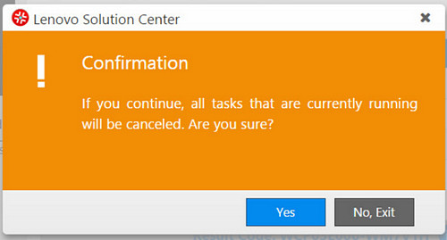
Read it carefully:
If you continue, all the tasks … will be canceled. Are you sure?
And you have two buttons to choose from:
YES [Which means Yes — I’m sure, do exit]
or
NO, EXIT [Which means I’m not sure, do not exit].
Obviously the second button is intended to mean “Exit this dialog, not the utility” — but this is confusing as hell, since exiting the dialog and exiting the utility are opposite actions.
Would it kill them to use a simple “CANCEL” on the second button?


0 Responses to “Bad, bad UI design!”