Here are two boxes of vitamins I take, separated by a few months in production time, newer version on the right.
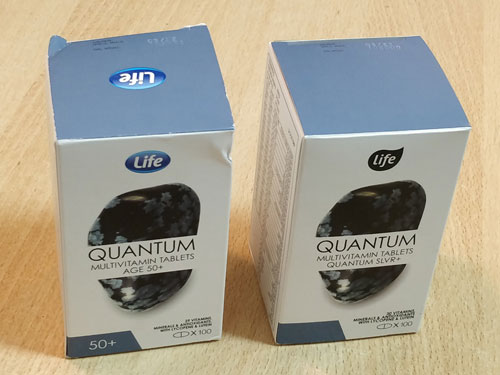
Same product, one change:

The original version is marked “Age 50+“, denoting the people it’s optimized for: those aged 50 and above (“+”).
The new version is marked “SLVR+“. After some thought I figured “SLVR” may stand for Silver, meaning people with gray hair. Of course this renders the “+” unnecessary and confusing.
Bottom line: some marketroid had a stupid idea to take a perfectly clear caption and make it confusing as hell.
Bad, bad marketroid!
Here is a screenshot from my Lenovo ThinkPad computer. The computer was running a self-test using the incorporated Lenovo utility, and I tried to abort this test by exiting that utility.
And then I got this dialog box:
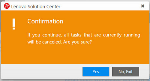
Read it carefully:
If you continue, all the tasks … will be canceled. Are you sure?
And you have two buttons to choose from:
YES [Which means Yes — I’m sure, do exit]
or
NO, EXIT [Which means I’m not sure, do not exit].
Obviously the second button is intended to mean “Exit this dialog, not the utility” — but this is confusing as hell, since exiting the dialog and exiting the utility are opposite actions.
Would it kill them to use a simple “CANCEL” on the second button?
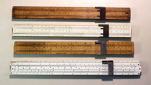
The Tavernier-Gravet company was France’s premier scientific instrument maker at the end of the 19th century, and it stayed abreast of the latest developments in slide rule design and production when it entered the 20th century. In this this new article on my History-of–Computing site I illustrate some of their problems and solutions as they transitioned into the new century.
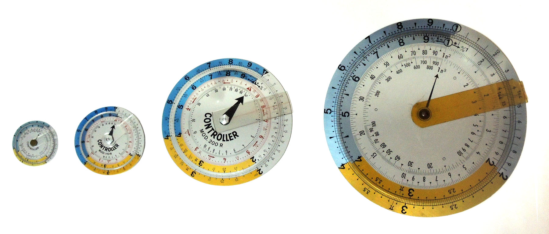
A few years ago I sighted on eBay a set of three German circular slide rules of the Controller brand. There was a big one, 20 cm in diameter; a midsized one 11 cm across; and a small one at 7.5 cm. They all looked pretty much the same except for their sizes, and this reminded me of those three bears in the Goldilocks story — a thought that amused me enough to push me into buying them. So now I had a Father Controller, a Mother Controller, and a Baby Controller.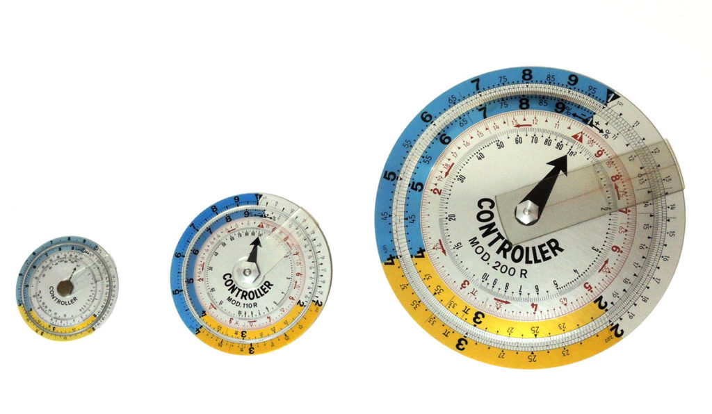
Actually this type of slide rule is fairly common, and is often seen on eBay. But then, one day, I saw an auction for what can only be described as Grandfather Controller: a truly large slide rule 30 cm across, and still identical in design to the Three others. This one is anything but common; in fact I’ve never seen anything like it, nor can I find any mention of it on the web. Naturally, I added it to my collection post haste, and now there were four!
Read the full article about this mysterious giant Controller on my HOC web site.
I was at this coffee shop and saw the two machinettas. Of course I didn’t buy one – as coffee lovers, we have all the machinettas we need at home – but I did notice how the pair represents two different solutions to a small but important design bug that the classic machinetta had subjected coffee drinkers to for ages.

The problem is seen below. The original design from Bialetti, who invented this useful little coffeemaker, had the metal block that the handle is bolted to, marked by the red arrow in this photo. This block was just the right size and place to scald your finger when you grab the handle.
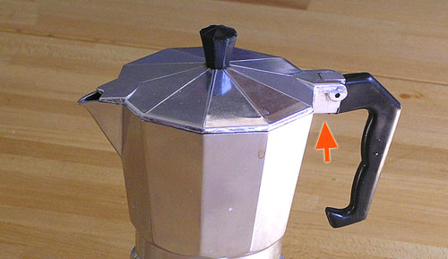
Photo credit: Dan-Martin Hellgren under CC license on Wikimedia Commons.
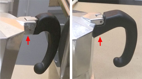
The two machines I’ve sighted solve this problem in two different ways frequently seen these days: the one at the left below leaves the offending hot block in place but provides a dent in the plastic to keep the finger away from it; the one on the right covers the metal with plastic all the way.
I can’t think how many times I got burned before someone at the factory decided to spare the users this pain…
An important element of everyday product design that is all too often ignored is the footprint of an object.
I mean, look at these two electric kettles, which are very common kitchen appliances. They serve the exact same purpose; they use the exact same technology; they have the same water capacity.
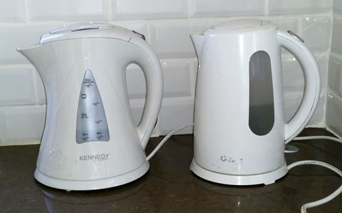
But there’s a big difference: the one on the right has a sensible, compact cylindrical form. The one on the left, by Kennedy, flares at top and bottom, so its footprint – the counter-top area it requires – is some 45% grater than for the Graetz kettle beside it. Kitchen counters can never have too much free area; the designers at the Kennedy company have wasted some of that area for no good reason at all, simply to show off their “artistic originality”.
I see this cavalier attitude to footprint in many products, and it always annoys me… why can’t these people think of their users?
Clearly marking tool and instrument controls is always a good idea, but it becomes vital where safety is at stake. And if there is one control where safety is definitely at stake, it is the safety catch!
Like this one, on a rechargeable jig saw from Taiwan:
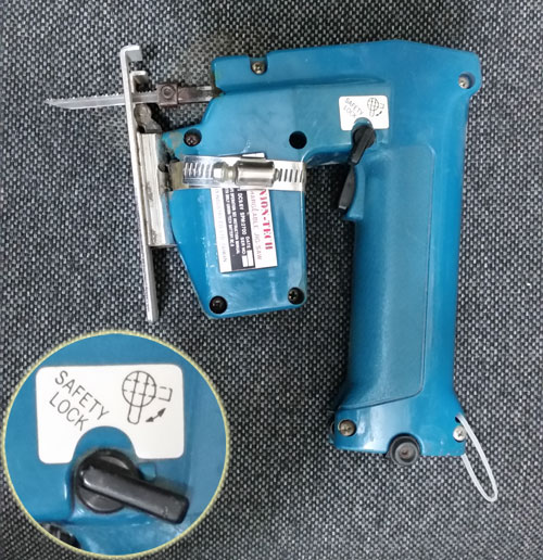
See the switch clearly marked “Safety Lock”? Very informative… but there is not a hint as to which position is the locked one. There is a picture that may try to indicate this, but it is quite ambiguous.
So – this is really a weird implementation of Russian Roulette. But hey, at least it’s rechargeable…
These days the preference for shoddy, cheap, use-and-discard products is all over the place. Here is an example:

This sorry street sign in Jerusalem has taken on a very “artistic” look – because it is made from a blue layer of stick-on plastic sheet over a metal plate. Over time the plastic started to shrink and curl, with this amusing result.
And it occurs to me that the ancients who lived in our city had a better method. Take this stone, which was part of the temple enclosure parapet in the second temple period (around the time of Christ). It too carries a Hebrew inscription, identifying the location of “the house of trumpeting” – the location where the priest stood who blew the ram horn to announce the entry of the Sabbath.

This stone took a big fall when the Romans destroyed the temple, but the lettering on it is crisp and legible after two millennia.
Sigh…
Was on a United flight enjoying my coffee (such as it was), when I noticed the text on the paper cup.
Nice cup:
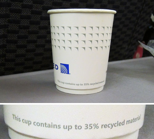
Makes them feel very ecological, no doubt… someone in Marketing must’ve though it a good point to brag about.
Except that it’s completely meaningless, of course. This statement remains true even if the cup contains zero recycled material.
Sigh…
See the mechanic working on my Renault Clio.
Do you know what he’s doing? Looks like he’s trying to squeeze his arm into a tiny space between some metal beams in the engine compartment frame. Why is he doing that? Because he wants to replace a burned out light bulb in the headlamp assembly.

Actually I carry spare lamps in the trunk, so I thought I could change the bulb myself. But after a long struggle I decided to take the car in to a garage shop, in the hope that the mechanic there could solve the riddle: how do you access the headlamp’s back side and extract the lamp?
Why, what’s the problem? Here is the problem:

The headlamp is wedged in behind the tube with the yellow cap, and is practically impossible to reach without disassembling the metal beam behind it. Yep… Renault designed this car so you need to take it apart to change a light bulb.
How many design engineers does it take to make it impossible to unscrew a light bulb?

