The trendy-looking kitchen tool in the photo, made by Koziol, is called “Mia” for some reason. Its purpose is to test Pasta: the frilly head is surprisingly adept at scooping (and holding) a few pieces of short Pasta (penne, fusilli, etc) out of the boiling water; and you use the hook at the other end to fish a strand of spaghetti. Then you can bite them to see if they’re underdone or just right (that is, “Al Dente”, not overcooked and mushy!) And the ring may be for measuring one-serving batches of uncooked spaghetti.
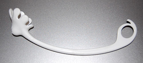
A useful little tool, addressing a real need – catching pasta in boiling water with a fork or spoon can be quite vexing. And it has a lovely zoomorphic design, like all of Koziol’s humorous, artsy kitchenware. It even has two depressions for eyes…
BUT… as it came from the store, it had one major design flaw: the deep scoop of the “head” catches not only fusilli, but also a spoonful of boiling water, which can all too easily spill on your hand as you try to grab your tasty catch. As a fishing net analogue, it has no holes!
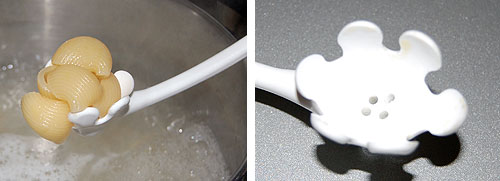
So, what can we do about this? Sometimes, what an industrial designer messes up, we can fix by ourselves. I used a fine drill to deepen the eyes until they punched through, making excellent drainage holes without destroying Mia’s funny face.
A particularly heinous bit of bad product design are ear-shattering car alarms.
The underlying thought was good, I’m sure: let’s make the car raise an unholy racket when someone messes with it, and we’ll put a stop to car theft! Of course, this failed miserably, both because of high false alarm rates and because in the case of a true alert most bystanders will prefer to mind their own business rather than confront a possibly violent thief. In fact the New York City Police Department claims that car alarms actually contribute to making the crime problem worse; and every urban dweller is familiar with their harm to quality of life in the city (for more data, see this report).
Now, car alarms come in many forms, and not all are harmful to our sanity; there are silent alternatives that will alert the owner wirelessly without raising a ruckus; there are immobilizer devices that can prevent theft in various ways; and so on. But many manufacturers still use the useless, maddening audible alarms, and a few design ones that will not shut themselves down after a minute or two – the designers of these deserve to be drawn and quartered…
So, what can we do about this? As a society we can certainly do much, if only we’d try (Terroncito has some interesting thoughts on this). I can tell you what I did. I used to have a car with a particularly nervous alarm, which got in the habit of treating my neighbors to minute-long blasts a few times a week. I tried to have it fixed, but to no avail. So I called my insurance agent, whose policy insisted I have this option in the car. I told him either the alarm goes, or his customer goes. Guess what – the insurance company wouldn’t budge, but the agent, after some diligent search, found another who was willing to accept a silent immobilizer. End of problem.
Remember: you can, and should, refuse to be told by some insurance company to torture your neighbors!
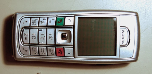
One evening a neighbor knocks on my door. She just got a new cellular phone, and she has a basic question: which key does she press to accept an incoming call?
Now this lady is not a youngster, but she’s used cellphones before; surely she must know that you press the key with the green handset image? Well, yes, she knows, but she can’t figure out which key that is. I think, Huh??? … But then I look at her instrument, and I see what she means. What used to be an image of a handset has degenerated into a tiny thin squiggle, similar to other tiny thin squiggles on some other keys. And yes, perhaps she could discern that this squiggle is a bit greenish, especially if she had a magnifier…
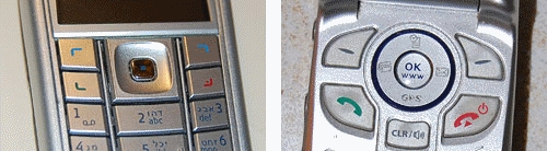
The problem is all too visible in the left photo, which is of my own Nokia 6230i: the four keys at the top have identical looking thin marks, and the colors of the bottom two, though red and green, are very hard to discern at a glance (which is the way they should be discerned; especially when you’re driving with the phone in a hands-free cradle). Compare this to the other photo, from a different model. That’s what good human engineering should provide!
So, what can we do about this? If you work at a cellphone manufacturer, by all means have a word or two with your design department… I don’t, so all I could do was fix my own problem. Here is what I did to my Nokia. Problem solved.