A few months ago I wrote about the surprisingly good customer service I received when my CardScan business card scanner died. Well, this was no accident, it seems.
The other day I installed the CardScan software on another computer and I noticed on the welcome dialog during installation the following fine print:
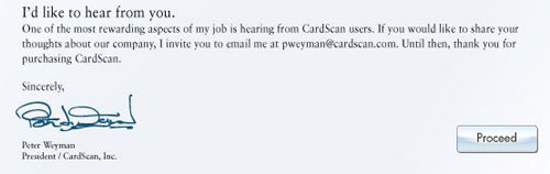
I was impressed. I install many software products, and most never go beyond offering a customer service pointer in case of trouble. Mr. Weyman’s invitation is much more positive and proactive, and I may take him up on it one day…
And on the same dialog they also say that you can return the product in the first 30 days for a no-questions-asked refund. These guys really understand customer orientation!
I went to shop for a widescreen LCD monitor. I went from one large store to another; each had at least half a dozen candidates, and it was amazing to see how poor the images on them looked!
Of course, in most cases the immediate cause was that they were being driven at the wrong resolution. As I explained before, a liquid crystal screen must be driven at its native resolution to avoid fuzziness. Since all the screens in a store were driven by one computer, yet had different resolutions, many were mismatched.
Of course one should never buy a monitor sight unseen… so I had the foresight to lug my notebook with me, and the store guys were willing to let me hook it to the screens on display after setting its output to the appropriate mode. But even then, most screens were fuzzy, so much so that it just didn’t make sense. I then discovered that in their complicated OSD menu system, there is usually a “Factory Reset” option. Guess what – in maybe half the cases doing this improved the display quality considerably!
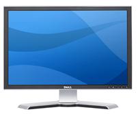 I the end I settled on a Dell 2208WFP, a nicely designed 22 incher. And when I got it hooked up at home, lo and behold, the text was just a little bit fuzzy. I did the Reset thing but to no avail. I played with the brightness and contrast – still no use. And then I explored the menus further and guess what? They had a setting called Sharpness! It was at 50%; I jacked it up and the monitor achieved that exquisite crispness I’d come to expect of Dell monitors.
Now, my experience is that a significant fraction of users spend their time in front of fuzzy displays. Many don’t even realize there’s a problem; in many cases a glaring resolution mismatch causes extreme fuzziness but they have no idea they could fix it in seconds. And then, I’m sure, there must be many who haven’t even bothered to adjust the display’s own controls (being hidden in the OSD makes them easy to miss).
So, look at the screen you’re reading this on and ask yourself: can you do better?
Was at Office Depot and noticed a keyboard on sale that was touted as the Anti-RSI keyboard from A4Tech. 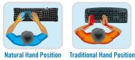
This, according to their web site, has an innovative “Natural A shape” layout that allows you to type ergonomically with your wrists held in their natural position, rather than bent at a strained angle. The site shows this convincing-looking diagram:
So I examine the keyboard, and it’s the exact same layout as on a normal one, but the keys are diamond-shaped so the lines between their edges have that “A” shape.

Which is nice, except that when I type I hit the tops of the keys, not their edges, who for all I care can have any shape at all. In fact, I hold my wrists at the correct angle when using any keyboard, and would do the same on this one.
So… either I’m missing something, or this is nothing but hype.
Any insight, anyone?
Today, Nov. 13, is World Usability Day, sponsored by the Usability Professionals’ Association.

This has been running since 2005; each year, on the second Thursday of November, over 225 events are organized in over 40 countries around the world to raise awareness for the general public, and train professionals in the tools and issues central to good usability research, development and practice.
This year the theme is Transportation, with various practitioners and organizations addressing the impact of transport methods and practices on people and on the environment we live in. And while browsing some of this, I found this interesting research report from the UX Alliance on Parking Meters around the world, with a focus on their ease (or not) of operation. Turns out that “… no two parking meters … are completely the same and that the complexity of operating the parking meters varies considerably. There is a world of difference between the auto-detecting parking meter in Tokyo and the complex and error-prone parking ticket dispenser in Amsterdam.” The report, with numerous photos, is quite interesting and insightful about proper design (or otherwise) – recommended reading!
The triangular Polycom conference phone is a familiar device; in many companies there is one in every conference room. It is so familiar that few give thought to its miraculous ability to transmit high quality sound from one roomful of jabbering humans to another. In fact, this involves some pretty sophisticated technology for echo cancellation and noise filtering; to quote the Polycom site, “Automatic Gain Control intelligently adjusts the microphone sensitivity based on where participants are seated in the conference room”!
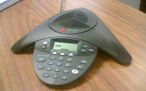
Image: Wikipedia, by Sweetness46, under Creative Commons license
A telephony engineer I once met explained to me that the microphones at the three ends of the Polycom are exquisitely optimized so the sound enters them just right, glancing off the table surface at the optimal angle, to achieve the best possible sound quality. Isn’t that smart design?
So what do we do, then? Why, we put the poor thing at the center of a round conference table and surround it with an impregnable wall of Notebook screens, as all attendees read their email during the meeting. There goes the exquisite design, the adjustment based on where participants are seated, the echo processing…
One can almost imagine a future generation of phones that can raise themselves on a robotic stalk to peer above the notebooks (OK, so this is more like an R2D2 kind of response than a likely reality). But in fact, I once visited a company where they mounted the Polycom on top of a 12 inch pole in the center of the table. It looked weird, but I’m sure it sounded great…
Care to guess what delightfully well-designed product is hidden inside this elegant 5 inch long metal case?
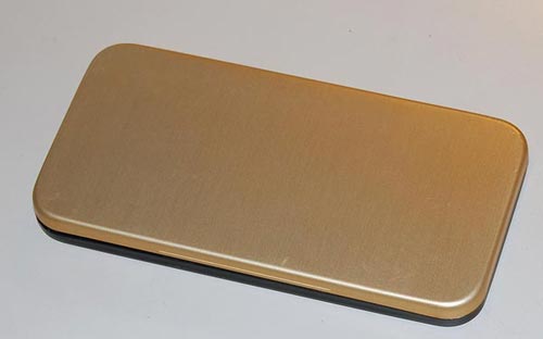
Check it out in the latest article on the Possibly Interesting web site!
Ordered some books today and was surprised to find on the Amazon.com home page a message from Jeff Bezos telling of their new initiative to alleviate “Wrap Rage” – “Amazon Frustration-free packaging“. Apparently they plan to recruit leading manufacturers to put an end to clamshell blister packs, steel-wire ties and excessive cushioning materials.

They aren’t necessarily resorting to Julie Andrews’s “Brown paper packages tied up with strings”, but they will push for smaller, easy-to-open, recyclable cardboard boxes designed to minimize both waste and customer fury. What’s more, these plain boxes are designed to ship as they are, without need for an additional shipping carton. More details here.
What can I say? Good idea! I wish more vendors did that sort of thing.


An alien twist on the On/Off Switch symbol
My post about the evolution of the On/Off Switch symbol turned out to be very popular with this blog’s esteemed readers. So, here is a second serving on the subject. This time, something completely different…
I was visiting someone in a hospital and I saw this piece of medical equipment by Alaris Medical Systems. From what I could gather, it was a controller for a volumetric injection pump that was administering medication to the patient at a programmable rate.
So – look at the symbols around the big key-switch (sorry about the quality of the hurried cellphone photo). Obviously, they’re meant to be conventional icons denoting some functionality – maybe On, Off, and something in between? Or Fast flow, Slow flow, and Manual flow control? The point is that it’s clear that they do mean some three states, and that their distinct simplified forms map to those three meanings somehow, yet for me, as a non-medical person, they could just as easily mean glrrrph, drerp and hoomphla. I’ve completely failed to decipher this symbolism. If you know what it means, add a comment for the benefit of the rest of us.
I assume the nurses that use this gear have been trained in its use… still, one wishes they’d add the meaning in plain English alongside (or instead of) the mysterious icons. But then, that goes to “one word can be worth a thousand pictures”, as I’ve considered here.
Which reminds me of a question I’ve pondered in some idle moments: would an alien visitor make any sense of our ubiquitous arrow symbol? Or do you have to descend from a specific hunter-gatherer background to feel that it must mean motion in the direction of the arrow’s tip?…