Archive for August, 2008

The real thing, in cross-section

Hedgehog skeleton Learning what makes things tick is a major pleasure for a techie… read my opinionated view on how one should teach the structure and function of objects, whether natural or technological, in the latest article on my Possibly Interesting web site.

Tools 4: The right tool for the job

A major cause of accidents and frustration is trying to use the wrong tool for the job.

Professionals usually know, and have available, the right tool. Amateurs and beginners may be blissfully unaware of it. When I was just starting into homebrew electronics in my teens, I actually used to drill holes in metal with a hammer and nail! I soon discovered the hand drill, but for the larger holes required for mounting tube sockets, panel meters, and such I had to drill a circle of small holes, then use a file to painstakingly smooth out the jagged contour this left. This is definitely the wrong tool…

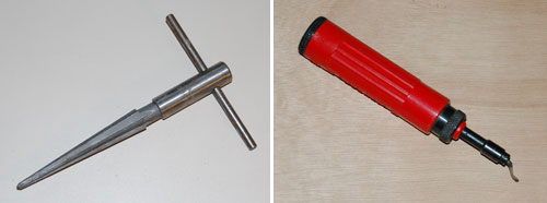
I became aware of the right tools after maybe a year of slaving over those holes. First came a chassis hole punch, where you’d drill a hole as thick as your finger, and use it for the screw that connects the punch’s two parts across the metal; tighten the screw and the punch eats the metal like butter. Making the finger-thick hole was still a matter of drilling and filing, until I discovered the Reamer, a sharp tool that widens the initial hole in seconds.

Chassis punch set

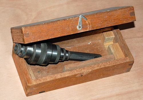
Lastly, I found the de-burrer – a tool for removing the sharp metal burrs that might remain around your hole. My trusty metal files got a well deserved rest, and I could focus my time on designing better electronic circuits… and enjoying their realization in hardware much more.

Reamer and deburrer

Whatever work you do, if it’s hard and frustrating, if you’re not enjoying it, you may be using the wrong tool for the job.

Babylonian memory technology

A gem I saw in a museum recently: this is a large cuneiform-inscribed cylinder, maybe 3-4 inches thick, which describes the building activities of king Nebuchadnezzar (better known in the bible for his opposite exploit when he destroyed Jerusalem in 587 BC).

Babylonian Cuneiform Cylinder

Anyway, in one of those moments of associative memory, it struck me how similar this looked to the contact-studded drum memory devices of the ABC, or Atanasoff-Berry Computer, one of the earliest electronic computers (1941), pictured below at the left. One is also reminded of the magnetic drums that served computers for memory in the 1950s, like the one to its right.

Computer Memory Drums

The idea of using a drum for computer storage makes good sense in terms of allowing it to be scanned easily by rotating it; but the Babylonians probably used this form because it allows you to cram much text (and many construction exploits, if you’re a busy king like Nebuchadnezzar, he of the hanging gardens of Babylon) into a relatively compact object.

Also worth noting: The king’s memory cylinder is still readable after more than 26 centuries; so, can you read your 5-1/4 inch floppies any longer?

Engrish on a camera LCD screen protector

I bought a screen protector for the LCD display on the back of my Nikon D40, and I just have to share the wonderful text on the back of the package, which reads:

Engrish

I’ve already expressed my incredulity at this sort of stuff; this one is just for your reading enjoyment.

Incidentally, the product itself is excellent, LCD panel guard for Nikon D40
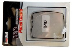
far better than the cling-on film type protector I tried before it, which simply fell off one day (in other words, did not have preservation status such as new product). This one is rigid and attaches to the camera at its raised edge. And of course, it always keeps 100% transparency because become UV coating processing work!

Where old projectors go to die

overhead projectors
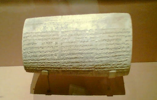
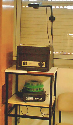
I was visiting a hospital, and passed by a seminar room where my eye caught the items in the photo, sitting on a custom stand in the corner.

Remember these? Used to be, they were so ubiquitous that they were instantly recognizable: an overhead foil projector and a circular magazine slide projector.

These days, no one uses them anymore… it’s been years since I even saw one of these. It’s PowerPoint everywhere. In fact this seminar room had a new LCD projector fixed to the ceiling. But these academic institutions are conservative: they throw nothing out. These useless devices may well linger there for years. And so, we are afforded a peek into a not all that distant past..

The importance of Exuberance in User Experience

Photoshop rules, and gets more powerful and more useful with every new release… but it will never recreate the joy of using Deluxe Paint.

Now, Electronic Arts’ Deluxe Paint was a raster graphics paint program released for the Commodore Amiga in 1985,King Tut, the iconic image of DeluxePaint which fast became the standard on that venerable 16-bit platform. It would typically handle 32-color images at up to 640×400 resolution. Sure, you could do things in it that no other personal computer could do at the time – like the King Tut image that became the hallmark of this program – yet in today’s terms it was utterly weak and primitive. So what’s the big deal?

The big deal, IMHO, was the Exuberant feel of its usage, the kind of joy one might feel when grounding the gas pedal in a powerful sports car… In DPaint you could mark a rectangle anywhere on your image, cut it (with one click) to become a brush, then drag and spray it across the screen in wide sweeps to create swatches of colorful shapes, in real time, under your immediate command. The village below was created in seconds from the single house at top left… And then you could set the program for mirror or tile modes that would reflect this action in a kaleidoscopic riot of visual joy. You could create colorful abstract images fast – click! click! click!…

Brush effects in Deluxe Paint

You may still say, what’s the big deal? You can do all that in Photoshop! Well, yes and no. You can achieve the same results (and lots more that was unthinkable in 1985) but you do this by going through a long sequence of steps, as if you’re performing delicate brain surgery. I mean, in DPaint you drew a circle by clicking a button and drawing the circle with one mouse motion. In Photoshop, the instructions for drawing a circle have 7 steps, and step 5 says “In the Stroke dialog box, type a value for Width, and then click the color swatch to display the Adobe Color Picker“. This certainly works, but it does not bring the words joy, or Real time, or Immediate to mind…

The same difference can be seen in comparing an iPhone to a Nokia. The iPhone’s UI is definitely exuberant; the joy of dragging stuff around with your finger and having it respond is very real. On a Nokia, you have to cope with all those teeny buttons… it works, but it just isn’t fun!

Hear that, designers? We need more products with an Exuberant user experience!

Hi-Tech Toothbrushes

The first mass-produced toothbrush was made in England by William Addis in England, around 1780. His idea was to attach bristles to a stick, and make a little brush with a long handle, to allow one to brush one’s teeth. You’d think that’s all it takes; you’d think the toothbrush would remain just that, a brush on a straight stick…

Toothbrushes on display

Think again. Today, any drugstore has a wall full of toothbrushes, and not one of them is as simple as Addis had envisioned. In fact there are so many types, such a riot of colors and designs, that it’s hard to buy a new brush that looks just like your old one. AndToothbrushes to compete with each other, the different makers dream up the weirdest configurations, with multicolored, contorted handle shapes that remind me of sports shoes (another area where form totally diverges from function in the interest of marketing hype), and with heads that must’ve taken real genius to design. The underlying ideas are impressive – brush heads with multiple bristle types sticking every which way to better remove bacteria from every cranny in the target dentition… all seemingly very important, very convincing, lest the consumer remember that a brush is a brush is a brush, and would work just as well if it had a simple monochrome handle and a straight head. The bacteria wouldn’t mind…
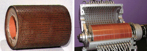
Automatic car window controls

Electric car windows have become the norm these days; and one feature on them is “Auto”, where you can open or close a window all the way with only a momentary push on the actuator button. A useful feature, too.

What I find strange is the stinginess with which this feature is applied. In most cars, you only get it on the driver’s window, sometimes only for opening it. My Mazda 3 is of the rare few that have two-way (open and close) Auto on the driver’s switches for all 4 windows. Why is this useful? because it allows you to close all windows when you leave the car with two 2-finger clicks!

Speaking of which, we could use a “close all windows” button – a very useful function that I have yet to see on any car (I did see cars where the windows close automatically when you lock the car, but that can be a safety issue, I suppose).

Invisible writing on medicines

Here is a box containing some medicine. As the law requires, it has the lot number and expiration date clearly marked. Well, OK, not clearly… in fact, the information is barely visible at all. The law, one can guess, says nothing about the information having to be Legible.

Medication box

It’s not like making the text visible is so difficult… as the next photo proves.

Medication Box

Speciation and Competition in Berlin’s traffic lights

Speciation, in evolutionary biology, is the splitting of a species into two different sub-species that cannot interbreed; it is one of the engines powering evolution. One mechanism responsible for this is the appearance of a physical barrier that cuts part of the species off from the rest, as when tectonic activity creates an insurmountable rift or mountain range, or an island breaks off from the mainland. The creatures on either side of the barrier evolve independently, resulting in such wonders as the dwarf elephants that used to exist on mediterranean islands, or the diverse finch species of the Galapagos.

During my recent visit to Berlin I was amused to see the same phenomenon, of sorts, happen to man-made objects – namely, pedestrian traffic lights.

Pedestrian crossing Walk/Don’t walk signals vary between countries, but in each country they usually have one standard design. In Europe they usually follow the European standard of a red standing man and a green walking man.
Now this is also the case in Berlin, except that there they have two designs. In West Berlin, the little men are skinny and utilitarian; but in East Berlin they are stylized, chubby and humorous: the famous Ampelmännchen.

Berlin walk signals

The Ampelmann design was developed in the GDR in 1961, and was used in East Germany while the barrier of the Iron Curtain prevented design standardization with the West. When the Berlin Wall became history, the citizens of that fascinating city had two different signal types; for a while you could tell which part of town you’re in by observing the one in use.

And when a barrier comes down and the two species mix again, it is possible for one to wipe out the other. In Berlin, there were plans to replace the Ampelmann with the EU standard of the skinny, businesslike version. Fortunately this planned extinction of the eastern variety met with a public outcry, and now the funny man in the hat is a protected species; in fact I heard they plan to replace the western version with Ampelmännchen, since they’ve become a kind of city mascot. In one pedestrian crossing I even saw the two little men – East and West – eyeing each other uneasily across the street…