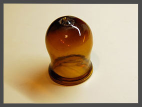
 Do you recognize the glass object in this photo? If not, you may want to check “Prey to Oblivion“, the March article on my Possibly Interesting web site, which has a bunch of everyday objects that were quite familiar a century ago but are now all but forgotten.
To avoid confusion:
- This here Commonsense Design is my blog, updated with new brief posts a few times a week.
- Possibly Interesting is my personal web site, where I post hopefully interesting but longer articles once a month.
I figure I should cross-post a link to the blog when an article of interest comes up on the other site.
And now, from the murky past, a serious lapse in designing for the intended user…
When my son was a toddler, many years ago, he had this habit of going into my den in my absence, climbing onto the lab bench and wreaking havoc (here, I once captured him on film reaching for a hammer).
Well, I had to protect kid and gear, and I had this idea to build an anti-toddler alarm system that would raise an alert if the kid went into the den without an accompanying adult. My design had two infrared beams crossing the door at different heights, and a control box complete with a cackle generator (to issue a sound like an angry hen when the alarm was triggered). When it was finished, I painstakingly built four lens assemblies for the IR beams, rigged them around the door frame, and prepared to have some fun. Cool, huh?…
Yah. The thing lasted for less than a day. As soon as the kid (did I say he’s very smart?) went on the prowl he spied the interesting new things on the door frame, decided they were worth studying, and tore them off the door to facilitate examination. I wasn’t in the mood to devise hardened housings, so that was the end of the project.
We tend to think of User-centered design as making life easy for the user. Evidently, you also have to ensure the system can survive its intended users!
We humans have this obsession with designing new products, even though many of them die out after a while (some, mercifully, after a very short while!) However, every so often a design is found that is simply so good and sensible that it stays around for a long, long time.
So, here’s an example I ran into in the archaeological museum in Agrigento, Sicily, a town founded by the ancient Greeks.
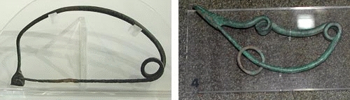
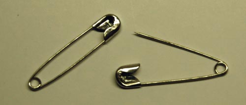
The object on the left is a bronze Fibula, made in the 13th century BC. Not one in a thousand people today would recognize the word “Fibula”, but hardly anyone would fail to identify this as a large safety pin. In fact, I saw not one but many of these, in various museums in Europe: they were widely used for many centuries. The second photo shows one from the 8th Century BC, with a more imaginative design (remember, unlike our safety pins these were also meant for decorative effect as fasteners for cloaks and such).
And for all our digital innovations, and perhaps unlike many of them, I doubt this good ol’ design is going to be supplanted anytime soon…
Map making is an ancient art, and a great deal of ingenuity has gone over the years into how you can draw the spherical surface of the Earth on a flat piece of paper in a way that still makes sense. That’s where all those map projections like Mercator’s come into play. More recently, to my dismay, I see in the media a much less sensible practice: drawing flat pieces of terrain onto a sphere.
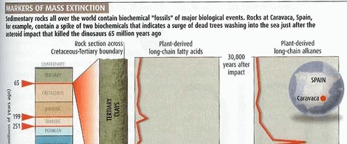
Consider this scan from an article in New Scientist, my favorite science magazine. Note the map at the right. Note how it takes you a disorienting moment to put it in context! At first glance, this is a sphere, hence it must be the earth; but what bizarre continent is it showing? Or is this some archaic proto-continent, long obliterated by continental drift?
Of course after a second you register that it is Spain; but if so, what is it doing stretched across an entire hemisphere? You might explain the circle as simply a picture frame – nobody said a map must be rectangular – but if so, why the shading in and below the circle, clearly denoting a three-dimensional sphere?
The explanation is simple, and has to do with the ease and irresistible allure of doing special effects in Photoshop and its ilk, along with the paucity of common sense in the users of such tools. The map insert should have been left flat-shaded; the conflicting 3D cues (and the circle itself, for that matter) add only confusion.
Nor is this an isolated example; we see a lot of this sort of thing going around. Yuck!
I upgraded recently to a Lenovo Thinkpad T61, from an IBM T42. Good road warrior that I am, I had the T42 accessoried to the hilt, notably with a bunch of extra batteries to last me through the long flights across the Atlantic. Since the new machine was also a Thinkpad, you’d think I would simply reuse the accessories in the new machine, right?…
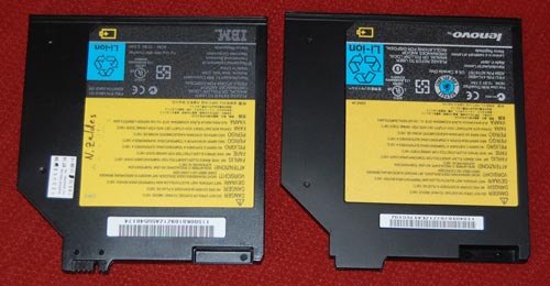
Wrong. The power supply can’t be used because it has a different output voltage – you can’t argue with that. The 3M privacy screen can’t be used because the screen’s a different size – fair enough. But the batteries?!!
The batteries are very similar, but their plugs differ. Intentionally.
Look at the photos to compare the Bay Batteries of the two machines; exactly the same dimensions, same voltage too… but the plug is just different enough to prevent reuse. Hard not to harbor cynical thoughts about the reason… 🙁
When Johannes Gutenberg gave us the printing press in the 15th century, he also invented a suitable ink to go along with it. His ink was a glossy black, and the idea of printing books in black on white paper has remained ever since, because that is by definition the highest contrast you can get, hence easy to read. Millions of books have appeared since Gutenberg, spanning a huge range of subjects and world views, but they did not differ in ink color one bit as the centuries came and went.
Lately, however, I notice a worrying trend as I browse the shelves in the bookstores I frequent. A small but growing number of books are published in all sorts of smart-aleck color schemes. Ignoring the ones on colored paper – where the color schemes are intentionally artsy – we see books in gray ink, blue ink, brownish ink, all on white paper. And not just a sidebar or special page; the entire book is printed this way, as if the publisher said to himself “Hmmm… how can I improve the reading experience? Ah! Let’s use a lower contrast ink than we might. Sure, gray ink may cost more than the standard black, but what’s a little money compared to the pleasure of giving my readers eye strain headaches?”
Bad, bad idea. Give us books in good old black on white!
Everyone uses the 3M Post-it note, and it’s often used as an example of the role of serendipity in product development – and of the wisdom of maintaining a corporate culture that encourages and empowers the pursuit of such serendipity.
But the Post-it note story has another interesting lesson, and it has to do with the degradation of the design of its packaging. The original version of the ubiquitous 100-note packet was wrapped in cellophane, with the highly original trick that you could open it by grabbing the packet with two hands on opposite sides, and cracking the cellophane open with a single rapid twist, rotating the two ends in opposing directions. This was by design; in fact, I recall it said so explicitly on the packet. It was the fastest, easiest way to open a cellophane wrapping that I ever saw; and whenever I did the little twist I felt a twinge of admiration for its designer (and perhaps a bit of triumphant gloating over the cellophane, a wrapping material noted for its unfriendliness – think “CD Jewel Case”).
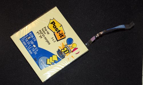
So guess what? A few years ago 3M did away with this method. Now they provide the usual thin strip whose end you need to pry loose and pull. Sure, it’s no big deal; but the new method is more complicated to manufacture, slightly harder to use, and, above all, is less elegant .
I’m disappointed in 3M: when you got a good thing, you shouldn’t mess with it. But if you must mess with it, can’t you go forward, not backward, in simplicity and functionality?
A particularly heinous bit of bad product design are ear-shattering car alarms.
The underlying thought was good, I’m sure: let’s make the car raise an unholy racket when someone messes with it, and we’ll put a stop to car theft! Of course, this failed miserably, both because of high false alarm rates and because in the case of a true alert most bystanders will prefer to mind their own business rather than confront a possibly violent thief. In fact the New York City Police Department claims that car alarms actually contribute to making the crime problem worse; and every urban dweller is familiar with their harm to quality of life in the city (for more data, see this report).
Now, car alarms come in many forms, and not all are harmful to our sanity; there are silent alternatives that will alert the owner wirelessly without raising a ruckus; there are immobilizer devices that can prevent theft in various ways; and so on. But many manufacturers still use the useless, maddening audible alarms, and a few design ones that will not shut themselves down after a minute or two – the designers of these deserve to be drawn and quartered…
So, what can we do about this? As a society we can certainly do much, if only we’d try (Terroncito has some interesting thoughts on this). I can tell you what I did. I used to have a car with a particularly nervous alarm, which got in the habit of treating my neighbors to minute-long blasts a few times a week. I tried to have it fixed, but to no avail. So I called my insurance agent, whose policy insisted I have this option in the car. I told him either the alarm goes, or his customer goes. Guess what – the insurance company wouldn’t budge, but the agent, after some diligent search, found another who was willing to accept a silent immobilizer. End of problem.
Remember: you can, and should, refuse to be told by some insurance company to torture your neighbors!
I got this new Smartphone recently. A couple of weeks later, I find my analog quartz watch is off by five minutes. I take it to have the battery replaced; a week later, same problem: it’s a few minutes out of whack. I send it to be repaired (it’s a good quality Seiko under warranty), and switch to an El Cheapo spare watch I have, which at first seems to work fine; but in a few days, it’s also off. I try another watch – Swiss, this time – same problem duly appears after a while.
Then it hit me: these malfunctions started only after I switched phones. So I thought, maybe the device emits some radio waves that mess with the watches’ electronics? A few tests of draping the watch on the Smartphone overnight (Hey, I’m a physicist, ain’t I?) ruled this out.
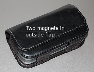
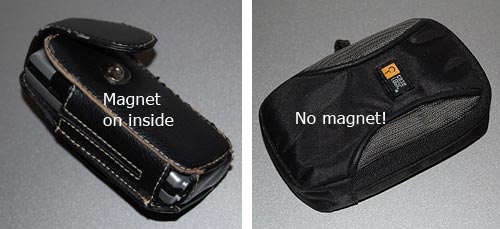
And then, I realized what was going on. The new phone came with a beautiful leather holster. This held the device horizontally on my belt at the left of my body, and closed it with a wide flap that snapped into position with an assertive magnetic click (which has a very nice feel, I must say). It was the magnet all along. This was easier to prove than I thought – hold an analog watch next to the flap, and its second hand stops immediately. With my left wrist brushing the holster randomly, you can see what was happening.
So, what can we do about this? As users, we can switch to non-magnetic pouches, ones with a zipper or Velcro closure; or we can move the device to the non-watch side of the belt. But as pouch designers, we can actually do a lot. The offending holster was designed with two magnets in the flap and two in the body, four in all, and the top ones right at the surface of the holster where the watch could touch it. Other pouches I see around have the magnet in the body, and the outer flap has a passive iron counterpart; thus, in the bad design the outside surface is magnetic (you can snap a screwdriver to it!); the better design is neutral on the surface. Take note, designers!
Interactive voice response (IVR) systems are notoriously annoying. As the joke goes, “For a list of all the ways that Technology has failed to improve the quality of your life, please press 3″…
Some IVR systems are better than others; the best will make allowance for the user’s need to get around them. I ran into a good one today. I called Continental Airlines to do a seat assignment, and this IVR setup gives me a bunch of options that don’t include what I want.
On a hunch, I said loudly: “I want to talk to an agent!”
System: “I think you said you want to talk to an agent. But if you give me your flight details first, I can help the agent serve you faster” (or something to that effect).
I play along and give the flight details to the machine.
System: “OK, your flight is confirmed, as follows […] You can hang up now”.
WTF?!! Hey, it promised! So I say, firmly and loudly:
“I want to talk to an agent!”
System: “OK, I’ll transfer you now”.
Got it? I took a stand and the system capitulated! Have to hand it to them, though: they never mentioned the option to talk to a human, but they included the speech recognition to identify when I ask for it. Good job! [well… almost. I was euphoric for of the three seconds until the system helpfully added: “your waiting time will be approximately 25 minutes”. And it was good at its word this time].

