Sure thing, Form should follow Function… but some designers haven’t heard of that. Like the Sony designers responsible for the two weird design choices below.
Round knobs are round because they need to be gripped and rotated… an optimal design for our opposable-thumb grip.
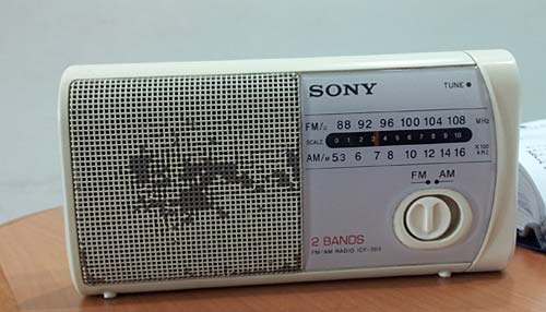
But the radio below has a round knob whose function is to slide right and left between two positions. There are wonderful switch designs for that, some going back to the Industrial Revolution… and their oblong form reflects the lateral movement. Not here, though…
And then there’s this little stereo system I use in my home office:

This has four shiny round knobs, of which one – at the right – actually rotates to control the sound volume. The other three are flush with the panel and are actually two-way momentary push-button switches – you push the top or bottom part of the control for a “click” that might advance the tuning or track up or down. The use of a round form here is an abomination, and each time I use them I go into a tiny cognitive dissonance. Fortunately, the sound quality is good enough to put me in a forgiving mood…
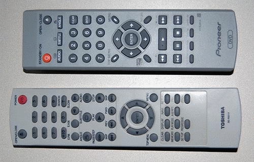
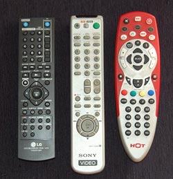 The proliferation of these gadgets has created a real problem, and home electronics makers are responding by creating R/C units that can control more than one item; most typically, a TV set and the DVD, PVR or VCR feeding it.
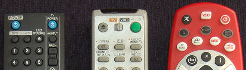


The evolution of the On/Off power switch symbol
We all know the symbol with a vertical line in a circle: it identifies the On/Off power switch. It occurred to me that this familiar symbol is evolving in a bizarre fashion.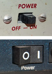
Originally, switches had a lever or slider that could move to either of two physical positions. In those days the switch was marked with the word POWER and its positions with ON and OFF. Then, as switches became smaller and more globalized, the two words were replaced with 1 and 0, as seen even today on many rocker switches.
And then the ubiquity of microprocessors made it more economic to do everything with momentary pushbutton switches; the computer inside could take care of figuring whether you meant ON or OFF. And so, the button now needed an icon that conveys both options; I surmise that is when the familiar “1-inside-a-0” symbol came into existence (if you know otherwise do share in the comments!) This round icon fit nicely on round buttons, and became ubiquitous.
But then we start to see the form shown in the two photos above right: a bastardized version combining the 1-in-a-circle with a 1 in the same symbol. This makes no sense at all – the correct representation would have been 1/0, for On slash Off. Instead we get On slash OnOff. Sloppy thinking…
Such erroneous contractions are often seen in spoken language – as in “IT technology”, which expands to “information technology technology” (there’s even a company by that name, and its slogan, amusingly, is “We make sense of IT“). But now we see the same error invading the more compact space of visual symbols…