Tag Archive for 'Commentary'

The demise of Tinkering, Take 2

I’ve lamented before the disappearance in our time of the Tinkerer, that fix-everything general technology expert of ages past. I ran into a demonstration of how far he’s gone the other day when shopping online for a new bluetooth hands-free cellphone car kit (my old one conked out, and fixing it would of course have cost more than buying new – another sign of our times).

I found on Amazon the Motorola T305 Bluetooth Speaker, and dug into its customer reviews. Turns out it has excellent audio quality, but there was a recurring complaint: people hated its big, intense blue light, which at night would blink very distractingly at the edge of the driver’s field of vision. Motorola Bluetooth Handsfree speaker model T305

The discussion among reviewers was about whether the blue light was terribly distracting, mildly distracting, or maybe you could get used to it after a while. What amazed me is that none of the reviewers I read (admittedly, only a sample of almost 300 of them) had done the obvious thing – solve the problem by tinkering with the device. This could be done in two minutes, tops: all you’d need is to cover the light with a sticker, which can be cut to measure from paper, or some masking tape, or – if you’re so inclined – a thin gold foil with inlaid silver patterns. Anything opaque to light would do. Or if you still want to see the light, but at lower intensity, you could punch a small hole in the sticker, or use a semi-transparent dark material instead of tape. Once you did that you’d have the great sound quality and none of the annoyance.

The fact that this obvious idea never occurred to anyone is disturbing indeed. We’ve become so accustomed to ready made products that the notion of improving them to serve us better is entirely gone! 🙁

And another On/Off power switch symbol!

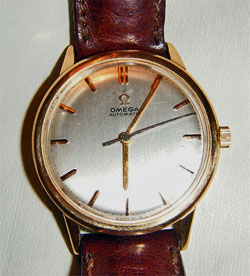
We’ve seen much diversity of On/Off Power switch symbols here and here… and there’s more.

Critikon On Off power switch
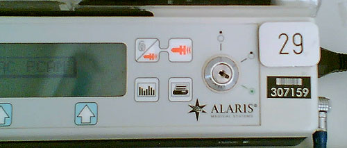
Here’s the latest addition to the gallery: I spied this on a piece of medical equipment (a Critikon Dinamap vital signs monitor).  It shows a dot centered in a circle for ON, and the same dot banished outside the circle for OFF. Luckily, they weren’t lazy and included the two words as well. This removes the possible confusion I’ve remarked on in my post on the Alaris symbology; it also provides a Rosetta stone for deciphering that one.

The Sweep Hand and the concept of Time

I met a guy who had an old Swiss chronometer watch, a self-winding mechanical one. As I looked at it, admiring the fine workmanship, I suddenly noticed a detail that used to be taken for granted: the thing had a seconds hand that was moving around the face of the watch.

Omega mechanical wristwatchSo what, you say?

So, it was moving, not in the swift jerky jumps we’re so used to in today’s superbly accurate Quartz watches. This hand moved at a constant rate, sweeping around the watch, which is why it used to be called a “sweep hand” back then. I remember this from my father’s watch when I was a small child: I would try in vain to discern any movement in the hours and minutes hands, but the sweep hand moved in its slow, stately march, signaling the inexorable continuity of time.

And it occurred to me that the switch from mechanical to electronic analog watches makes the seconds hand mirror the zeitgeist of their respective periods in history. The jumpy quartz-driven hand is such a great fit to the hectic, jerky pace of our modern life, whereas the sweep hand is a better reflection of the more sedate lifestyle of centuries past…

Those conservative business cards…

Business cards have been around for a long time – very long, if you count visiting cards – so we should not be surprised if they tend to have an innate inertia to them. Still, business has changed so much in recent years – isn’t it time that the cards paid attention?

I was scanning a batch of business cards I got in a conference recently when I noticed an interesting fact: they may come in many designs and colors, but 90% of cards will have the contact information in the following order:

Physical address
Phone number
Fax number
Mobile number
Email address
Web site URL (if any)

Now this is interesting, because it has two attributes:

  1. It follows the approximate historical order the various technologies appeared in (first we had office buildings, then telephones, then faxes, etc.)
  2. It gives the items in reverse order in terms of usefulness, the least useful at the top: in today’s virtual, mobile, global world, we would most often use email to reach people, or a cellphone if they have one; faxes are not yet gone but may soon be, and physical addresses are only of marginal use in a “work anywhere” culture.

I had a friend, a master blogger and geek, who once said if he had his way he’d simply put on his card his name and “Google me!” – now that’s modern thinking for you! The closest you get to this are Moo minicards, those miniature cards that barely have room for a name, job role and email address.

Now that I noticed this I checked my own new card that I made after leaving Intel – and guess what, I had it almost right in terms of descending importance:

Name
Web site URL
Email address
Physical address
Mobile number (the only phone I use)
Fax number

Only the physical address stayed higher than it should be…

Quality, pure and simple

Quality is an elusive attribute, but you usually know it when you see it. For my part, I keep around a small memento that captures it very well, and comes from my years – long ago – as a forensic scientist. My main job at the time was around electron microscopy of invisible evidence, but there was also, at the other end of the complexity spectrum, a lot of straightforward examination of picked and mangled locks. I and my coworkers had ample opportunity to study the locksmith’s domain, and it was then that I put on one ring two simple cylinder lock keys from long forgotten origins that I felt capture the gap between high and low quality. Here they are: one made by Corbin and one by Nabob. Can you tell which is the better quality one?

Two cylinder lock keys

The better one is the Corbin key at the right. The feel for its quality is more obvious when you actually hold it, but the photo may suffice. And it goes more than skin deep, though the design of its bow (the “handle”) is certainly more thoughtful and elegant. Here are all the other ways in which the key at right is better than the one to its left:

  • Thickness. The Corbin key is thicker, hence more durable. In fact, the Nabob key already shows some bending along its blade, though it’s hard to see in the photo; were it in use, it would eventually break.
  • Profile. The Nabob has a flat blade, meaning its lock would admit any flat object to serve as a lock pick. The Corbin has a deeply convoluted cross-section that would make picking far more difficult (though still easy for a professional – these are both simple, low security keys).
  • Number of pins. The Corbin’s lock has six pins; the Nabob has five (reflected in the depressions on the blade). More teeth, more combinations, longer time to pick. (You can see this in my lovely cross-section of a lock, pictured here).
  • Quality of the combination. The teeth in the Nabob are almost the same height, making it far easier to pick with a straight pick. The Corwin has great height variations.

So many differences in such a trivial everyday object… do you wonder why I keep this pair as a representation of quality?

The demise of Tinkering

The progress of engineering over the years has brought us many triumphs of human ingenuity, but it has left quite a bit of roadkill behind. One species driven to the brink of extinction is the Tinkerer.

The attitude to Tinkering has always been ambivalent. Look at the dictionary definitions:

tinkerer [noun]

1. a traveling mender of metal household utensils.
2. A clumsy repairer or worker; a meddler.
3. a person who enjoys fixing and experimenting with machines and their parts.
4. a person skilled in various minor kinds of mechanical work; jack-of-all-trades.
5. Scot., Irish English.
a. a gypsy.
b. any itinerant worker.
c. a wanderer.
d. a beggar.

What a mix! On the one hand, a person skilled in fixing things; on the other, a beggar, a clumsy worker…

The truth is, this was an extremely useful person in centuries past. This was the ingenious man who made the rounds of the county, a wanderer indeed, and who knew how to fix everything that had broken down since he last came. All the newfangled contraptions that were useful to the villagers but beyond their ability to fix: sewing machines, radios, bicycles, gramophones, tractors… And this tinkerer had manifold skills – a real jack of all trades – but even more so, he could improvise, making replacement parts from whatever was at hand, working around the missing or broken pieces. Take my favorite definition of engineering – The art of making what you want from things you can get – replace “making” with “fixing”, and you have the Tinkerer’s calling. Above all, this is “a person who enjoys fixing and experimenting…” – someone who loves his work, hence deserving our respect.

And now he’s a threatened species, for two reasons having to do with how we design our technology today: first, because we design it to be discarded at the first failure, so no need to fix it; and second, because with the advent of microprocessors, most items cannot be fixed by improvisation. If your car acts up, you need to get it to an authorized garage where they hook it up to a computer that tells them what to do; no way can you take a screwdriver and a shoestring and fix it… and in any case we specialize so much that no one person can fix the electronics in a sewing machine, a DVD player and a car.

Too bad – those tinkerers had a technological flair to their way of life and their vocation that will be missed – or not, once we forget they ever existed. 🙁

An alien twist on the On/Off Switch symbol

My post about the evolution of the On/Off Switch symbol turned out to be very popular with this blog’s esteemed readers. So, here is a second serving on the subject. This time, something completely different…

Switch on Alaris pump controller

I was visiting someone in a hospital and I saw this piece of medical equipment by Alaris Medical Systems. From what I could gather, it was a controller for a volumetric injection pump that was administering medication to the patient at a programmable rate.

So – look at the symbols around the big key-switch (sorry about the quality of the hurried cellphone photo). Obviously, they’re meant to be conventional icons denoting some functionality – maybe On, Off, and something in between? Or Fast flow, Slow flow, and Manual flow control? The point is that it’s clear that they do mean some three states, and that their distinct simplified forms map to those three meanings somehow, yet for me, as a non-medical person, they could just as easily mean glrrrph, drerp and hoomphla. I’ve completely failed to decipher this symbolism. If you know what it means, add a comment for the benefit of the rest of us.

I assume the nurses that use this gear have been trained in its use… still, one wishes they’d add the meaning in plain English alongside (or instead of) the mysterious icons. But then, that goes to “one word can be worth a thousand pictures”, as I’ve considered here.

Which reminds me of a question I’ve pondered in some idle moments: would an alien visitor make any sense of our ubiquitous arrow symbol? Or do you have to descend from a specific hunter-gatherer background to feel that it must mean motion in the direction of the arrow’s tip?…

Something is wrong with our Notebook LCD screens, part 3

And now, following Parts 1 and 2, here is the last installment…

These days, more and more Notebooks come with displays branded by the makers as VibrantView, or CrystaslBrite, or OptiClear… exciting names indeed. What they all refers to is glossy LCD screens, which would be much better described as GlareMirror, or UglyReflector, or maybe just RazzleDazzle

Glossy screen on a Notebook computer

Photo source: Marco Wessel, under Creative Commons license.

The underlying idea is to remove the matte anti-glare layer on the older screens, a change which results in better definition and more vibrant colors, plus better outdoors visibility. All commendable attributes, except that the price you pay is a mirror-like surface that reflects windows, light fixtures and other bright objects, a problem that motivated the original matte layer to begin with. Solutions? Work in a totally dark room, or try to yank the screen around until you find a reflection-free angle. Note that the last works for a single viewer – these screens are most annoying when someone shows you something on their screen: maybe they found the glare-free position, but you, looking from the side or over their shoulder, will get the full blast of annoying reflections.

Now if the matte screens were bad – if their colors really sucked, or their focus was totally fuzzy, I can see the possible value of a trade-off; but TFT LCD’s have reached maturity years ago, and are a delight to use. So what got into the vendors’ heads, to throw in the glossy finish – not as a  rare option, but as a mainstream technology?

Something is wrong with our Notebook LCD screens, part 2

We discussed the recent trend that is eliminating the optimal resolution in notebook computer screens. Another undesirable trend is the move to widescreen displays. These days it is almost impossible to buy a notebook PC with the traditional 4:3 screen form factor; all new models boast a “wide” screen with a 16:10 form factor such as WXGA (1280×800) and WSXGA (1680×1050). In fact Lenovo, makers of the Thinkpad I use, have just proudly declared that they’re dropping all 4:3 screens in their new line of notebooks.

And what are they proud of? What’s so cool about giving us less effective screens?

Xerox Alto system
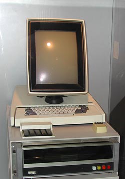
16:10 is a perfect choice if you want to watch movies, which come increasingly in wide formats. However, business notebooks are not intended primarily for this enjoyable purpose. They are meant to do business on, primarily word processing, email, presentations, and the like. And for this purpose, widescreen is totally inadequate. Documents are invariably taller than they are wide, like the paper pages they emulate; even presentation slides have a 4:3 aspect ratio. That’s why the venerable Xerox Alto (at right), sporting the granddaddy of all of today’s Personal Computer interfaces, had a “portrait” form factor screen: because you could process a whole page at once.

Now ideally, a wide screen might accommodate two pages side by side; and that works fine with a large external monitor. But Notebook screens are kept small for portability, and there is no way you can comfortably read two pages on a 14″ or even a 15″ screen. So you have to use the screen for one page, and since these screens are shorter (top to bottom) for a given diagonal size than the 4:3 type, you end up seeing less lines on a document at a given page width. You get more area at the edges of the screen, which you don’t need, and less height, which you do.

Like I already said, something is very wrong…

Something is wrong with our Notebook LCD screens, part 1

Something very odd is happening to the LCD screens on the Notebook computers that play such a major role in our existence.
386 notebook with monochrome LCD scrreen

The first aptly named “laptops” had small, low-contrast monochrome screens that had “eye strain” written all over them (well, not all of them did – the Grid Compass, in 1982, had a lovely bright orange-on-black display). Then came the first color screens, like Passive Matrix and DSTN, which were also pretty poor; and the  screen grew slowly in size, though there was still much plastic surrounding it. And finally Active matrix TFT screens achieved affordable prices and became the standard, and their size attained the width of a the keyboard while resolutions reached 1024×768. We were at a sweet spot, with notebooks whose keyboard and screen were so good that one could use them ergonomically without even wanting an external screen. For anyone who grew through the earlier clunky technologies, this was notebook nirvana.

And then…

… In the last few years, we are drifting away from that bliss. New notebooks have screens that make less and less sense. In this post series I’ll look at a number of issues with these.

For starters: Native resolution.

As I said, a sweet spot for screen resolution was (IMHO) 1024×768 pixels (XGA) on a 14″, 4:3 screen. The trend in the last 4 years is to go ever higher: 1400×1050 (SXGA+), for instance, and beyond. Obviously, the higher the resolution, the more things you can show – more spreadsheet columns, larger unscaled hi-res images, more windows, more emails… but then, at a given screen size (say, 14″) these things are smaller in absolute size; text and icons become small enough to cause significant eye fatigue, especially for anyone over forty.

Now, in principle you can try to fix this problem by driving the screen at a lower resolution. Some users actually try that, with sorry results, because one thing about LCD screens (as opposed to CRTs) is that you must use them at their native resolution. This is because an LCD, unlike a CRT, can’t increase the physical pixel size. Reducing resolution from 1400×1050 to (say) 1024×768 means that each pixel must now span a square of approximately 1.37 by 1.37 physical pixels; but this is a physical impossibility in an LCD, where each pixel is a discrete physical electronic device. The display driver now attempts to solve the problem by shading the “half pixels” in intermediate colors and shades, and this results in an unacceptable degree of fuzziness of the entire screen.

A better solution is to set applications to use larger fonts, and/or to change the overall DPI setting in the display properties in Windows. This will indeed cause text and other elements on screen to become larger. However, it will not get you back to where you were with the 1024-wide screen, because not all elements will scale – for example, icons will become blocky, and images on web pages will remain tiny while text grows, badly distorting the layout of many pages. Basically, you’re jumping through hoops to make a hi-res screen simulate a lower-res screen – poorly.

Of course, some users may need the added pixels – programmers, graphic artists, even accountants… but they would be better off using a physically larger screen, either by buying a 15″ or 17″ notebook, or by using a large external screen. Ordinary users, however, are better off with the portability of 14″ (or less) and the unscaled text and crisp focus of the XGA screen. Not that anyone’s asking them… new notebooks have screens of 1400 or even 1680 pixels across. Since these must cost more to produce, while being harder on the eyes, it’s unclear why the vendors don’t offer low res screens as at least an option; but in fact XGA notebooks are now rarer than hens’ teeth. Go figure…