One day the ladies in the household decided they’ve had it with our handheld hairdryer, which was indeed weak and ailing. So I went to buy a new one, and decided to follow my first principle for tool acquisition: always buy the most professional, high-quality tool you can afford – it will repay the expense many times over!
I asked the appliance store guy for his best tool, and he offered me a sturdy blue unit that, he said, was what professional hairdressers (sorry, hair styling artists) use. The wattage on the label was indeed higher than any I’ve seen before. I brought it home proudly, only to discover the next day that it was no good to anyone there.
This was a new one for me: how can a tool that professionals prefer be useless to an amateur? In my world of engineering and DIY projects, this would be unthinkable. What difference can it make? A hairdryer is a hairdryer, after all.
Here’s the difference: the hairdryer is a hairdryer, but the hairdresser uses it to dry hair that is on someone else’s head! When you dry your own hair, the dryer must be short enough to fit between your hand and your skull; when you dry someone else you can just step back. The professional tool was longer, not much but just enough to make it awkward to use on oneself.
So, a lesson: always keep an open mind and challenge your own assumptions on the way a design fits its intended use. These errors seem obvious in retrospect – always in retrospect…
When you see an ad for a piece of consumer electronics, you seldom see a close up of its remote control. In fact, most people ignore the lowly R/C when making a buying decision. Yet this little item is the main way we interact with our TVs, VCRs, and so on; and a its usability, or lack thereof, is going to impact our user experience many times every day.
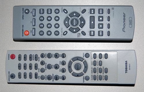
Look at these two R/C units, from two similarly priced DVD players, one mine, one my parents’. See the difference? In the one at the top the important buttons – play, FF, Rew and Stop – are prominent, visible, obvious… in the other, they are hidden among a confusing jumble of similar small buttons. And this means slower operation and frequent errors when you hit the wrong button by accident. We can assume the two arrangements cost exactly the same to manufacture; this is not about cost, it’s about attention to usability in the design stage.
So, of course, the better one is mine, because I always check this when making a buying decision? Well… err…
So many XY pointing devices have been developed over the years… I’ve used light pens, graphic tablets, trackballs, touch screens, joysticks, touch pads, trackpoints, even that weird HP desktop machine, the HP-150 from 1983, where you pointed at the screen and your finger intercepted IR beams crisscrossing the raised screen bezel (this last failed miserably – how could they ignore fatigue from repeatedly raising the arm to touch the screen?!)
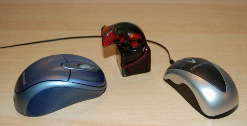
But the king of all XY input devices is without question one of the earliest: the Mouse. Only the QWERTY keyboard has greater tenacity (unfortunately, in this case). Invented in 1963 by Doug Engelbart and later commercialized by Xerox PARC, the mouse remains the most popular device in the family, and this is (IMHO) because it is simply the best – it maps extremely well to the brain-hand-screen-eye-brain closed loop, making its action so intuitive as to be transparent. It just doesn’t get any better than that. And interestingly, the exact shape of the mouse is unimportant: almost like cars, they went from blocky to streamlined as time went by, but are just as good in any shape. It’s the basic “movable box with buttons under the fingertips” that is the winning factor; the rest is window dressing.
Here’s kudos to a great design!
One evening a neighbor knocks on my door. She just got a new cellular phone, and she has a basic question: which key does she press to accept an incoming call?
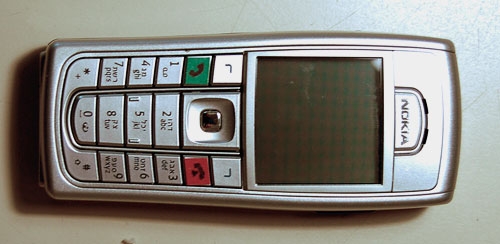
Now this lady is not a youngster, but she’s used cellphones before; surely she must know that you press the key with the green handset image? Well, yes, she knows, but she can’t figure out which key that is. I think, Huh??? … But then I look at her instrument, and I see what she means. What used to be an image of a handset has degenerated into a tiny thin squiggle, similar to other tiny thin squiggles on some other keys. And yes, perhaps she could discern that this squiggle is a bit greenish, especially if she had a magnifier…
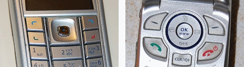
The problem is all too visible in the left photo, which is of my own Nokia 6230i: the four keys at the top have identical looking thin marks, and the colors of the bottom two, though red and green, are very hard to discern at a glance (which is the way they should be discerned; especially when you’re driving with the phone in a hands-free cradle). Compare this to the other photo, from a different model. That’s what good human engineering should provide!
So, what can we do about this? If you work at a cellphone manufacturer, by all means have a word or two with your design department… I don’t, so all I could do was fix my own problem. Here is what I did to my Nokia. Problem solved.