I got this new Smartphone recently. A couple of weeks later, I find my analog quartz watch is off by five minutes. I take it to have the battery replaced; a week later, same problem: it’s a few minutes out of whack. I send it to be repaired (it’s a good quality Seiko under warranty), and switch to an El Cheapo spare watch I have, which at first seems to work fine; but in a few days, it’s also off. I try another watch – Swiss, this time – same problem duly appears after a while.
Then it hit me: these malfunctions started only after I switched phones. So I thought, maybe the device emits some radio waves that mess with the watches’ electronics? A few tests of draping the watch on the Smartphone overnight (Hey, I’m a physicist, ain’t I?) ruled this out.
And then, I realized what was going on. The new phone came with a beautiful leather holster. This held the device horizontally on my belt at the left of my body, and closed it with a wide flap that snapped into position with an assertive magnetic click (which has a very nice feel, I must say). It was the magnet all along. This was easier to prove than I thought – hold an analog watch next to the flap, and its second hand stops immediately. With my left wrist brushing the holster randomly, you can see what was happening.
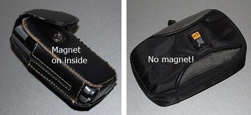
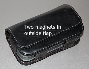
So, what can we do about this? As users, we can switch to non-magnetic pouches, ones with a zipper or Velcro closure; or we can move the device to the non-watch side of the belt. But as pouch designers, we can actually do a lot. The offending holster was designed with two magnets in the flap and two in the body, four in all, and the top ones right at the surface of the holster where the watch could touch it. Other pouches I see around have the magnet in the body, and the outer flap has a passive iron counterpart; thus, in the bad design the outside surface is magnetic (you can snap a screwdriver to it!); the better design is neutral on the surface. Take note, designers!