Tag Archive for 'Cellular'

Sygnet handsfree design flaws, part 2: Control overloading

Sygnet Handsfree with stickers
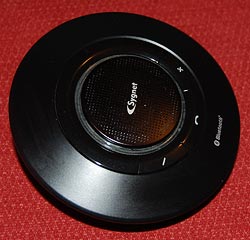
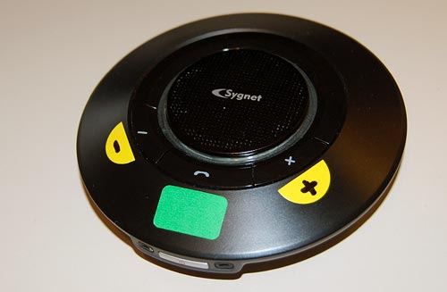
Back to my Sygnet Bluetooth Handsfree Carkit model BTS600. We saw its problem with cloaking the controls and indicator lamps… but on top of that, the people at Sygnet played a trick that is becoming very common in this digital era: they overloaded the controls and the lamps.

I use Overloaded in the Object Oriented Programming sense: the use of one operator or function name to perform several different functions depending on context.

The Sygnet device has three operating buttons and more than a dozen actions; so each button can do many different things. For example, the “-” button rejects a call if pressed for 3 seconds while the phone is ringing; it initiates voice recognition dialing if pressed for 3 seconds when the phone isn’t ringing; it cancels the voice recognition if pressed until a beep is heard; it cancels bluetooth device recognition if pressed for 6 seconds; it reduces audio volume; it mutes/unmutes a call when pressed concurrently with the “+” button; and it starts a conference call if pressed for 3 seconds while one call is active and another waiting. The other buttons likewise do a great many things; it’s so complicated that I carry the instructions in the glove compartment at all times! Needless to say, the captions on the device merely identify the buttons, not their functions.

The two indicator lamps, meanwhile, are similarly overused: The blue lamp blinks 3 times every 2 seconds to indicate an active Bluetooth link; it blinks rapidly together with the red lamp when the device recognizes the cellphone; it blinks every 2 seconds when bluetooth is inactive; it stays lit with the red lamp during charging, and without it when charging is completed. So now you need a stopwatch to figure out what it means…

To illustrate how excellent this human engineering is, consider its application in a ballistic missile situation: “Hey, Joe, does two blue blinks followed by a long beep mean a 3 second push on button D launches the missiles unless you first tap on button A, or does it mean the Mr. Coffee needs maintenance?”

So, what can we do about this? Well, by now you know my style. At least I could make the cloaked buttons eminently visible…

Sygnet Handsfree with stickers

Sygnet handsfree design flaws, part 1: Control cloaking

Sygnet Bluetooth HandsfreeWhen I got my Nokia E71 smartphone, I also bought a hands-free device for it: the Sygnet Bluetooth Handsfree Carkit model BTS600. This actually works quite well – it wirelessly identifies the phone on my belt when I get in the car, and until I leave the car all calls are routed to this device. Throw in voice recognition based dialing, and it’s convenient indeed.

Still, the controls of this elegant space age device – it really looks like a miniature flying saucer, doesn’t it? – embody some basic human engineering errors, ones that are all too common in other products; we can call them control cloaking and control overloading.

By control cloaking I mean making controls that are all but invisible and indistinguishable from each other. The BTS600 has only four controls: a power switch, and the three marked with +, – and a handset symbol. The user needs to identify the last three rapidly, at a glance, while driving a motor vehicle. So what would you do to make this easy?

I know what I would do: I would design large, obvious buttons, each differing markedly from the others in color (for daytime use) and in shape (for night time driving). Something like the three skyscrapers in the Azrieli Center in Tel Aviv – one round, one triangular and one square, and all impossible to miss…

Not so the good engineers at Sygnet. They made the three buttons flat, and blended them into the device’s surface so elegantly that you can barely make them out – with tiny labels that are hard to read even when parked. And the device’s perfect circular symmetry makes it impossible to locate the buttons by their positions relative to its edges.

Sygnet Handsfree controls

And then there’s the matter of indicator lights. The device has two lamps: blue and red. You’d expect these to be visible from all angles; which would be the case if they protruded outside the casing. But instead they are sunk deep inside, under the clear plastic ring around the speaker grille. Again, very elegant – but quite invisible unless you look straight in.

Don’t miss the control overloading post coming up next!

Nokia E71: 40 years of progress in handheld devices

I just got me a Nokia E71 smartphone. It looks like a particularly well-constructed gadget, though I reserve judgment until I’ve used it a while – stay tuned!

However, I can already share one observation: the incredible amount of technology crammed into this tiny device. A few years ago we’d marvel at its slimness if it were only a cellphone; but it isn’t only a cellphone. It’s a cellphone, and it’s a PDA, and it’s a GPS, and it’s an MP3 player, and it’s a video player, and it’s a recorder, and it’s a radio, and it’s a web browser, and it has bluetooth, and it has WiFi, and it has Infrared, and…

Nokia E71 smartphone and JRC VHF transceiver

You get the idea: this device has everything under the sun, and it’s still tiny. So for comparison, I present it here next to another 2-way communication device, a VHF transceiver made by the Japan Radio Co., Ltd., sometime in the sixties. I won this at a raffle in the annual meeting of the Israel Amateur Radio Club in the early seventies; and at the time I had to get a special license for it, it was such a big deal. It was also considered very miniaturized, since it used transistors and could be held in the hand – just like the Nokia beside it; however, this JRC was not a PDA, and it wasn’t a GPS, and it wasn’t an MP3 player, and it wasn’t a video player, and it wasn’t a recorder, and it wasn’t a radio, and it wasn’t…

You get the idea: back then it was all they could do to pack a radio transmitter and receiver into this 9 inch long box; today, the sky is the limit. And so, one can safely state, we’ve come a long way… and I can’t help but think that, with all respect to Kubla Khan and his stately pleasure dome, it is Nokia’s engineers who should be credited for giving us a miracle of rare device !

Where have all the cradles gone?

In the early years, when portable electronic devices were considered wonderful miracles of technology, they used to come equipped with cradles. These would at a minimum charge them – the case with the “dumb” cellular phones of the day – and later also provide cabled connectivity to a computer, as in the early Palm Pilots. The cradles were meticulously designed to be functional as well as good looking; I remember a cellphone I had that had a two-slot cradle – one for the phone, the other for charging a spare battery. And it was indeed utterly convenient to plop or push the device into the cradle before bedtime and forget it until the next morning.

So where have all these cradles gone? These days, even the smartest devices charge through one cable and connect through another; connecting a cable is no major problem, but it is still less comfortable than dropping a device into a slot, and it leaves the device flopping about on one’s desk with much less dignity than the cradle afforded. Some manufacturers do make cradles as accessories, or you can get them from third party manufacturers, but they are much less common today.

Palm PDA in a Cradle and HTC smartphone with a charger's cable

Of course, a cradle is less portable; when I had my Palm V I had to buy a separate “travel kit” that replaced the cradle with a cable and plug arrangement. But when I would return home from a trip I’d be greeted by the more permanent arrangement, hooked up to my notebook’s docking station.

I was never certain whether the cradles of yesteryear were eliminated to reduce manufacturing costs, or because users preferred the flimsier cable system. What is your view on this choice?

The importance of Exuberance in User Experience

Photoshop rules, and gets more powerful and more useful with every new release… but it will never recreate the joy of using Deluxe Paint.

Now, Electronic Arts’ Deluxe Paint was a raster graphics paint program released for the Commodore Amiga in 1985,King Tut, the iconic image of DeluxePaint which fast became the standard on that venerable 16-bit platform. It would typically handle 32-color images at up to 640×400 resolution. Sure, you could do things in it that no other personal computer could do at the time – like the King Tut image that became the hallmark of this program – yet in today’s terms it was utterly weak and primitive. So what’s the big deal?

The big deal, IMHO, was the Exuberant feel of its usage, the kind of joy one might feel when grounding the gas pedal in a powerful sports car… In DPaint you could mark a rectangle anywhere on your image, cut it (with one click) to become a brush, then drag and spray it across the screen in wide sweeps to create swatches of colorful shapes, in real time, under your immediate command. The village below was created in seconds from the single house at top left… And then you could set the program for mirror or tile modes that would reflect this action in a kaleidoscopic riot of visual joy. You could create colorful abstract images fast – click! click! click!…

Brush effects in Deluxe Paint

You may still say, what’s the big deal? You can do all that in Photoshop! Well, yes and no. You can achieve the same results (and lots more that was unthinkable in 1985) but you do this by going through a long sequence of steps, as if you’re performing delicate brain surgery. I mean, in DPaint you drew a circle by clicking a button and drawing the circle with one mouse motion. In Photoshop, the instructions for drawing a circle have 7 steps, and step 5 says “In the Stroke dialog box, type a value for Width, and then click the color swatch to display the Adobe Color Picker“. This certainly works, but it does not bring the words joy, or Real time, or Immediate to mind…

The same difference can be seen in comparing an iPhone to a Nokia. The iPhone’s UI is definitely exuberant; the joy of dragging stuff around with your finger and having it respond is very real. On a Nokia, you have to cope with all those teeny buttons… it works, but it just isn’t fun!

Hear that, designers? We need more products with an Exuberant user experience!

Backlit cellphone keys – not such a good idea!

Have you had the experience, as a child, of discovering the optical properties of oiled paper?

I remember it well… I was an avid reader as a kid, and when a smudge of oil from some snack would get onto my books I’d notice that the translucent oily spot that looked darker than the paper would become lighter when you held the page up to the light. Before long it occurred to me that if the shade of oiled paper can go from darker to lighter as you raised the page, there must exist an intermediate position where the spot would become invisible as its shade became identical to the dry paper’s. Sure enough, so there was!

We met the hard to read keyboard on my Nokia 6230i before. Well, apparently the keyboard designers at Nokia were also trying to emulate the oil/paper experiment from my childhood…

Nokia 6230i keys in daylight

Like many handheld devices these days, the keyboard on this phone is backlit. The numbers are translucent, and a strong white light can shine through. Seemingly a great idea, for night time use. Now in bright daylight this works fairly well. The backlight gets washed out in the sunlight and although the transparent digits are of a lower contrast than a black ink would have provided, you can see them well in dark gray on silver (since the keys are silver and reflect ambient light in unpredictable ways, the contrast admittedly varies, as seen in the photos; I’ve already commented on the advisability of plain black on white for optimal viewing). But once evening starts to fall…

Nokia 6230i backlit keys in low ambient light
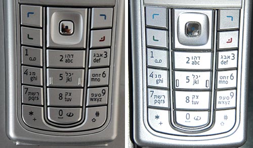
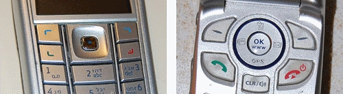
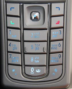
The third photo shows what happens in lower ambient light. There is an intermediate light level when the transition from dark numerals on bright silver to white backlit numerals on dark silver just evens out, and the numbers become almost invisible. In fact, since the backlight source is localized, different keys reach this point at different light levels; in the photo the “7” is in day mode, the “0” is in night mode, and the 5 is barely visible – just like the oil spot on those old books.

Now imagine trying to distinguish these keys while driving, with the phone in a hands-free cradle, where you can’t touch-type and you need your attention on the road.

So, what can we do about this? Well, we could prefer black keys with white digits – then the day and night contrast would be the same so there would be no crossover point of invisibility. Another good idea (which I recall seeing on some devices) is to make the backlight come on only in truly low light conditions. And of course, we should test the devices we buy in all situations, not just in the bright showroom where we normally make buying decisions…

Smartphone Holsters can stop time!

I got this new Smartphone recently. A couple of weeks later, I find my analog quartz watch is off by five minutes. I take it to have the battery replaced; a week later, same problem: it’s a few minutes out of whack. I send it to be repaired (it’s a good quality Seiko under warranty), and switch to an El Cheapo spare watch I have, which at first seems to work fine; but in a few days, it’s also off. I try another watch – Swiss, this time – same problem duly appears after a while.

Then it hit me: these malfunctions started only after I switched phones. So I thought, maybe the device emits some radio waves that mess with the watches’ electronics? A few tests of draping the watch on the Smartphone overnight (Hey, I’m a physicist, ain’t I?) ruled this out.

PDA holster with magnets in flap

And then, I realized what was going on. The new phone came with a beautiful leather holster. This held the device horizontally on my belt at the left of my body, and closed it with a wide flap that snapped into position with an assertive magnetic click (which has a very nice feel, I must say). It was the magnet all along. This was easier to prove than I thought – hold an analog watch next to the flap, and its second hand stops immediately. With my left wrist brushing the holster randomly, you can see what was happening.

So, what can we do about this? As users, we can switch to non-magnetic pouches, ones with a zipper or Velcro closure; or we can move the device to the non-watch side of the belt. But as pouch designers, we can actually do a lot. The offending holster was designed with two magnets in the flap and two in the body, four in all, and the top ones right at the surface of the holster where the watch could touch it. Other pouches I see around have the magnet in the body, and the outer flap has a passive iron counterpart; thus, in the bad design the outside surface is magnetic (you can snap a screwdriver to it!); the better design is neutral on the surface. Take note, designers!

Alternative holsters

Invisible buttonware

One evening a neighbor knocks on my door. She just got a new cellular phone, and she has a basic question: which key does she press to accept an incoming call?

Now this lady is not a youngster, but she’s used cellphones before; surely she must know that you press the key with the green handset image? Well, yes, she knows, but she can’t figure out which key that is. I think, Huh??? … But then I look at her instrument, and I see what she means. What used to be an image of a handset has degenerated into a tiny thin squiggle, similar to other tiny thin squiggles on some other keys. And yes, perhaps she could discern that this squiggle is a bit greenish, especially if she had a magnifier…

Cellular phone key comparison

The problem is all too visible in the left photo, which is of my own Nokia 6230i: the four keys at the top have identical looking thin marks, and the colors of the bottom two, though red and green, are very hard to discern at a glance (which is the way they should be discerned; especially when you’re driving with the phone in a hands-free cradle). Compare this to the other photo, from a different model. That’s what good human engineering should provide!

So, what can we do about this? If you work at a cellphone manufacturer, by all means have a word or two with your design department… I don’t, so all I could do was fix my own problem. Here is what I did to my Nokia. Problem solved.

Nokia cellphone with stickers