Here is a street sign from Tel Aviv’s Ramat Hachayal area, a vibrant hi-tech hub. The sign hangs on a building at Hanechoshet st., as stated in English.
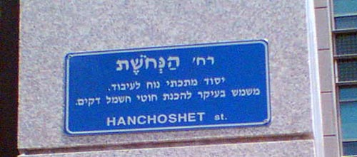
The Hebrew is more detailed: it has the street name at the top, followed by the fine print, which explains the name. Nechoshet in Hebrew means copper, and so the text on the sign educates us:
Copper st. / An easily worked metallic element. Serves primarily to make thin electric wires.
Well, Duh!…
The origin of this utterly unneeded explanation can probably be traced to the commendable practice of adding explanations to street names referring to little known persons or events, such as
Rafael Weiss st. / Biblical scholar, 1940-1974.
Not every passerby can be expected to know every biblical scholar, or politician, or artist from bygone generations, so this is somewhat useful.
Knowing when to break a standard mold and leave a field empty in a template is a sign of intelligence…or perhaps a sort of mini Turing Test?
Beauty can sometimes appear in the most unusual places.
I snapped this photo on a sidewalk near my home:
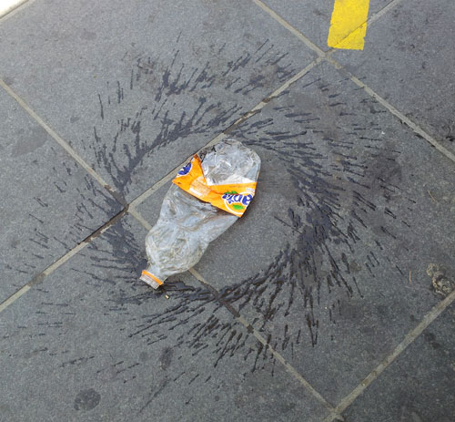
As I was watching, a passerby kicked the bottle, and it started spinning, giving me a good idea of what we’re seeing: someone had discarded and squashed the bottle, and someone else set it spinning and splashing its remaining content.
Whatever the details, it’s a lovely pattern!
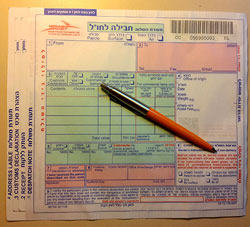
So we had to ship some parcels overseas, and we were given these forms to fill at the post office.
Not surprisingly, the form had four copies, and asked for a lot of shipping and customs information. what was surprising, however, was the incredibly poor functional design of the form’s layout.
Most obviously silly was the layout of the field for the recipient’s address, which you can see in the photo below:
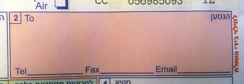
The small area provided would barely accept any respectable street address, but then they ask you to add telephone, fax and email on the indicated lines. Forget about a.very.long.email.address@long.host.domain.com – you couldn’t even fit short@gmail.com on that tiny line! Same thing for any respectable phone and fax numbers. Nor can you try your hand at miniature calligraphy, because to mark the four copies you must push very hard on the pen…
Every day hundreds of people in the country struggle with this form. Won’t anyone at the PO take pity on us?

