Yesterday I was at a meet of the Israel Innovation Forum hosted at IBM, and over coffee I notice this guy whose name tag reads
David Shay
Wikipedia
At first I thought he must be one of the few people who actually work at Wikipedia as employees; but he assured me there are only 15 of those, all in the US. No, he told me, he simply writes for the Hebrew Wikipedia. I asked whether he’s part of some special group appointed to manage the local version, and he said no, he simply writes and edits articles, like anyone else. I do that occasionally myself, but David does a lot more of it.
When we exchanged business cards I found that he actually has a regular day job at a regular company; he just felt good proclaiming himself on his badge as a Wikipedian. And maybe he’s right – though people seldom bother to check who wrote the article they are referencing, the impact you can make on humanity by writing online can be much greater than whatever you can do in a regular job (well, unless you’re a major inventor, scientist, or world leader, I suppose).
Wayda go, David!
The idea with the use of graphic icons as controls in web pages and applications is the they are a compact, fast way to represent an action. And that they do, very effectively, subject to one condition: the icon’s image should represent the action in question (Duh!)
So, an icon that causes the page to print should have a small picture of a printer. It should not have a picture of a hippopotamus. Right?
Well – consider the web site of the Israel Discount Bank. A customer can log in and see their account, which is useful indeed. And there are icons like these:

Surely you can tell what each of these is supposed to do.
But then, there are also these icons, right above the account activity table:

Care to guess what they mean?
Actually, the middle one means “Select columns”. Not that there’s any likelihood you’d figure that on your first encounter, but at least in later visits you will be reminded of this meaning. So what does the icon on the right mean? From comparing it to the one next to it, it would seem to be “Delete column selection”? But no – it means “Cancel filtering of data”. Totally unrelated to the image.
And the leftmost icon is a beaut: it means “Show all accounts”. A hippopotamus would depict that sentiment just as effectively.
Can’t these people think?
I was trying to reach the customer service of a company just now. There I was, listening to the endless music of an IVR system, punctuated by the usual happy reminders that I am oh-so-appreciated by them and they’ll get to me real soon (liars!), when something happened. The recording declared that they were very busy so if I could leave my name and number they’ll get back to me. No option to keep waiting.
To their credit, the next step was done professionally – the IVR had me state my name, then key in my phone number, then confirm it when it read it back to me – so I have good reason to believe they will really get back to me. Which is actually better than the silly music. So giving me this way out is a good idea.
The bad part is, if they knew they were busy (and, assuming it’s a FIFO queue, they had the necessary information – my place in line – as soon as they picked up my call) – why wait for long minutes of stupid music before switching to the leave-your-name-and-number routine? They’re giving the customer the combined worst of both solutions!
These days we all have at least half a dozen gadgets whose batteries require charging, and they each come with their own charger (incompatible with all the others, of course). Now, I won’t push for standardizing the chargers – can’t aim that high – but here is a more modest goal: can we please standardize the status indicator LEDs on them?
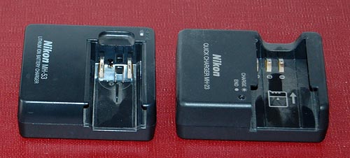
Here are two chargers that came with my two Nikon cameras, the old point and shoot and the newer DSLR. No, they are not interchangeable, even though the batteries are both Li-Ion and of the same voltage. Both have a LED indicator that blinks during charging and stops blinking when done; however, in one it stays lit when there’s no battery inserted, and in the other it stays unlit.
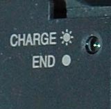 But the bigger problem is remembering what’s what when you come back later and the light is stable. You see, in these, this means charge complete; but in my cordless shaver it means that it isn’t; there, blinking indicates a full charge. Different vendor, and they probably just flip a coin at design time…
My own solution was documenting it all on a post-it note stuck near these chargers; but then Nikon must have realized that this is an issue, because in the later camera – my D40 DSLR – they labeled the charger itself to remove any doubt. Good move!
My loyal readers know that in addition to this blog I maintain Nathan’s Possibly Interesting Web Site, where I share my history of computing collection, software, and various articles. I built it some years ago as a personal web site, and am happy to have it as just that.
However, now that I am starting into my new career, I faced a problem – you can’t talk business to people and when they Google you they reach a collection of slide rules! I needed a site devoted to my areas of professional expertise and service offerings. So I wrote one. As of this week http://www.nzeldes.com is the professional site, and the Possibly Interesting site links off of it under “Personal site”, or you can bookmark it if you wish at http://www.nzeldes.com/possiblyinteresting.htm. I have every intent to keep it alive and growing at its usual steady rate of one page a month.
You’re also welcome to send in feedback on the new site’s design and content via its contact page; this is a first revision, and will be developed as things progress.


Those conservative business cards…
Business cards have been around for a long time – very long, if you count visiting cards – so we should not be surprised if they tend to have an innate inertia to them. Still, business has changed so much in recent years – isn’t it time that the cards paid attention?
I was scanning a batch of business cards I got in a conference recently when I noticed an interesting fact: they may come in many designs and colors, but 90% of cards will have the contact information in the following order:
Now this is interesting, because it has two attributes:
I had a friend, a master blogger and geek, who once said if he had his way he’d simply put on his card his name and “Google me!” – now that’s modern thinking for you! The closest you get to this are Moo minicards, those miniature cards that barely have room for a name, job role and email address.
Now that I noticed this I checked my own new card that I made after leaving Intel – and guess what, I had it almost right in terms of descending importance:
Only the physical address stayed higher than it should be…