Archive for February, 2009

My blogging passes the immersion test!

A few days ago I was at the IEC history of computing museum where they also exhibited their progress in map making – from old blueprints and paper maps to modern CAD and GIS software. They had there an old 1960’s map that caught my eye – a 1:50,000 topographic map by the Israel Survey Department. These were the best you could get when I was a kid hiking around the country; every house was correctly shown as a black dot of the exact right shape, and every hill and gully were visible in the contour lines.

I looked at the map and it struck me how much maps’ visual quality has progressed since then, with modern printing techniques. The stark colors used in the 60’s are replaced today with delicate pastels; the topography is enhanced by fine shading; the important details are not drowned out by the density of equally strong contour lines. The information of the old maps was perhaps perfect, but to the modern eye they look, well… old. Unfortunately, as far as I know the maps you can buy today at such a detailed scale use the same old techniques.

Then the next day I came to see a new Israel Survey Department map that was wondrous fine to behold, done in pastel shades and fine shading gradations, reminiscent of what you see in Google Maps but with all the detail of the maps of my youth. And my friend Gadi happened by, and I said unto him, lo, see this map, for it is very finely done, and only the other day had I wished such were made; and he looked upon the map and found it good. And I said to him, surely I should blog about this map and compare it to the older ones, and he said, verily thou shouldst. And I resolved to make it so. And then the matter passed from my mind until my alarm clock went off to wake me for my day’s labors.

The bad news is, evidently the Israel Survey Dept. has yet to produce the fine map I saw in my dream. The good news is, looks like my blogging has reached the point where it passes the immersion test. I’ve found long ago that when I really immerse myself in some practice or task, it makes its way into my dreams. As a forensic scientist, I would dream of Gunshot Residue Particles; as a Thin Films VLSI engineer I would examine LTO defects in dreamland; and when I took to developing software, I would dream at times of bugs – I remember once actually solving a particularly stubborn one in my sleep, a solution that turned out to be valid in real life. So now I dream of searching for stuff to blog about!

Topographic Maps

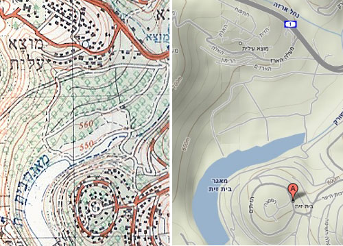
As for my resolution, I can’t show you the nonexistent topographic map, but I can and hereby do show you a comparison of an old ISD map and a detail of the same area from Google Maps (Terrain option) that illustrates the visual qualities I was dreaming of merging with it.

Blast from the Past

Today I had the pleasure of attending the opening of the Computing and Communications museum of the Israel Electric Company. The IEC has been around for almost a century and has kept pace with computing advances since its early days; curator Dlila Shapira did a great job rounding up some lovely vintage pieces from the “big iron” era and later.

No less interesting than the equipment on display were the speeches of some veteran managers of the computing division. One gentleman told us how when he first arrived on board as a programmer his first task was to glue shut holes that had been punched in error onto punched cards; a bottle of the liquid used was on display, and here it is.

Punched Cards and correction fluid

Also on display were storage devices of yesteryear. In the photo below you see a removable hard disk pack from a Prime computer system of the 1980’s; the dozen 12-inch platters together hold 300MB. For comparison, you see on the glass case another removabe storage unit, namely a 2.0 GB – 2000MB – Disk-on-key from today. We’ve come a long way…

300MB Disk Pack from the 80's

Little Big KVM switch from LevelOne

I have a desktop and a docked notebook on the same desk, which I never use concurrently, so I decided to reclaim precious desk surface by keeping only one screen, keyboard and mouse and switching them between the two machines with a KVM switch.

LevelOne KVM-0221 KVM switch

An online check discovered the cute KVM-0221 2-Port USB KVM Switch from LevelOne. It does what I need, it looks good, and – crucial for my desk reclaim purpose – it is tiny at a 100 x 65 mm footprint. So I ordered it.

And when I wired it, lo and behold: its footprint area was maybe 4 times the above. You can see why in the next photo:

LevelOne KVM-0221 KVM switch wiring

Here is the problem: in a day and age where small devices have the form factor we see in routers, i.e. a low box with all connectors at the back and all controls at the front, this device has the controls on the flat top and the connectors on all four sides! There is no way you can stash it neatly away at the edge of your desk, or fix it to the wall, or stack it under some other equipment. This cute little switch wants to have its own place in the sun, and let no other object dare to come close!

The two biggest plugs, by the way, also come from LevelOne – they are specially made to contain both video and USB lines – but I can’t imagine that they couldn’t have been made at half their length. Apparently, footprint was not on the LevelOne designers’ mind…

Sygnet handsfree design flaws, part 2: Control overloading

Sygnet Handsfree with stickers
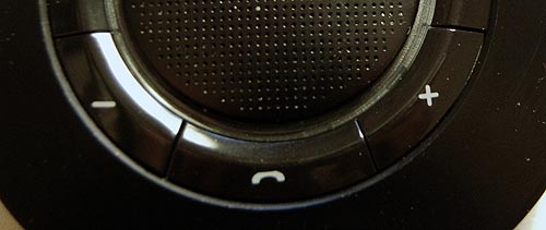
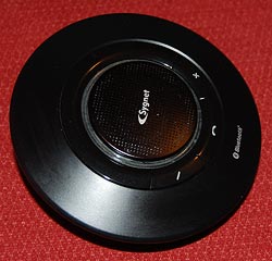
Back to my Sygnet Bluetooth Handsfree Carkit model BTS600. We saw its problem with cloaking the controls and indicator lamps… but on top of that, the people at Sygnet played a trick that is becoming very common in this digital era: they overloaded the controls and the lamps.

I use Overloaded in the Object Oriented Programming sense: the use of one operator or function name to perform several different functions depending on context.

The Sygnet device has three operating buttons and more than a dozen actions; so each button can do many different things. For example, the “-” button rejects a call if pressed for 3 seconds while the phone is ringing; it initiates voice recognition dialing if pressed for 3 seconds when the phone isn’t ringing; it cancels the voice recognition if pressed until a beep is heard; it cancels bluetooth device recognition if pressed for 6 seconds; it reduces audio volume; it mutes/unmutes a call when pressed concurrently with the “+” button; and it starts a conference call if pressed for 3 seconds while one call is active and another waiting. The other buttons likewise do a great many things; it’s so complicated that I carry the instructions in the glove compartment at all times! Needless to say, the captions on the device merely identify the buttons, not their functions.

The two indicator lamps, meanwhile, are similarly overused: The blue lamp blinks 3 times every 2 seconds to indicate an active Bluetooth link; it blinks rapidly together with the red lamp when the device recognizes the cellphone; it blinks every 2 seconds when bluetooth is inactive; it stays lit with the red lamp during charging, and without it when charging is completed. So now you need a stopwatch to figure out what it means…

To illustrate how excellent this human engineering is, consider its application in a ballistic missile situation: “Hey, Joe, does two blue blinks followed by a long beep mean a 3 second push on button D launches the missiles unless you first tap on button A, or does it mean the Mr. Coffee needs maintenance?”

So, what can we do about this? Well, by now you know my style. At least I could make the cloaked buttons eminently visible…

Sygnet Handsfree with stickers

Sygnet handsfree design flaws, part 1: Control cloaking

Sygnet Bluetooth HandsfreeWhen I got my Nokia E71 smartphone, I also bought a hands-free device for it: the Sygnet Bluetooth Handsfree Carkit model BTS600. This actually works quite well – it wirelessly identifies the phone on my belt when I get in the car, and until I leave the car all calls are routed to this device. Throw in voice recognition based dialing, and it’s convenient indeed.

Still, the controls of this elegant space age device – it really looks like a miniature flying saucer, doesn’t it? – embody some basic human engineering errors, ones that are all too common in other products; we can call them control cloaking and control overloading.

By control cloaking I mean making controls that are all but invisible and indistinguishable from each other. The BTS600 has only four controls: a power switch, and the three marked with +, – and a handset symbol. The user needs to identify the last three rapidly, at a glance, while driving a motor vehicle. So what would you do to make this easy?

I know what I would do: I would design large, obvious buttons, each differing markedly from the others in color (for daytime use) and in shape (for night time driving). Something like the three skyscrapers in the Azrieli Center in Tel Aviv – one round, one triangular and one square, and all impossible to miss…

Not so the good engineers at Sygnet. They made the three buttons flat, and blended them into the device’s surface so elegantly that you can barely make them out – with tiny labels that are hard to read even when parked. And the device’s perfect circular symmetry makes it impossible to locate the buttons by their positions relative to its edges.

Sygnet Handsfree controls

And then there’s the matter of indicator lights. The device has two lamps: blue and red. You’d expect these to be visible from all angles; which would be the case if they protruded outside the casing. But instead they are sunk deep inside, under the clear plastic ring around the speaker grille. Again, very elegant – but quite invisible unless you look straight in.

Don’t miss the control overloading post coming up next!

The considerate envelope

I was interviewed recently by the Columbia Journalism Review for an issue they were putting together about Information Overload, and as promised was then mailed the hardcopy magazine in a manila envelope.

I was heartened to see the stamp in the photo on the envelope.
Stamp on envelope from CJR

Obviously this did not apply in my case – The entire issue was of interest to me, so the page number was not filled in – but I love the idea. Telling the recipient where to look in something mailed to them is a key concept of good email etiquette that I’ve been teaching for years: if you send someone a presentation with 70 slides (which, alas, many do in the corporate world) at least add in the email body “Check slides 45-47, they contain info related to your project”. The CJR uses hardcopy, but they evidently apply the same concept there. Good thinking!

Semantinet’s headup

Well, many friends asked to stay current on my adventures outside the cubicle farms, and though it’s early days, here is one thing I’ve been up to: I spend one day each week working with a start-up called Semantinet.

It is an attribute of start-ups that they both empower and expect every person in their small team to contribute directly to the main thing, which is the application of innovative technology to create magic. You work hard, but you can really make a difference, as explained by Paul Graham in his insightful book Hackers and Painters. I like it a lot.

Semantinet headup logo
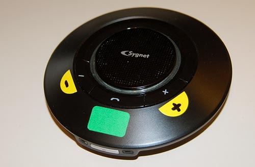
So, what magic do we make there? Semantinet, as the name hints, applies leading edge semantic search technology to enable a whole new manner of experiencing the web. Its product, headup, is a Firefox add-on that identifies on pages you browse names of entities like people, places, events, books, musical artists, videos, and more; and it shows you on demand a small window with additional information on any of these.

The additional information can be general – like financial data for a company, or albums and tracks for a band. But things get interesting once you personalize headup by pointing it at your accounts in social sites like Facebook, FriendFeed, or Last.fm. Then, headup starts surprising you with information like “your friends that work at this company”, or “upcoming concerts by a band you like in this city”, or “books that both you and this person like”, or “mutual friends you both know”. I call it a “Serendipity Engine”: you never know what it will discover. How does it know? By correlating information that you and others had published in any of numerous social sites. And because Semantinet is a start-up and works at the pace that this enables, new capabilities are added to the product literally every day.

If you use Firefox, give it a try – the application just went out of stealth mode and into public beta last week so you can download it at headup.com. And do share with me any comments and critique – at this early stage you, too, can make a real difference in the evolution of this magical product!

Holes, Honesty and Hand cream

Neutrogena Norwegian Formula hand cream
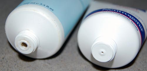
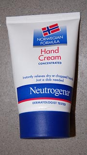
“Truth in advertising” sometimes seems an oxymoron, and the cosmetics industry is hardly where you’d expect to find much of it. So hats off to Neutrogena’s Norwegian Formula hand cream, whose statement on the tube that it “instantly relieves dry or chapped hands – just a dab needed” is absolutely correct. They claim it was devised from the experience of Nordic fishermen with the effect of fish oils; be that as it may, I can attest that this formula really can handle chapped skin that would laugh at your usual hand lotion.

But more to the point, just a dab is really all it takes, and here the manufacturer did something really amazing: it designed the tube to ensure you don’t use more than that dab. Look at the photo below, which compares the tube of this fishy formula with another cream. The hole the cream comes through is barely a pinprick. Obviously, this spares the consumer’s money – at the expense of the vendor’s profit. Wow!

Neutrogena Norwegian Formula and another brand

Which reminds me of the story of the guy who came to a toothpaste company and proposed they give him a megabuck if they like his idea for increasing profits: he then told them to enlarge the hole at the end of the tube, since consumers measure out paste by length, not volume. The guy got his money (though I can find no confirmation that this ever happened – can you?) because the toothpaste manufacturer was not as honest as the makers of the Norwegian hand cream discussed here…