Check the latest addition to the History of Computing exhibition at the Possibly Interesting web site: Michaelis’s concrete calculator (well, actually, Kvasnicka’s version of it).

Nathan Zeldes blogs on everyday product design
Check the latest addition to the History of Computing exhibition at the Possibly Interesting web site: Michaelis’s concrete calculator (well, actually, Kvasnicka’s version of it).
For the last couple of years I kept saying I’m not buying a DVD recorder until the VCR dies. Well – the VCR died, so I went and bought a DVD recorder. In fact I bought a dual-mode unit that has a VCR and a recording DVD in the same box.
I thought I was keeping a VCR option in order to play the many old tapes we have, and perhaps convert them all to DVD when I have some spare time (yeah right). And I thought I’d use the DVD side to dump to disc the many programs we record on hard disk in our cable PVR, just like I used to do with the old cassette unit, may it rest in peace. So guess what… after getting the hang of the new setup, I find myself dumping many programs to cassette tapes, rather than to DVD. Turns out the tape format has an inherent advantage over DVD in some situations; and it is precisely what we tend to think of as a disadvantage: its serial access.
An optical disc is a random access device; the head can skip to any position on its surface instantly. With tape, which is serial, you have to wind it slowly to get to a given spot. When would that be an advantage?
Here’s when: if you record, as I do, multiple chapters of a given TV series – say, half a dozen episodes of Babylon 5 – at one run to a single media, then watch them one at a time, then with a tape you hit Stop at the end of an episode and the next day, or week, or year, you stick the cassette back in and hit Play and the next episode starts immediately. With a disc, you need to find the start of each episode, and while the head can get there in an instant, it can’t tell where an episode begins, not if they were recorded in one run. So you have to start running forward and backward to locate it. That’s why I use the DVD to record single movies, and the VHS tapes for TV series.
Of course, I still haven’t converted a single movie from one format to the other…
It’s hard to speak ill of Adobe Photoshop. Even its painful price tag is well justified by this application’s incredible power, which I’ve been barely scratching in my many years as a faithful user. Still, there is one inexplicable sin its designers have committed.
Tastes vary, which is why Microsoft have included in their Windows OS the ability to customize the GUI’s elements. For my part, I do three things whenever I install Windows for my use: get rid of that incongruous green hill on the desktop, revert to the more businesslike classic (“Windows 95”) look, and make the menu font easier on the eyes by turning it Bold and, on high-res screens, enlarging it by a point. Since the whole idea is that this font tweak affects all programs running under Windows, I’m all set.
So what happens when I upgraded from Photoshop CS to version CS2? The menus are a tiny, skinny Normal font. The good folks at Adobe decided to violate the basic guideline that all apps must comply with the Windows UI preferences. The user’s preferences. My preferences. “So why do we care”, they say, “if you get a headache from peering at a tiny font? That’s none of our concern!”
But that’s not the end of the story; because in CS2 they also added the option, in Photoshop’s Preferences, to choose the UI Font Size! What Adobe hath taken away, Adobe now giveth back! Hallelujah! I select Large, restart the application as directed, and… various elements of the UI – Palette captions, for instance – are indeed larger. Except the menus. They remain tiny. Looks like they applied this “UI Font Size” setting to only part of the UI but not to the one they initially messed with.
And now I moved ahead to CS4, and I was hoping they’d seen the error of their ways and given us back control over our menus, one way or another. So I was hoping… but of course they hadn’t.
Take note, Adobe… that is bad, bad programming practice.
The key idea of Human Engineering is to design the product to fit the humans using it. Makes sense? Sure does, but there are also cases of the opposite approach; Select the human to fit the task or the product!
Obvious examples abound in sports, as with the physical attributes of the horse racing jockey and the basketball player (and while we can’t change the horse’s reaction to a heavier load, we could actually lower the basket if we were designing it to fit the average human…)
A technological example would be the Soviet solution to giving battle tanks a low silhouette: make the tank low, and recruit soldiers of short stature to 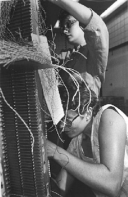 crew them.
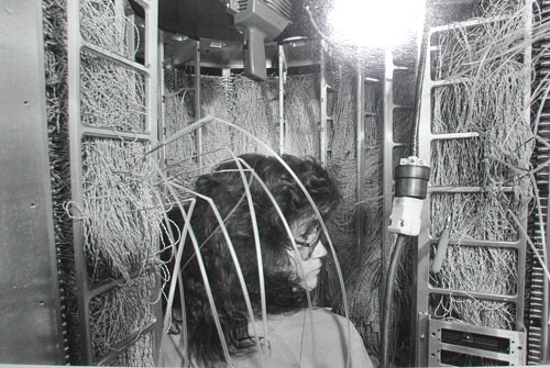
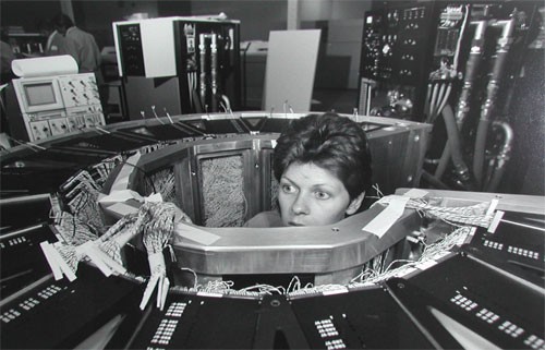
But an example I really like has to do with the construction of the Cray 1 supercomputer in the 1970s. This elegant computer was built in a round form with the electronics modules on the outside and a central cavity surrounded by the wiring connecting them (the same idea, more or less, is used in the human brain). The wires – huge numbers of them – had to be soldered correctly in the narrow central space, a nightmare task. So how did they manage it?
I once met a veteran of Cray Research at the Computer History museum and he explained it to me. Cray hired women for this task – ones selected for their patience and precision – and they put two of them on each machine: a tall girl to solder at the top of the structure and a short one to work the bottom. Unbelievable? Look at these photos!
Two of the least pleasant-to-use GUI controls are the scrollable list box and its cousin the drop-down list, especially when they have many items listed. Of course, that’s exactly when they are indispensable… you can’t use radio buttons for 50 choices, so if you need to let the user choose a state of the union, a drop down list is inevitable. Likewise for countries of the world, or for their currencies.
But the way these geographic-oriented controls are implemented in software and web sites is really annoying.
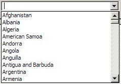 Take the image at right, the list you have to go through to select a country for a new contact in Outlook and other applications: it opens on a list of ten countries, of which one – Argentina – may be even remotely likely to be inhabited by business contacts of yours. You can scroll down, of course… and in the next ten you find even greater concentrations of business partners, like the entry for the Ashmore and Cartier Islands, which are a group of small uninhabited tropical islands in the Indian Ocean!
Not that I have anything against the inhabitants of Ocean islands, or of Angola, Antigua, or Anguilla, but given the statistics, why should I have to scroll past them – and past Cook Islands, and Namibia, and Nauru, and Palmyra Atoll, for that matter – on my way to find the US, or the UK, where I really have many more contacts and affairs?
Or look at the next screen grab, from a web site for computing currency exchange rates. Do I really need to have Equatorial Guinea’s CFA Franc, the Eritrean Nakfa, and the Ethiopian Birr pushing down the Euro and the US Dollar farther away from the British Pound, just because of the accident of alphabetic order?
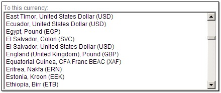
Obviously, the people of Estonia do care about the Kroon (and I care about the Israeli Shekel, also far from the heart of global finances). But what is needed is a list that gives the most common choices – the Dollar, the Pound, the Euro – by default at the top of the list, where 99% of users will benefit. And then we need personalization, so each of us in the rest of the world can put their country, or those they deal with, at the very top.
This can be done in many ways. One’s home country can be extracted from Windows Regional settings and put up front. Web sites may use cookies to remember which currencies you converted last time. Local software tools can keep my choices in the Windows registry. Smarter tools may learn from your past choices and bump them up the list in future. The techniques exist; it’s just that someone should step out of the silly box and dump the alphabetic order in favor of what makes users more productive and less annoyed!
I was waiting for a Cappuccino at a coffee shop and asked the girl making it to also give me a glass of water. An incongruous conversation ensued:
Girl: To drink or to smoke?
Me: Huh?
Girl: To drink or to smoke?
Me (the sensible part of my brain trying to stop the engineer’s part from concocting images of transforming the glass of water into an improvised Hookah): How would I smoke a glass of water?
Girl: Oh, sorry. You don’t smoke, right?
Right. So then the girl obligingly demonstrated, picking up a disposable plastic cup and mimicking a smoker holding it in one hand and flicking ashes into it from an imaginary cigarette in the other.
And so I discovered that following the draconian ban on smoking in public places, and thus the removal of ashtrays from the cafes, smokers figured that a plastic cup with a protective puddle of water in it can serve as an excellent mobile ashtray to use either indoors or (if they get chased out) on the go.
There is no stopping the human spirit!
The progress of engineering over the years has brought us many triumphs of human ingenuity, but it has left quite a bit of roadkill behind. One species driven to the brink of extinction is the Tinkerer.
The attitude to Tinkering has always been ambivalent. Look at the dictionary definitions:
tinkerer [noun]
1. a traveling mender of metal household utensils.
2. A clumsy repairer or worker; a meddler.
3. a person who enjoys fixing and experimenting with machines and their parts.
4. a person skilled in various minor kinds of mechanical work; jack-of-all-trades.
5. Scot., Irish English.
a. a gypsy.
b. any itinerant worker.
c. a wanderer.
d. a beggar.
What a mix! On the one hand, a person skilled in fixing things; on the other, a beggar, a clumsy worker…
The truth is, this was an extremely useful person in centuries past. This was the ingenious man who made the rounds of the county, a wanderer indeed, and who knew how to fix everything that had broken down since he last came. All the newfangled contraptions that were useful to the villagers but beyond their ability to fix: sewing machines, radios, bicycles, gramophones, tractors… And this tinkerer had manifold skills – a real jack of all trades – but even more so, he could improvise, making replacement parts from whatever was at hand, working around the missing or broken pieces. Take my favorite definition of engineering – The art of making what you want from things you can get – replace “making” with “fixing”, and you have the Tinkerer’s calling. Above all, this is “a person who enjoys fixing and experimenting…” – someone who loves his work, hence deserving our respect.
And now he’s a threatened species, for two reasons having to do with how we design our technology today: first, because we design it to be discarded at the first failure, so no need to fix it; and second, because with the advent of microprocessors, most items cannot be fixed by improvisation. If your car acts up, you need to get it to an authorized garage where they hook it up to a computer that tells them what to do; no way can you take a screwdriver and a shoestring and fix it… and in any case we specialize so much that no one person can fix the electronics in a sewing machine, a DVD player and a car.
Too bad – those tinkerers had a technological flair to their way of life and their vocation that will be missed – or not, once we forget they ever existed. 🙁
First, wishing all readers of this blog a superb new year. May it be far better than the last one, yet worse than the one to follow it.
For my part, this year heralds a new freedom – after 26 years of doing many wonderful and innovative things at Intel, I decided it’s time to do more wonderful things elsewhere. Yesterday was my last day as an Intel employee, and today I started working for myself (the advantage being, me and my new boss are guaranteed to get along splendidly 🙂 )
So, what will I be doing? Helping organizations cope with the challenges posed by today’s intense 24×7 combination of computing, communications, information and a dispersed, overloaded, anytime-anywhere workforce; and improving the software tools involved in all this. Details TBD, but stay tuned… interesting times are ahead.
Meanwhile, and more relevant to the theme of this blog: new job, new tools! Will be blogging my opinion of them as insight materializes (and time permits).
Happy 2009, folks!


Quality, pure and simple
Quality is an elusive attribute, but you usually know it when you see it. For my part, I keep around a small memento that captures it very well, and comes from my years – long ago – as a forensic scientist. My main job at the time was around electron microscopy of invisible evidence, but there was also, at the other end of the complexity spectrum, a lot of straightforward examination of picked and mangled locks. I and my coworkers had ample opportunity to study the locksmith’s domain, and it was then that I put on one ring two simple cylinder lock keys from long forgotten origins that I felt capture the gap between high and low quality. Here they are: one made by Corbin and one by Nabob. Can you tell which is the better quality one?
The better one is the Corbin key at the right. The feel for its quality is more obvious when you actually hold it, but the photo may suffice. And it goes more than skin deep, though the design of its bow (the “handle”) is certainly more thoughtful and elegant. Here are all the other ways in which the key at right is better than the one to its left:
So many differences in such a trivial everyday object… do you wonder why I keep this pair as a representation of quality?