Sometimes one runs into elegant design in humble places…
I was sitting in a meeting and fiddling idly with the remote control of the NEC LCD projector. After toying with the laser for a while, I pushed out the battery cover on the back. As expected, it unlatched and slid open, like these things always do. But there was a twist…
The cover slid off, but stayed connected to the unit by a thin rubber ribbon. We’ve seen so many R/C units missing their cover – well, not this one! The only extra part required was the rubber ribbon, which clips into a slot on the R/C itself. Simple, elegant, professionally designed. Good job!You can see in the photos how this works:
Sometimes you find elegant design in the places you least expect it.
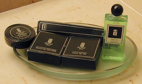
We stayed in the Dan Carmel in Haifa, and the small supplies in the bathroom came in color-coordinated little boxes: shower cap, cotton pads, the usual stuff. Still, they failed to go all the way: they had tall bottles for the shampoo and a round box for the shoeshine sponge:
Which reminded me of a much better attempt at such standardized packaging that I saw in the Hotel Silken in Zaragoza, Spain:
They had ALL the supplies fit in square packages, made of either cardboard or plastic, and these all fit like a puzzle into a rectangular cardboard tray. Even the shampoo bottles were square and fit the scheme perfectly. It was a delightful design, injecting elegance into this utterly mundane collection of supplies, so I share it here.
These guys had such a thing going for the rectangular form factor, that even the sunny-side-up eggs they served for breakfast were square!
And now, following Parts 1 and 2, here is the last installment…
These days, more and more Notebooks come with displays branded by the makers as VibrantView, or CrystaslBrite, or OptiClear… exciting names indeed. What they all refers to is glossy LCD screens, which would be much better described as GlareMirror, or UglyReflector, or maybe just RazzleDazzle…
The underlying idea is to remove the matte anti-glare layer on the older screens, a change which results in better definition and more vibrant colors, plus better outdoors visibility. All commendable attributes, except that the price you pay is a mirror-like surface that reflects windows, light fixtures and other bright objects, a problem that motivated the original matte layer to begin with. Solutions? Work in a totally dark room, or try to yank the screen around until you find a reflection-free angle. Note that the last works for a single viewer – these screens are most annoying when someone shows you something on their screen: maybe they found the glare-free position, but you, looking from the side or over their shoulder, will get the full blast of annoying reflections.
Now if the matte screens were bad – if their colors really sucked, or their focus was totally fuzzy, I can see the possible value of a trade-off; but TFT LCD’s have reached maturity years ago, and are a delight to use. So what got into the vendors’ heads, to throw in the glossy finish – not as a rare option, but as a mainstream technology?
They say that form follows function. So – take a look at the form of this strange device, which stands about a meter tall. Can you guess its function?
No, it isn’t a trashcan with dreadlocks.
I saw this thing in the Biosphere at Potsdam. This pleasant museum is smaller and less ambitious (should I say, less pretentious?) than the one in Arizona, and serves very well to exhibit different ecosystems to the visiting public.
The item you see here is a display device for displaying smells. You sniff the end of a tube to get a whiff of the plant shown on the round image below it.
We discussed the recent trend that is eliminating the optimal resolution in notebook computer screens. Another undesirable trend is the move to widescreen displays. These days it is almost impossible to buy a notebook PC with the traditional 4:3 screen form factor; all new models boast a “wide” screen with a 16:10 form factor such as WXGA (1280×800) and WSXGA (1680×1050). In fact Lenovo, makers of the Thinkpad I use, have just proudly declared that they’re dropping all 4:3 screens in their new line of notebooks.
And what are they proud of? What’s so cool about giving us less effective screens?
16:10 is a perfect choice if you want to watch movies, which come increasingly in wide formats. However, business notebooks are not intended primarily for this enjoyable purpose. They are meant to do business on, primarily word processing, email, presentations, and the like. And for this purpose, widescreen is totally inadequate. Documents are invariably taller than they are wide, like the paper pages they emulate; even presentation slides have a 4:3 aspect ratio. That’s why the venerable Xerox Alto (at right), sporting the granddaddy of all of today’s Personal Computer interfaces, had a “portrait” form factor screen: because you could process a whole page at once.
Now ideally, a wide screen might accommodate two pages side by side; and that works fine with a large external monitor. But Notebook screens are kept small for portability, and there is no way you can comfortably read two pages on a 14″ or even a 15″ screen. So you have to use the screen for one page, and since these screens are shorter (top to bottom) for a given diagonal size than the 4:3 type, you end up seeing less lines on a document at a given page width. You get more area at the edges of the screen, which you don’t need, and less height, which you do.
Something very odd is happening to the LCD screens on the Notebook computers that play such a major role in our existence.
The first aptly named “laptops” had small, low-contrast monochrome screens that had “eye strain” written all over them (well, not all of them did – the Grid Compass, in 1982, had a lovely bright orange-on-black display). Then came the first color screens, like Passive Matrix and DSTN, which were also pretty poor; and the screen grew slowly in size, though there was still much plastic surrounding it. And finally Active matrix TFT screens achieved affordable prices and became the standard, and their size attained the width of a the keyboard while resolutions reached 1024×768. We were at a sweet spot, with notebooks whose keyboard and screen were so good that one could use them ergonomically without even wanting an external screen. For anyone who grew through the earlier clunky technologies, this was notebook nirvana.
And then…
… In the last few years, we are drifting away from that bliss. New notebooks have screens that make less and less sense. In this post series I’ll look at a number of issues with these.
For starters: Native resolution.
As I said, a sweet spot for screen resolution was (IMHO) 1024×768 pixels (XGA) on a 14″, 4:3 screen. The trend in the last 4 years is to go ever higher: 1400×1050 (SXGA+), for instance, and beyond. Obviously, the higher the resolution, the more things you can show – more spreadsheet columns, larger unscaled hi-res images, more windows, more emails… but then, at a given screen size (say, 14″) these things are smaller in absolute size; text and icons become small enough to cause significant eye fatigue, especially for anyone over forty.
Now, in principle you can try to fix this problem by driving the screen at a lower resolution. Some users actually try that, with sorry results, because one thing about LCD screens (as opposed to CRTs) is that you must use them at their native resolution. This is because an LCD, unlike a CRT, can’t increase the physical pixel size. Reducing resolution from 1400×1050 to (say) 1024×768 means that each pixel must now span a square of approximately 1.37 by 1.37 physical pixels; but this is a physical impossibility in an LCD, where each pixel is a discrete physical electronic device. The display driver now attempts to solve the problem by shading the “half pixels” in intermediate colors and shades, and this results in an unacceptable degree of fuzziness of the entire screen.
A better solution is to set applications to use larger fonts, and/or to change the overall DPI setting in the display properties in Windows. This will indeed cause text and other elements on screen to become larger. However, it will not get you back to where you were with the 1024-wide screen, because not all elements will scale – for example, icons will become blocky, and images on web pages will remain tiny while text grows, badly distorting the layout of many pages. Basically, you’re jumping through hoops to make a hi-res screen simulate a lower-res screen – poorly.
Of course, some users may need the added pixels – programmers, graphic artists, even accountants… but they would be better off using a physically larger screen, either by buying a 15″ or 17″ notebook, or by using a large external screen. Ordinary users, however, are better off with the portability of 14″ (or less) and the unscaled text and crisp focus of the XGA screen. Not that anyone’s asking them… new notebooks have screens of 1400 or even 1680 pixels across. Since these must cost more to produce, while being harder on the eyes, it’s unclear why the vendors don’t offer low res screens as at least an option; but in fact XGA notebooks are now rarer than hens’ teeth. Go figure…
These days, every product and service come with scary warnings intended to cover the maker’s back side in case you harm yourself. Electrical appliances warn you not to drop them in water (Duh!), restaurant menus tell you you can die by eating their food (not here, thank God, but in the US they do), coffee cups tell you their content is hot, an so on ad nauseam.
But the strangest, and strangely endearing, manifestation of this must be the sign we saw at the entrance to the Baha’i gardens on the slopes of Mt. Carmel in Haifa. Here is the sign:
What they tells us is that the beauty of the gardens is such that we might be distracted into not watching our step and falling down one of the hundreds of steps that take you downhill!
And I must hand it to them… they aren’t exaggerating. These gardens are mind bogglingly serene and beautiful, though the risk is probably from trying to snap photos instead of looking where one is walking. The photo below shows only a small portion of the gardens, with the shrine of the Bab, a prophet of the Baha’i religion, in the background, and the port of Haifa even farther out.
This small photo can hardly do justice to what we saw there, but may give you a hint. The real thing is simply breathtaking!
We already saw how overuse of pictorial instructions can be confusing. Well, I just ran into a wonderful victory of this trend. I passed a large office copier – the Konica 7222 – and here is what I saw on its document feeder:
These guys spared no effort in their belt-and-suspenders approach: there is large text, and tiny text, in every language you could desire; there are pictures, and icons, and arrows all over the picture… isn’t it just wonderful? Especially given that no office worker would need any of it except the “Face Up” bit?
Here is an absolutely trivial product feature that turns out to be very nice. This is the latch release for the more recent IBM (now Lenovo) Thinkpad notebook computers.
I’ve been through more models of Thinkpad than I remember, and until the T4x series they all had two latch releases on the front edge of the lid. Then came the T40, and it only had one, on the right, which actuates both latches through an inner linkage. When I first saw this I was disdainful: who cares, after all? But when I started to use a T41, I realized how useful this feature is. These days we mobile users run around the workplace from meeting to meeting with our notebook; and until someone comes out with the secondary displays we’ve seen on futuristic promotional videos (but never in reality), we often have to open the notebook to check details of our coming meeting while walking towards an elevator… and with the single-latch arrangement, you can hold the machine in your left hand while opening its screen with the right.
Like I said, a trivial detail, but it really is useful. A nice piece of design from IBM!
While touring the Spreewald in Germany we came upon the strange device in the center of this photo. In fact we saw many of them while punting in the canals of this “Germany’s Venice”.
This is a leaky wooden box hanging on chains with a mechanism to raise and lower it relative to the water level. What the residents of this canal-riddled valley use it for is to store live fish that they’d caught in the river, thus keeping them fresh until they want to eat them. Not sure what the fish think about this temporary lease on life, but one has to admit it’s an ingenious idea, and well suited for daily use when your house’s front lawn terminates in a riverfront!
 The cover slid off, but stayed connected to the unit by a thin rubber ribbon. We’ve seen so many R/C units missing their cover – well, not this one! The only extra part required was the rubber ribbon, which clips into a slot on the R/C itself. Simple, elegant, professionally designed. Good job!You can see in the photos how this works:


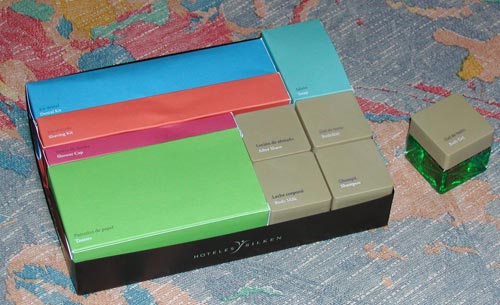
 or plastic, and these all fit like a puzzle into a rectangular cardboard tray. Even the shampoo bottles were square and fit the scheme perfectly. It was a delightful design, injecting elegance into this utterly mundane collection of supplies, so I share it here.
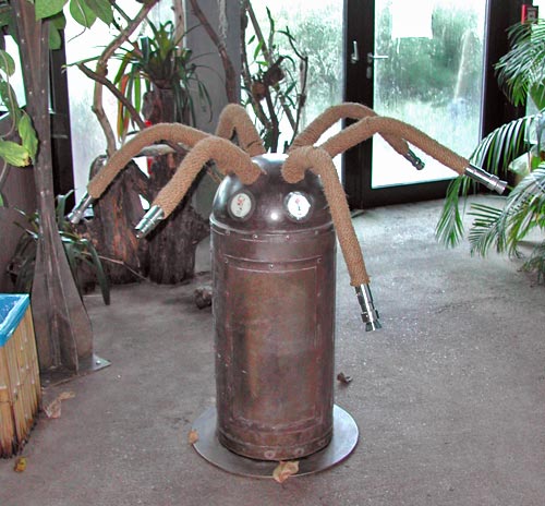
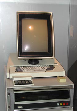 16:10 is a perfect choice if you want to watch movies, which come increasingly in wide formats. However, business notebooks are not intended primarily for this enjoyable purpose. They are meant to do business on, primarily word processing, email, presentations, and the like. And for this purpose, widescreen is totally inadequate. Documents are invariably taller than they are wide, like the paper pages they emulate; even presentation slides have a 4:3 aspect ratio. That’s why the venerable Xerox Alto (at right), sporting the granddaddy of all of today’s Personal Computer interfaces, had a “portrait” form factor screen: because you could process a whole page at once.
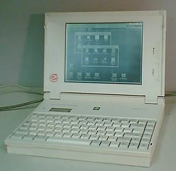


Something is wrong with our Notebook LCD screens, part 3
And now, following Parts 1 and 2, here is the last installment…
These days, more and more Notebooks come with displays branded by the makers as VibrantView, or CrystaslBrite, or OptiClear… exciting names indeed. What they all refers to is glossy LCD screens, which would be much better described as GlareMirror, or UglyReflector, or maybe just RazzleDazzle…
Photo source: Marco Wessel, under Creative Commons license.
The underlying idea is to remove the matte anti-glare layer on the older screens, a change which results in better definition and more vibrant colors, plus better outdoors visibility. All commendable attributes, except that the price you pay is a mirror-like surface that reflects windows, light fixtures and other bright objects, a problem that motivated the original matte layer to begin with. Solutions? Work in a totally dark room, or try to yank the screen around until you find a reflection-free angle. Note that the last works for a single viewer – these screens are most annoying when someone shows you something on their screen: maybe they found the glare-free position, but you, looking from the side or over their shoulder, will get the full blast of annoying reflections.
Now if the matte screens were bad – if their colors really sucked, or their focus was totally fuzzy, I can see the possible value of a trade-off; but TFT LCD’s have reached maturity years ago, and are a delight to use. So what got into the vendors’ heads, to throw in the glossy finish – not as a rare option, but as a mainstream technology?