Archive for July, 2008

A brush with Ford’s Human Machine Interface (HMI)

We rented a Ford Galaxy minivan for a day. Nice car, if you need the space. And such sophisticated controls… way too sophisticated for its own good, or for its users’, if you ask me.

Ford is very proud of its latest Human Machine Interface:

Human Machine Interface (HMI) -An upgraded instrument cluster plus a new steering wheel including toggle switches … take vehicle ergonomics to a new level. …
HMI is standard on all Ford S-MAX and Galaxy models. It is simple and intuitive to operate. It follows strict, straightforward and logical rules and combines critical areas of ergonomic development to optimize the interaction of the driver with the comfort and entertainment systems. …
The system enables a controlled dialogue between the driver and various support systems – radio, navigation system, Adaptive Cruise Control, and mobile phone.

Ford Galaxy minivan

So, my experience as a new user (remember, “intuitive” means a new user can figure it out without recourse to a manual): I wanted to zero the trip kilometer counter readout. After looking in vain for the standard push-rod near the odometer, I tried the 5-button toggle pad on the steering wheel hub, which turned out to control a multi-level menu system that eventually – after drilling maybe 3 levels down – let me clear the readout (not before forcing me through an ‘are you sure?’ confirmation). Pushing a standard button while driving is one thing; operating a complex multi-step interface, one which is different from car to car, is as silly as it is unsafe. I haven’t located the cruise control submenu, but the standard buttons on the wheel would certainly have been faster to use…

I suspect I may have figured it out wrong, and maybe there is a faster way to achieve this result via a different sub-menu. But then, I’m an experienced technologist; if I couldn’t do better at first try, your average driver would likely have done worse.

Another case in point: in this car, if you switch on the turn signal and change your mind, clicking the lever back to the center position will leave the signal on for 2-3 extra cycles. Not sure whether this is due to some ill-conceived “strict, straightforward and logical rule” the Ford designers applied, or whether the car’s computer is so busy doing other feats (polling the trip counter reset action?…) to respond faster. Either way, we were better off when the lever simply actuated a switch that directly controlled the blinking lamp.

Take note, Ford: you make excellent cars – please keep them simple to use!

Photo source: Wikimedia commons

Communicative alarms

I already shared my animosity towards car alarms. Since these are not going away anytime soon, the question becomes, how can we improve them to reduce the pain they cause the general populace? Same thing for house burglar alarms, that have the tendency to trigger – rigthly or wrongly – when the owner is on vacation in Hawaii…

The key problem is that when one of these monstrosities starts wailing, there is no one to call. Some house alarms have a sign indicating a security company that is in charge; in these cases you can try their number. But a sensible general solution would be to require all alarms to bear a “here’s what you can do to get me to shut up” indication. A name and cellular number of the owner would be a good starting point; a second, backup contact number would be useful as well. This is a matter for legislators; serious fines on owners of alarms failing to share this information would be useful. Until then, people can do it on a volunteer basis…

Tools 3: How to test a tool?

Another thing worth knowing is how to test a tool before you buy it.Claw Hammer testing

Different tools have very different methods… for example, I was saved from losing a lot of money because I knew how to test a Curta mechanical calculator before buying it (basically you start with all zeros, subtract a 1, then add it back. The readout should be all nines then all zeros again. This tests much of the inside gearing in two seconds).

Testing a hand tool can be even simpler. When I started into DIY I had this manual that had a section on hammers, including the paragraph shown at right. I used this test to select a claw hammer, ending up with a Stanley Hercules that has served me well through countless projects, and as you can see below it passes the test well. And if you think this is not very important, I can tell you that this hammer can drive nails right into anything without slipping or bending them, as a low quality tool often would; you supply the momentum, the hammer takes care of convincing the nail it had better go straight in. A real pleasure to use!

Stanley Hercules claw hammer

Coffee and Waste

Back from NYC… I already reported on the big stuff I saw there; and here is a small but annoying thing I also saw.

My hotel room had a drip coffee maker, a standard item in American hotel rooms (and much better than the old dependence on Room Service). But this one had one unusual feature. Instead of the usual plastic basket that you put a filter bag into, this one had no built in basket. The brew basket came in the filter pack – and was disposable.

Coffee pack and contents

You can see the content of the pack in the photo: the black plastic tray has a hole in the bottom, and you throw it out with the soggy filter bag after one use. The old system with a reusable basket was perfectly good – whatever gave anyone the idea that we need more trash on this planet?!…

And ironically, the packaging has the green “Rainforest Alliance” logo at the top which asserts it is environmentally friendly. Yah right!

Lick-and-Stick stamps endangered?

In 1840 Sir Rowland Hill introduced postage stamps to the world, giving us an effective postal system, and a fascinating collecting hobby. The Penny Black, of course, had to be licked to affix it to letter – it was a stamp, wasn’t it? That’s how a stamp should behave!

Self Adhesive Stamps

Well, not any more. These days we see a growing incursion of self-adhesive stamps; in other words, stamps that are in essence peel-off stickers.

These were introduced in Sierra Leone in 1964, apparently to solve problems of sheets sticking together in the tropical climate there. That, at least, is a good reason. But now we see a growing number of countries playing with the new stamps-that-are-not really-stamps…

So is that a problem? Well, there are bigger problems, but note that these stamps waste twice the paper, since their backing has to be discarded, and besides, the lick-and-stick operation was somehow an integral part of letter mailing (not that anyone writes letters these days either, unless they’re bills, it would seem). Also, stamp collectors are pretty unhappy – these stamps can’t be removed by soaking the envelope in water, and the adhesive can cause deterioration in the stamps over time.

I read somewhere that the US postal service refuses to see the collectors’ complaint as an issue, since long term collectability of stamps is not part of their product specification. Now, isn’t that heartless? Isn’t the whole purpose of stamps to enable this lovely obsession that has given pleasure to tens of millions of people, young and old, for well over a century?

King of the skyscrapers

Still in NYC, following the auspicious IORG launch, and took the opportunity to visit the Empire State Building.

I was totally unprepared for what I saw.

The Empire State Building

Of course, It’s tall, and the view from the top is incredible, but somehow I was expecting a ‘has been’. After all, this skyscraper was built some 80 years ago, in the great depression, the days when giant apes were swatting at quaint biplanes… the world is full of much taller towers today.

I couldn’t have been more wrong. The Empire State is still the tallest in Manhattan, following 9/11; and it totally dominates the Midtown skyline. But it is its superb architectural design that sets it apart. Its iconic tearraced lines thrust skyward in a perfect platonic expression of UP and STRENGTH that none of the funky new Glass and Gossamer skyscrapers can hold a candle to (speaking of strength, this tower took a direct hit by a twin engined B25 bomber in 1945 with only relatively minor damage).

This assertive presence is complemented by a magnificent attention to detail. All lobbies and corridors are faced in marble. Tasteful art deco ornaments add a twenties touch that is just right. You can make snide phallic jokes all you want, but It’s all simply beautiful, and in a way that no photo can do justice to.

Makes you proud to be an engineer!

Photo courtesy Wally Gobetz, shared on flickr under CC license.

Information Overload Research Group launched!

Quite off topic, but how exciting! After months of preparation, the group I co-founded is now alive and kicking!

The Information Overload Research Group (IORG) is a non-profit association of researchers interested in solving theglobal problem of Information Overload. It prides itself on bringing together key people from industry, academia, consultancies and software vendors who bring their diverse points of view to bear on the problem – thereby creating a collaboration that far exceeds what each can do alone.

iorg-banner-500.jpg

So, I’m in New York City now (quite a city, that!) and yesterday we’ve held a wonderful conference at the Penn Club where we formally announced and launched our group, and delighted in meeting some scores of like-minded researchers and practitioners, and listening to some fascinating lectures. Jonathan Spira of Basex , my fellow director on the IORG board, gave a perspective on the nature and extent of the problem; Mark Hurst, author of Bit Literacy, shared his approach to attaining an empty Inbox; Maggie Jackson lectured and then signed her new book, Distracted; and Prof. David Levy of the university of Washington spoke of his research into the phenomenon of ” No Time to Think”, giving us a scary historical perspective into the degradation of Contemplative Scholarship in academia in recent times.

There were also two panels, one to discuss what corporations were doing about it all (that was where I spoke) and one for visionary vendors who presented amazing new products they’re introducing.

I usually blog about my work elsewhere, but I thought I’d share this!

Backlit cellphone keys – not such a good idea!

Have you had the experience, as a child, of discovering the optical properties of oiled paper?

I remember it well… I was an avid reader as a kid, and when a smudge of oil from some snack would get onto my books I’d notice that the translucent oily spot that looked darker than the paper would become lighter when you held the page up to the light. Before long it occurred to me that if the shade of oiled paper can go from darker to lighter as you raised the page, there must exist an intermediate position where the spot would become invisible as its shade became identical to the dry paper’s. Sure enough, so there was!

We met the hard to read keyboard on my Nokia 6230i before. Well, apparently the keyboard designers at Nokia were also trying to emulate the oil/paper experiment from my childhood…

Nokia 6230i keys in daylight

Like many handheld devices these days, the keyboard on this phone is backlit. The numbers are translucent, and a strong white light can shine through. Seemingly a great idea, for night time use. Now in bright daylight this works fairly well. The backlight gets washed out in the sunlight and although the transparent digits are of a lower contrast than a black ink would have provided, you can see them well in dark gray on silver (since the keys are silver and reflect ambient light in unpredictable ways, the contrast admittedly varies, as seen in the photos; I’ve already commented on the advisability of plain black on white for optimal viewing). But once evening starts to fall…

Nokia 6230i backlit keys in low ambient light
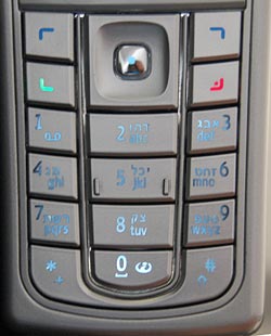
The third photo shows what happens in lower ambient light. There is an intermediate light level when the transition from dark numerals on bright silver to white backlit numerals on dark silver just evens out, and the numbers become almost invisible. In fact, since the backlight source is localized, different keys reach this point at different light levels; in the photo the “7” is in day mode, the “0” is in night mode, and the 5 is barely visible – just like the oil spot on those old books.

Now imagine trying to distinguish these keys while driving, with the phone in a hands-free cradle, where you can’t touch-type and you need your attention on the road.

So, what can we do about this? Well, we could prefer black keys with white digits – then the day and night contrast would be the same so there would be no crossover point of invisibility. Another good idea (which I recall seeing on some devices) is to make the backlight come on only in truly low light conditions. And of course, we should test the devices we buy in all situations, not just in the bright showroom where we normally make buying decisions…

Pillboxes and Clay balls: inside and outside

I recently bought this box of vitamins, and noticed it had a life size outline of the pills’ actual size. This makes sense, since the box is “safety sealed for your protection”, so people can’t see what’s inside before they buy.

Vitamins box

This reminded me (wonders of associative memory!) of something rather different, yet following the same idea, from the History of Computing (one of my favorite hobbies). I read about it long ago, but recently was delighted to run across the real thing in a small showcase in the Pergamon museum in Berlin. Back in ancient Mesopotamia, around 9,000 years ago, people had this neat idea of recording commercial transactions with clay tokens. Different shaped tokens might represent a sheep, a jug of beer, or a sack of grain… and so you could represent a loan or tax payment by a collection of tokens (SAP was far in the future then, as was Excel; in fact they had yet to invent writing, so they couldn’t use that for their records). Here is a sample of these tokens:

Mesopotamian Clay Tokens

Then, around 3,500BC in ancient Sumer, the idea occurred that it’s better to keep all the tokens in an “envelope”, a hollow ball of clay that could be signed with the parties’ seals, then fired to harden it. These balls of clay are like an authenticated, signed record; their content can’t be altered without breaking the ball. The museum had some of these balls cracked open, with the tokens still in them:

Mesopotamian Clay Balls with Tokens

Mesopotamian Clay Ball with imprinted tokens

And since the clay is not transparent, they would sometimes press the tokens on the outside of the ball before sealing them inside – so you’d know what each ball was about. And now we have an accessible copy of the record on the outside, and a sealed version on the inside… just as with the vitamins box!

The next step is obvious in retrospect: who needs the tokens on the inside? So around 3,300BC they dispensed with the tokens, flattened the ball into a clay tablet and made do with the indentations on this, as in the next photo.

Mesopotamian Clay Tablets

And lastly… surely you can see where this is going? Once they could Early Writing on a Mesopotamian tablet
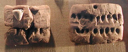
represent stuff in the real world by abstract marks on a tablet, they were on the path to real writing, starting with pictographs and ending with true cuneiform. Here is another exhibit from the Pergamon, which seems to be halfway through the transition. Wayda go!

More of the science behind this fascinating history can be found on the web site of Prof. Denise Schmandt-Besserat of the university of Texas, a leading researcher of the origins of writing and counting .

Car parts designed to smash up, take II

We saw how Our car had a turn indicator lamp in the side trim, where it was vulnerable to damage. Even more interesting is the turn signal on some newer cars, which is put on the most smash-worthy part of any automobile: the side rear view mirror. And not at the base of the mirror like in this red Citroen C4; but at its outer edge, as in this blue Mercedes!

They used to speak of “Planned obsolescence”; looks like today’s automakers are unwilling to wait for their parts to wear out, so now they’re actively soliciting breakage by design…

Side mirrors with turn signals