Just got off the phone at a teleconference meeting hosted by some service in the USA. I was impressed by the logic of the automated system, which went something like this:
“Welcome to the ___ teleconference system. Please enter your passcode”.
<I did>
“The number you entered is <bla bla bla… all 9 digits read slowly>.
Please press one if this is the correct passcode, or two to re-enter the code”.
What on earth could make them think this is a good idea? Why not just test the number and only if it is incorrect ask for it again?!…
Of all the everyday objects you will own, Tools deserve a place of honor, since they are the ones you use to make other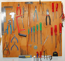 objects. In fact, tools are arguably what distinguished our hominid ancestors from the animals. For my part, as a maker of things for pleasure and work, tools – the workshop kind – have been my lifelong possessions and companions, so I will blog about them for a bit.
The first point I want to share should be obvious, yet as the massive commerce in low grade tools shows it certainly isn’t: when buying a tool, always go for the best quality available. It does make a huge difference.
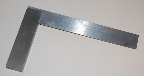
Take the tool in the photo: a machinist’s square for metal work. It was made by Moore and Wright of Sheffield, a maker of precision tools since 1906. Now the first time I bought a machinist square (I was in my teens), it was much prettier than this one, and had a scale of centimeters along the edge too; it only had one drawback: it had an angle just short of 90 degrees. So I took it back to the store and got another, with an aluminum stock; this one was just over 90 degrees. Eventually I went to a better store and got the Moore & Wright: no scale, just an ugly lump of iron that tends to rust – but it still measures a precise straight angle after decades.
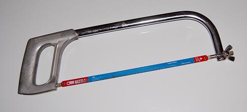
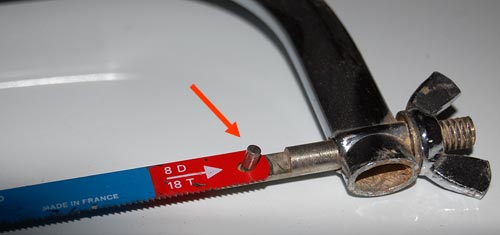
Or take the saw in this photo. I had a cheaper one, and it would use the same blades… only they would pop off the frame every so often. Only when I went and got this more expensive one, made by Eclipse, did the problem go away – and all it took was to have the little rods that go through the blade be longer! Little details like these make a big difference to tool usability and usefulness – and quality is all about the little details.
We got this new HP LaserJet M5035 multifunction printer/copier at my workplace that is very sophisticated and capable. It has a high res touch screen that it uses to accept our commands and to tell us what’s going on.
So today it had a fault and advised me to cycle its power, which I did. The printer then went into a boot sequence, complete with whirring sounds and flashing lights, that took long minutes… very long minutes. 🙁
And all through it, its wonderful display screen showed an HP logo growing larger and smaller, larger and smaller… endlessly. Very neat, but didn’t it occur to the designers of this machine that the user would much prefer a simple text message like “Machine warming up… should be ready in X minutes“?
The Sony Mini-stereo on my desk has excellent sound, which is the main thing I suppose; but it has some annoying misfeatures. Take this one: what do you think happens when you hit the “Open CD Tray” button? If you said “The CD tray opens”, think again. Eventually it does, but first, the display switches to say “OPEN” and this word blinks a few times. Then, after 2-3 seconds of deliberation, the tray opens – making the display totally redundant (we can see that the tray is opening, Can’t we?!)

Or take what happens when you hit the power off button. The same display now says “STANDBY”, and blinks this unsolicited information for maybe 6 seconds – then changes to “- – : – – “, its standby indication. So why didn’t it make this switch instantly? It isn’t as if it had to shut down a nuclear reactor core…
This behavior, where our electronic creations take their time before obeying, is seen in many devices around the house. I’d much rather have them do as they’re told and shut down (and up!) instantly.
Recently I replaced my old Mazda 3 with the new model. The two are practically identical – why mess with a good thing? it’s a fine car! – but there are some minor differences, and I’ll be blogging them now and then… they afford us a peek into the design team’s thinking processes.
Here is the trunk door on the previous model. The problem is, it is not spring loaded; to open it you had to press the lock button and then claw it open by trying to pry up the bottom edge, which is a tight fit to the bumper below it (on most cars the door at least has some depression, perhaps for the license plate, where you can grasp it; this door is smooth and lacks any such grab point).
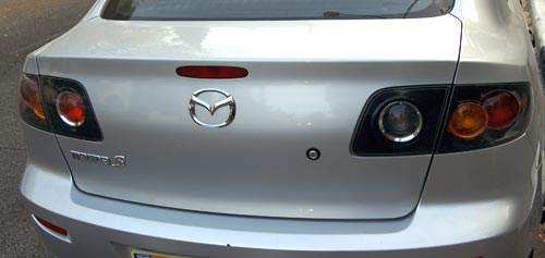
Quite annoying, and a lovely bit of poor usability. In fact, I saw one of these cars on the road whose enterprising owner had screwed a handle – from a kitchen drawer, by the looks of it – onto this door!
So here is the same door on the new model. Same door – one key difference: now there is a depression in the bumper to allow you to grasp the door.
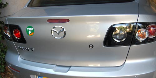
People must have been complaining – and the design team at Mazda had been listening. Better late than never!
As a conscientious techie I do what many car owners don’t: I ch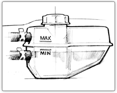 eck the oil and other fluids in our cars once a month, rain or shine. But our latest car, the 2007 Renault Clio, seems determined to foil this good intention.
It used to be simple: A fluid would either have a straight dipstick with marks for Max and Min, or a clear reservoir with lines marking these two limit levels. The new Clio, however, abuses these age old concepts.


Like most modern cars its engine compartment is as densely packed with systems as an animal’s belly is with entrails; and the clear reservoirs for coolant and brake fluid are so positioned that there is no way on earth you can see all the level lines without either a dentist’s mirror or X-Ray vision. You can see the Maxi lines, but the Minis are hopelessly hidden (see photos).
As Obelix would’ve said: Ils sont fous, ces ingenieurs!

“O knob, thou whose perfect roundness doth . . .”
Nah. A poet I’m not. Still, I would if I could, because the round knob is a fast disappearing species, a trend well worthy of lament.
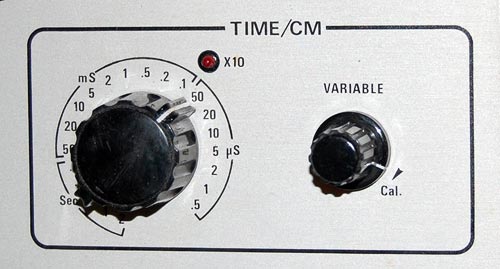
Throughout the 20th century the round control knob was a mainstay of human interface design for electronic devices. With good reason: it was perfectly suited to humans’ major feature, the opposable thumb. You grasped the knob between that thumb and forefinger and you had superb fine control of the knob’s angular position. If the function called for finer control, you just used a fatter knob. At the machine end of this human/machine interface the knob could rotate a switch, a variable capacitor, or a potentiometer – there were many analog devices back then that lent themselves well to rotary control.
Today most of our input components have gone digital, and are either computer controlled or handled by pushbutton switches. This makes sense in some cases, but there are still many situations when a function is intrinsically analog (say, a volume control on a car radio) yet the designers are making the controls digital (say, by using a pair of + and – pushbuttons). This is pure evil from a human engineering perspective: the round knob is much more intuitive, convenient, and faster to boot. And it really was worthy of the name control: it gave the user a sense of controlling the instrument, instead of fighting it…
I’m sure the electronics driving the volume these days are fully digital, but even so a round knob with some D/A conversion is the correct choice. It must also be more expensive to make, because the radio makers – preferring low cost to user experience – increasingly shy away from it. 🙁
Many times, a small change in a design makes a product a lot better.
You know the modern version of the office water cooler: a vertical unit that dispenses cold (and in many models, also hot) water into disposable cups. Well, I’ve just seen one that made my day. The unit in the photo, a new model from Tami (a.k.a. Tana Water), has a small but smart addition: the button marked “Room Temp”.

What’s the big deal? Well, in most models, you push the button and get ice-cold water. This must be very attractive if you’ve just jumped off a camel at a desert oasis on a scalding summer day; but in most offices, which are air conditioned, you don’t need it to be ice-cold, and some prefer it not to be. Their solution in the past was to either try to add a little boiling water, or to sip slowly. So now Tami have added the Room Temp button – you can get the same clean, filtered water, without the extra cooling. A tiny redesign, leading to a better product.
Our kitchen light fixture started to char its plastic housing, so we went and bought a new China-made one, equipped with two concentric fluorescent lamps like its predecessor. It was only later, after much climbing ladders and drilling holes overhead, that the problem appeared: try as we might, fitting the two lamps seemed impossible to do. Then it became clear that it actually was impossible!
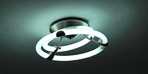
The fixture had three equidistant radial arms to place the lamps on, and these each had metal protrusions to locate the neon rings in position. The problem was, no matter how we pushed and bent, the smaller ring would simply not fit – its diameter was wrong. Note that the two lamps came in the same fitted cardboard box with the fixture, right from the manufacturer!
At first we were so upset we decided to replace the contraption; but it then struck me that as it hangs there with off-center skewed rings it does have a retro charm reminiscent of the Googie style (think Jetsons or retro Sci Fi ray gun designs). So for now, the lamp stays. Still it does boggle the mind that they’d sell a lamp that can’t be assembled, as if by design.
Recently I discussed how workers at customer call centers can turn into computer-like zombies. The other day I stood face to face with such a person.
I was trying to order two coffees at a fast coffee shop. My wife likes her espresso with a drop of foamed milk on top – “Espresso Macchiato”, meaning “stained espresso” in Italian. I take mine pure. So I order:
Me: Two espressos, one of them Macchiato.
Coffeeshop cashier: Huh?
Me: One short espresso, one espresso macchiato.
Cashier: what’s that?
Me: It’s espresso with a little foamed milk on it. It’s called espresso macchiato.
Cashier: you can order espresso, or you can order macchiato.
Me: OK, one espresso, one macchiato.
Cashier: [accepts the order without further comment].
You see, it wasn’t that he had never seen a Macchiato – he works in a fancy coffeshop that sells it routinely – it was that the expression “espresso macchiato”, which is grammatically correct and in common usage worldwide, had failed his string processing subroutine. His computer had a button for espresso and a button for macchiato; there was no button for the combined form. A customer ordering anything without a button dedicated to it could be served no more than a Klingon ordering a serving of Gagh.

