Archive for May, 2008

Don’t you miss Borland’s no-nonsense EULA? (sigh)

Every commercial piece of software we use comes with an End User License Agreement (EULA), which we all merrily accept without reading. After all, who has time to read a rambling document of barely decipherable legalese that we can’t do anything about anyway? Sometime I do glance through them, and my blood pressure shoots up (the part I like best is where it says “Some states do not allow the exclusion of [bla bla], so the above exclusion may not apply to you”, which essentially says “we will abuse you all the way, but if your state prohibits this we will abuse you a little less”). 🙁

So, I sometimes remember fondly the old (1980’s) Borland No-Nonsense License, which said:

You must treat this software just like a book …

…By saying “just like a book,” Borland means, for example, that this software may be used by any number of people, and may be freely moved from one computer location to another, so long as there is no possibility of it being used at one location while it’s being used at another or on a computer network by more than one user at one location. Just like a book can’t be read by two different people in two different places at the same time, neither can the software be used by two different people in two different places at the same time. [you can find the full text here].

Sensible, isn’t it? And fair, too. An agreement decent people might freely enter, and have respect for (check the sentiment expressed here). Our world needs more of this sort of thing!

Incidentally, the distinction between the Borland style and the one prevalent today – what I call People language vs. Lawyer language – is what inspired my own legal blurb on Possibly Interesting.

Divide and Conquer!

We like our cars to have large glove compartments, but when we cram stuff into them we can’t seem to find anything (a problem especially while driving). I recently drove a Chevrolet Optra, and it had an obvious solution: a divider, to split the compartment in two, like this:

Divided Glove Compartment in Chevrolet Optra

But even nicer, the divider was removable, allowing you to recover the full width at will. Of course, drawers in office furniture have been doing this sort of thing for ages, and I’ve retrofitted homemade dividers to drawers in our home many times – it extends the usefulness of storage space significantly. However, this is the first time I see it in a car. Nice touch!

Glove compartment in Chevrolet Optra, sans divider

The amazing Posographe

A riddle: what’s rectangular and flat, can fit in your pocket, and can calculate six-variable functions?

No, not a pocket calculator; I forgot to mention – it has no electronic components whatsoever.

Here, check it out in the latest addition to the HOC collection on my Possibly Interesting web site.

Human or IVR? A reverse Turing Test!

I discussed a while ago how Interactive Voice Response (IVR) systems are being designed to be more human like. Well, the reverse is also sometimes true, with human operators becoming more and more computer-like. Consider:

Our car lighted up a “service required” lamp, so I called the 24×7 number provided by our garage, to ask whether the car was due for maintenance. A polite young lady answered:

Young Lady: How may I help you?
Me: Hi. My car claims it needs maintenance but has only 5500 Km on it. I want to know whether this model requires maintenance at 5000 Km?
YL: what is your name please?
Me: Zeldes. [I was assuming she plans to look up my car in some customer database]
YL: Is that your first name?
Me: No, it’s my last name. [Duh!…]
YL: What is your first name?
Me: Nathan. [Strange question: the database would be indexed by last name!]
YL: May I have your phone number? Someone will call you.
Me: [gave my cellular number].
YL: May I have your home number?
Me: No, use my cellular, it’s what I can be reached at.
YL: May I have your home number?

At this point it hit me: I was talking to a computer program! It was implemented in wetware, but the girl was following a preset routine and had no independent thought: a living computer. So I gave her my home number, and she exited that particular program loop and eventually hung up.

And it struck me that the moment she repeated the home number question is when I achieved certainty that there was no sense talking her out of the routine she was bound to; in essence, she had passed at that moment a reverse version of the Turing Test. A human would’ve said “OK, that’ll do then”.

Incidentally, the term “Reverse Turing Test” can be intepreted in many ways – here’s another, more often seen interpretation of this.

Aesthetics and Design: Boeing’s LAR rule saves the day

Passing through an airport I bought the book “Boeing 777: the technological marvel” by Norris and Wagner. This gives many fascinating insights into the novel design methodologies that went into the 777, my favorite jetliner. It also introduced me to one of the ugliest airplane designs ever to disgrace a designer’s sketchpad.

Boeing 767X - the Hunchback of Mukilteo

The Boeing folks were looking to build a plane larger than a 767 and smaller than a 747; one idea they tried was to graft half the cabin of a 757 on the rear half of the larger 767. You can see how endearing the result looks; in fact it earned the nickname “Hunchback of Mukilteo”, after a town near the Boeing facility.

There were many reasons why this version never proceeded off the drawing board, not least among them the disgusted derision of potential customers. But what I like best is that a key reason, according to the book, is that the design failed Boeing’s “LAR rule” – which stands for “Looks About Right”. If that is indeed their guideline, they are a smart company indeed: good design has an ineffable elegance to it, and no engineer should be forced to build something that offends their aesthetic sense.

The Ear and the iPod: a perfect fit!

The wonders of the natural world are many, and the living body includes countless amazing features (and, admittedly, some not-so-amazing ones as well). Today I give due homage to a piece of truly elegant design: the perfect match of the outer ear to the iPod’s earphones!

iPod Earphone

The earphones’ convenient usage stems from the presence of those details of ear anatomy that form a perfect keyhole structure to hold the earbud in place just against the opening of the ear canal. The structure echoes (after a 180 degree turn) that seen on the backs of many wall-mounted household objects, like the fan seen in the photo below.

Ear and KeyholeOuter Ear Anatomy

In case you wondered, the small folds in the outer ear’s convolutions that make this possible are called the Tragus and Anti-Tragus, as seen in this detailed illustration from Gray’s Anatomy. They hold the earphone’s round body in a snug fit against the suitably sized Concha.

We humans may not have the most impressive ears (just ask a bat, or a rabbit, or an elephant) but we certainly come pre-customized to hear our favorite music on the go!

The growing obesity of our Science Fiction

I was putting in order our bookcase of Science Fiction, and noticed an interesting fact best illustrated by the two piles of books in the photo.
One pile has three books, all written after 1980. The other has eight books written in the fifties, the later part of the “Golden Age” of Science Fiction. And the two piles are the same height.

Science Fiction books

Fact is, most paperbacks published recently tend to be much longer than the “Pocket books” of the fifties. They can easily exceed 400 pages, where their predecessors ran happily to 200 or so. And the sad thing is, this does not make them better. The three fat books in the pile at left are certainly good – but the other pile contains absolute classics like Bradbury’s The illustrated man, Clarke’s Childhood’s end, and Asimov’s I, Robot (the wonderful short story collection, not the silly movie); the others, by such masters as Sturgeon, Heinlein, Blish and Wyndham were likewise influential and a joy to read.

Two Science Fiction books

Here, go read Footfall (1985), all 700 pages of it, and Wolfbane (1959), with a mere 160; both are wildly imaginative works, good SciFi indeed, but the GPP (goodness density per page) is on the skinny tome’s side. In fact, it makes me wonder, why did authors become so much more verbose of late? Any ideas?

Cars should be seen but not heard

The constant roar of traffic makes many a city center noisy. Then you drive home to your quiet suburb, where traffic is less of a problem… but cars still make their presence known there. Apart from the infamy of car alarms , each time a neighbor parks a car, or gets into one, you hear the multiple bleeps of the remote controlled electric locking system.

Let’s avoid the question of why a car needs to beep when you lock or unlock it (surely blinking the lights would be informative enough); but if they gotta beep, at least the designers should try to make the beeps quiet! In reality some cars are considerate, and give off pleasant, melodious peals of unnecessary sound; but there are many that squawk like a hen that had its tail stepped on. If you have a neighbor that works late night shifts, or otherwise needs to drive when others are asleep, this can become a real nuisance.

Hear that, Detroit?

Worth a thousand words?

Greg Bear’s hyper-imaginative Sci Fi novel “Eon” brings its protagonists to a parallel reality whose highly advanced post-humans use Picting to communicate; that is, they project in mid-air sequences of holographic icons to convey their thoughts.

This may work for post-humans… but can become a problem when mere mortals try it with excessive zeal. I refer to the increasingly common practice of using pictures and icons in signage and instruction manuals, even when written text would be far better. The notion that pictures are easier to grasp works fine for signs like “left turn” on a road, or “Danger – High Voltage” on a transformer, which are reasonably self-explanatory. And they are invaluable in instruction manuals when they illustrate some technical complexity explained in the text. The problem begins when those manuals start conveying complex concepts like “Don’t drop this camera on a hard floor”, which they might do by showing a person weeping as the camera smashes to pieces… Konica manual extract

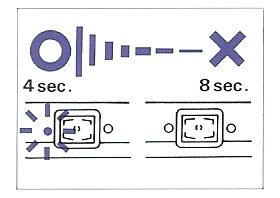
Take this picture, from a Konica camera manual. Can you decipher its meaning? Fortunately the text on the same page explains: it means “The battery should be replaced when the flash takes more than eight seconds to charge”. That’s 15 words, and they are far better than the picture. And from the same manual (this time without a Rosetta stone in the text), the “Don’ts” in this mosaic:

Konica manual extract

The Thermometer I can get, and maybe the “Don’t take a screwdriver to this camera” (or is it, “Don’t stick a screwdriver in the lens?)… but the one in the center eludes me (“Don’t take photos on windy days”??) and the one to its right is a total mystery (“Beware radiation emanating from TV sets and refrigerators”? Or is that a Microwave oven? And since when do fridges emit anything?)

But no manual beats the one we have for our Electrolux dishwasher, which has a pull-out card that starts with exhorting its own virtues (top row, which merely illustrates one word, “RTFM”); then goes on to totally confuse us (is this filter cleanup due daily? Weekly? Daily, but only during the first week of each month?)

Electrolux dishwasher instructions

And then it shows this masterly rendition of “Help the environment by only using as much detergent as needed”:

Electrolux dishwasher instructions

Sometimes, I guess, a word (wisely selected) is worth a thousand pictures!

Buildings designed for Software Engineers

With the wonders of Google Maps at our service, we can get some interesting insights. Take the photo below, also viewable here. This is the older part of the Microsoft campus at Redmond, where much of the software in the computer I’m writing this on was developed.

Microsoft buildings at Redmond

Notice how the buildings all have cross shapes visible in their plans. This is not because of a religious bias in the company’s management. It is, I was told when I visited there, because Bill Gates had decided when he started the company that an effective software engineer needs the peace and quiet made possible by an office with a door. Indeed, while myriads of hi-tech engineers (yours truly included) work in cubicles in the noisy open space made famous by the Dilbert comic strip, Microsoft coders all have their own individual offices with real doors to block out the world when they need to concentrate. Of course such an office requires a window too, or it gets claustrophobic… which explains the shape of the buildings – with a need for so many windows, they had to be made with a convoluted outline, to maximize surface-to-bulk ratio.

For my part, I admire the tenacity – Microsoft moved to Redmond in 1986, and 22 years later they still resist the temptation to compress their engineers into cubes. They have a good thing, and they stick to it!