Here is a screenshot from my Lenovo ThinkPad computer. The computer was running a self-test using the incorporated Lenovo utility, and I tried to abort this test by exiting that utility.
And then I got this dialog box:
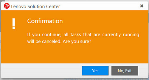
Read it carefully:
If you continue, all the tasks … will be canceled. Are you sure?
And you have two buttons to choose from:
YES [Which means Yes — I’m sure, do exit]
or
NO, EXIT [Which means I’m not sure, do not exit].
Obviously the second button is intended to mean “Exit this dialog, not the utility” — but this is confusing as hell, since exiting the dialog and exiting the utility are opposite actions.
Would it kill them to use a simple “CANCEL” on the second button?
Back from vacation, having flown a Boeing 737. This lacked the personalized screens seen in longer haul craft but it had a headset jack and a set of volume and channel controls for each passenger. The controls were set in the armrest, in easy reach of the passenger, like this:
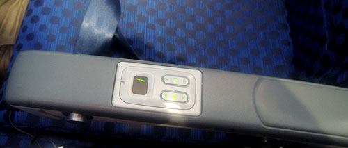
Cool, huh?
Not cool. The two rocker switches for the volume control and channel selector are flush with the surface of the armrest. This means that if you rest your arm on the thing – or if your neighbor in the next seat does – your channel is bound to skip up or down every few minutes. If you watch a movie this can get truly aggravating.
And all they had to do was recess the controls a couple of millimeters under the surface…
A century ago Gilbert Small, of Waltham, Massachusetts, invented a compact pocket calculator that is small, effective, and designed with special attention to usability.
Read the new article on my History of Computing site to see what he’d crafted!
 When Elisha Otis invented the ‘safety elevator’ mechanism in 1852, elevator crashes have become a rare event indeed. But these days “crash” has a new meaning, which Otis couldn’t have foreseen. Consider the elevator in the photo, from the Azrieli towers in Tel Aviv. It has a wonderful new control system with a large computer screen to tell you what’s going on.
And, as you can see in the photo below, it has crashed…

Too bad the weary traveler has no way to follow any of these cryptic instructions.
In fact, we run all too often into this situation: a computer-embedded system that sends admin-level error messages at a user that has neither the ability nor the expertise to address them. A simple blinking red light captioned “malfunction – call maintenance at tel. 1234567” would at least be actionable!
Today we have a guest post from our loyal reader George Trudeau of Hyannis, Massachusetts.
George sent me this photo:

And here is the story:
I went to a Doctor appointment and took the elevator up to the second floor office by pressing the great big 2.
When I left the office, I was still thinking more about my appointment than how to operate an elevator, so I pressed the button under the 2, the doors closed, and I returned to my thoughts. Eventually I realized nothing was happening so I pressed the button under the 2 again… It even has arrows pointing to it.
If I wanted to go sideways I might have pressed the right button the first time.
Nice catch! Not only is the up/down direction represented sideways, but the line in the “Close doors” icon does look like a “1” in the same style of the “2”. Of course, you have to be distracted to make this mistake… but usability is about ensuring proper user interpretation even when distracted!
Not all cool ideas are actually good.
Back in 1983, around the time the IBM PC made its debut, my boss at Intel had acquired a very innovative personal computer: the Hewlett Packard 150.
I remember it well; it was a really cool machine – at least in the context of its day: it had an 8MHz (yes, 0.008 GHz) CPU and 256KB (0.000256 GB) memory, as well as two floppy disks of 270KB each. It also had that solid look and feel that the better companies gave their machines when they could charge thousands of dollars for them. But what made it super cool was the screen, and the ad here shows you how proud HP was of developing it:
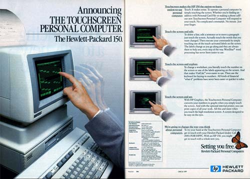
The HP 150 had the first Touch Screen I’ve ever seen on a commercial computer. It was actually a regular nine inch green CRT, with a bezel that had holes all around it with IR emitters and detectors in them; sticking a finger at the screen would block some IR rays and tell the computer where you were pointing. And this is where the designers had failed: they forgot that the human arm is not designed to be held in the air, poking at a surface in front of one’s face. The resultant muscle fatigue was known as Gorilla Arm…
That alone was enough to relegate this screen to the junk heap of failed ideas, and touch screens would have to wait for tablets and devices that can lie flat on a tabletop or be held in one’s hand.
Still, you have to admit it was a good looking machine!

Photo source: Computer museum, Stuttgart University.
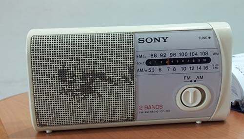
Sure thing, Form should follow Function… but some designers haven’t heard of that. Like the Sony designers responsible for the two weird design choices below.
Round knobs are round because they need to be gripped and rotated… an optimal design for our opposable-thumb grip.
But the radio below has a round knob whose function is to slide right and left between two positions. There are wonderful switch designs for that, some going back to the Industrial Revolution… and their oblong form reflects the lateral movement. Not here, though…
And then there’s this little stereo system I use in my home office:
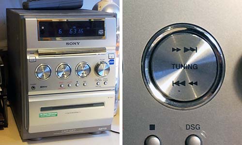
This has four shiny round knobs, of which one – at the right – actually rotates to control the sound volume. The other three are flush with the panel and are actually two-way momentary push-button switches – you push the top or bottom part of the control for a “click” that might advance the tuning or track up or down. The use of a round form here is an abomination, and each time I use them I go into a tiny cognitive dissonance. Fortunately, the sound quality is good enough to put me in a forgiving mood…
Back then we had the Palm Pilot. It had a gray lo-res screen and minimal capabilities. No wireless, no GPS, no games, just basic PDA funcfions. Compared to the android phone I use now it was like a stone ax. And yet, that old Palm had a key attribute that is long lost: simplicity of use.
 A prime example: the “EDIT” button. Take the common task of modifying a memo or appointment. In Android, you have to open the item, and then hit EDIT to enter a mode where you can make your changes. And when you’re done you hit SAVE. Makes sense? Not really. In PalmOS you opened the item and just started typing. Edit mode and View mode were one and the same. Just like a sheet of paper: you can read it and you can write on it as you wish.
It may look like simple matter, but all those extra clicks do add up and clutter the user experience; what’s more, they detract from elegance – that intangible element which calls for keeping it simple!
We all know the paper towel dispensers that you crank to get the required length out. The more sophisticated ones dispense with the crank action and use an electric motor actuated by a proximity detector: wave your hand in the air in front of the machine and out comes the preset length of paper with a satisfying whirring sound. Hygienic, neat, and foolproof.
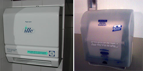
But even with this foolproof concept there are different designs. The device at the left in the photo tells you to wave your hand to the right of the paper outlet slot. The one at the right has the sensor centered above the slot’s middle. Why does this matter? because the average person will reach out for where the paper is expected; with the second unit this will trigger the sensor, whereas with the first, it will not. Then you have to start groping and try to figure it out, and maybe notice the frantic effort the vendor made to guide you: the picture of a hand titled “sensor”, the big blue arrow pointing to it, and the text captions that try to make it all clear.

All nice and good, but a towel dispenser is not a literary work, and should not rely on texts and explanations. Had they put the sensor in the middle all this would’ve been unnecessary…
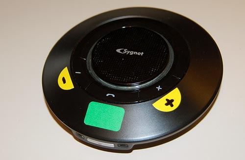
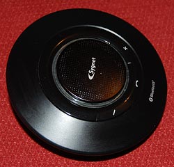 Back to my Sygnet Bluetooth Handsfree Carkit model BTS600. We saw its problem with cloaking the controls and indicator lamps… but on top of that, the people at Sygnet played a trick that is becoming very common in this digital era: they overloaded the controls and the lamps.
I use Overloaded in the Object Oriented Programming sense: the use of one operator or function name to perform several different functions depending on context.
The Sygnet device has three operating buttons and more than a dozen actions; so each button can do many different things. For example, the “-” button rejects a call if pressed for 3 seconds while the phone is ringing; it initiates voice recognition dialing if pressed for 3 seconds when the phone isn’t ringing; it cancels the voice recognition if pressed until a beep is heard; it cancels bluetooth device recognition if pressed for 6 seconds; it reduces audio volume; it mutes/unmutes a call when pressed concurrently with the “+” button; and it starts a conference call if pressed for 3 seconds while one call is active and another waiting. The other buttons likewise do a great many things; it’s so complicated that I carry the instructions in the glove compartment at all times! Needless to say, the captions on the device merely identify the buttons, not their functions.
The two indicator lamps, meanwhile, are similarly overused: The blue lamp blinks 3 times every 2 seconds to indicate an active Bluetooth link; it blinks rapidly together with the red lamp when the device recognizes the cellphone; it blinks every 2 seconds when bluetooth is inactive; it stays lit with the red lamp during charging, and without it when charging is completed. So now you need a stopwatch to figure out what it means…
To illustrate how excellent this human engineering is, consider its application in a ballistic missile situation: “Hey, Joe, does two blue blinks followed by a long beep mean a 3 second push on button D launches the missiles unless you first tap on button A, or does it mean the Mr. Coffee needs maintenance?”
So, what can we do about this? Well, by now you know my style. At least I could make the cloaked buttons eminently visible…