Working in Adobe Photoshop CS4, and I just bumped into a menu item I needed that is grayed out. This does happen: Photoshop has a huge wealth of commands and capabilities, and many depend on the context – for example there are things you can only do in RGB color mode and not in Indexed color mode, and so on.
However, because things are so rich and full of complex dependencies, it is sometimes impossible to figure out WHY a given command is unavailable. It can get quite maddening, in fact. So, here is an idea for the folks at Adobe to consider:
When there is a grayed out menu item, please add a tooltip or status line tip or some such that says “This command is unavailable because…”
This would make life so much easier for us. You’ve put considerable effort into providing help for things that we can do, so also give us some advice when we can’t do what we’d like. Of course this is very context-sensitive – the command may be unavailable for a variety of reasons, and the program knows, internally, what the current reason it.
I can think of one software product that does this, though not on a computer: the TV PVR box we have, provided by Hot cable company, announces every now and then that you can’t preset a recording because there are already two others overlapping the same time slot. But it doesn’t just refuse to record; it announces on screen “to record program X you must cancel one of the following two programs [Y and Z]… please select which one to cancel, or ESC to exit”. It explains the issue and it immediately allows you to fix it.
The same advice applies to a variety of products, not just Adobe’s, of course!
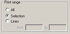 I needed hard copy of a paragraph from a long text document, so I opened it in my trusty old editor (
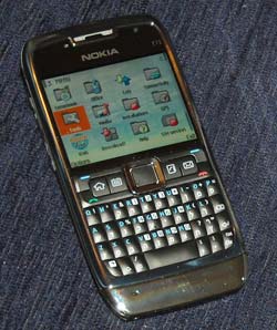 Take the calendar application that came on this handheld. It has a number of shortcomings (more on these later) and one amusing quirk: most of the time when you click the calendar button it displays an empty screen with the phrase (no entries) at the center. Then, less than a second later, the actual entries for the day (in my hectic life, alas, there are always entries…) show up.
