 Everyone knows that the QWERTY keyboard layout sucks, because it carries a legacy from the early typewriter days; still, we’re all locked into its use and live in oblivion of what we’re missing. But we have another legacy from mechanical typewriters that is hard to forget because it bites us daily. i REFER TO THE cAPS lOCK KEY.
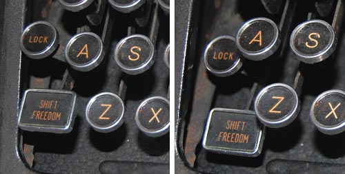
It is interesting to trace the history of this design infamy. Originally, it made a lot of sense: in a mechanical typewriter the Shift keys did just that: they shifted the type mechanism vertically so the type bars would hit the paper with the uppercase letters; and the Shift Lock key would keep the keys locked in this position. This key had to sit right above the Shift key, because it physically latched it in a depressed position; hitting Shift again would release the lock. It was very easy to see (and feel) whether Shift was locked or not, because both keys would be depressed when the lock was engaged. The photos below are from an antiquated Royal typewriter; you can see how the Lock key holds down the Shift key on the right (and note the quaint caption on the latter key – Shift / Freedom, in allusion to releasing the Lock).
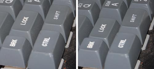
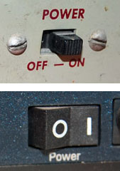
Early computer keyboards carried this idea forward, with a Shift Lock or Caps Lock key that had two physical positions: depressed for Lock, and flush with the other keys when released. You could therefore tell when you were in Caps mode, and would notice immediately if you hit the lock accidentally while touch typing. The delightful Commodore 64 had this feature, among others; the photos show a keyboard that came with the collection of homebrew boards described here, from the late 70s.
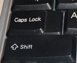
Later, as keyboard makers sacrificed quality for cheap manufacturing, the more complex and different two-state key was replaced with a momentary key like all the others, with electronics to implement toggle action. Gone was the tactile feedback. Now a simple brush of the finger could accidentally lock you in Caps mode. Worse still, the position of the Lock key next to the left Shift key, which made sense a century ago, was retained – placing this relatively little used key right in harm’s way.
I don’t see manufacturers giving us back the 2-position key (it would cost them a few cents, after all), but the least they could do is move this stupid key to the top row, next to the Scroll Lock, where it will remain unused, unnoticed, and harmless.
So, what can we do about this? Well, one thing we can do is disable the offending key. No need to tear it out – I used KeyTweak, a free key remapping utility, to disable it on my Windows XP system. Good riddance!
Also, if you use MS Word, you may be unaware that depressing Shift+F3 repeatedly will change any selected text to lowercase, uppercase, and sentence case; a very useful feature after YOU’VE ACCIDENTALLY HIT sHIFT lOCK AND CONTINUED TYPING.
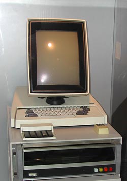 16:10 is a perfect choice if you want to watch movies, which come increasingly in wide formats. However, business notebooks are not intended primarily for this enjoyable purpose. They are meant to do business on, primarily word processing, email, presentations, and the like. And for this purpose, widescreen is totally inadequate. Documents are invariably taller than they are wide, like the paper pages they emulate; even presentation slides have a 4:3 aspect ratio. That’s why the venerable Xerox Alto (at right), sporting the granddaddy of all of today’s Personal Computer interfaces, had a “portrait” form factor screen: because you could process a whole page at once.


Something is wrong with our Notebook LCD screens, part 3
And now, following Parts 1 and 2, here is the last installment…
These days, more and more Notebooks come with displays branded by the makers as VibrantView, or CrystaslBrite, or OptiClear… exciting names indeed. What they all refers to is glossy LCD screens, which would be much better described as GlareMirror, or UglyReflector, or maybe just RazzleDazzle…
Photo source: Marco Wessel, under Creative Commons license.
The underlying idea is to remove the matte anti-glare layer on the older screens, a change which results in better definition and more vibrant colors, plus better outdoors visibility. All commendable attributes, except that the price you pay is a mirror-like surface that reflects windows, light fixtures and other bright objects, a problem that motivated the original matte layer to begin with. Solutions? Work in a totally dark room, or try to yank the screen around until you find a reflection-free angle. Note that the last works for a single viewer – these screens are most annoying when someone shows you something on their screen: maybe they found the glare-free position, but you, looking from the side or over their shoulder, will get the full blast of annoying reflections.
Now if the matte screens were bad – if their colors really sucked, or their focus was totally fuzzy, I can see the possible value of a trade-off; but TFT LCD’s have reached maturity years ago, and are a delight to use. So what got into the vendors’ heads, to throw in the glossy finish – not as a rare option, but as a mainstream technology?