We got this new HP LaserJet M5035 multifunction printer/copier at my workplace that is very sophisticated and capable. It has a high res touch screen that it uses to accept our commands and to tell us what’s going on.
So today it had a fault and advised me to cycle its power, which I did. The printer then went into a boot sequence, complete with whirring sounds and flashing lights, that took long minutes… very long minutes. 🙁
And all through it, its wonderful display screen showed an HP logo growing larger and smaller, larger and smaller… endlessly. Very neat, but didn’t it occur to the designers of this machine that the user would much prefer a simple text message like “Machine warming up… should be ready in X minutes“?
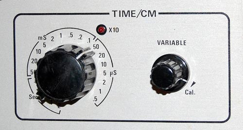
“O knob, thou whose perfect roundness doth . . .”
Nah. A poet I’m not. Still, I would if I could, because the round knob is a fast disappearing species, a trend well worthy of lament.

Throughout the 20th century the round control knob was a mainstay of human interface design for electronic devices. With good reason: it was perfectly suited to humans’ major feature, the opposable thumb. You grasped the knob between that thumb and forefinger and you had superb fine control of the knob’s angular position. If the function called for finer control, you just used a fatter knob. At the machine end of this human/machine interface the knob could rotate a switch, a variable capacitor, or a potentiometer – there were many analog devices back then that lent themselves well to rotary control.
Today most of our input components have gone digital, and are either computer controlled or handled by pushbutton switches. This makes sense in some cases, but there are still many situations when a function is intrinsically analog (say, a volume control on a car radio) yet the designers are making the controls digital (say, by using a pair of + and – pushbuttons). This is pure evil from a human engineering perspective: the round knob is much more intuitive, convenient, and faster to boot. And it really was worthy of the name control: it gave the user a sense of controlling the instrument, instead of fighting it…
I’m sure the electronics driving the volume these days are fully digital, but even so a round knob with some D/A conversion is the correct choice. It must also be more expensive to make, because the radio makers – preferring low cost to user experience – increasingly shy away from it. 🙁
Here is our Toshiba DVD player. It works well enough, but its design does make you wonder…
I’ve already extolled its remote control’s virtues (Not). Well, here is the unit itself. You turn it on with the round button at the right; good enough. Then you look for the Eject button, to open the tray. And you look. And you look??? because it is in the wrong location.

The button is marked in the photo with the red arrow. The point is, that is the last place you’d look for it! It is there to open the disc tray, which is far to the left. You end up reading the button captions – and these are quite tiny and hard to discern, of course – until you find it.
To quantify the extent of this design crime, compare the DVD player with the VCR on which we have it standing. Compare the red and green arrows’ lengths. That’s the difference between Human Centric Design and… whatever it is they did on the DVD unit. See what I mean?

One evening a neighbor knocks on my door. She just got a new cellular phone, and she has a basic question: which key does she press to accept an incoming call?
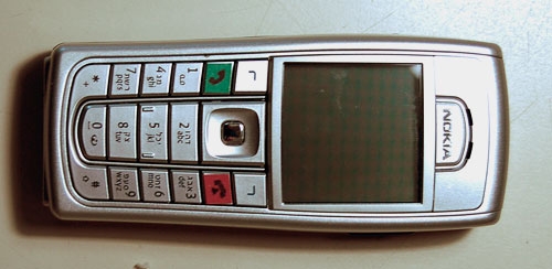
Now this lady is not a youngster, but she’s used cellphones before; surely she must know that you press the key with the green handset image? Well, yes, she knows, but she can’t figure out which key that is. I think, Huh??? … But then I look at her instrument, and I see what she means. What used to be an image of a handset has degenerated into a tiny thin squiggle, similar to other tiny thin squiggles on some other keys. And yes, perhaps she could discern that this squiggle is a bit greenish, especially if she had a magnifier…

The problem is all too visible in the left photo, which is of my own Nokia 6230i: the four keys at the top have identical looking thin marks, and the colors of the bottom two, though red and green, are very hard to discern at a glance (which is the way they should be discerned; especially when you’re driving with the phone in a hands-free cradle). Compare this to the other photo, from a different model. That’s what good human engineering should provide!
So, what can we do about this? If you work at a cellphone manufacturer, by all means have a word or two with your design department… I don’t, so all I could do was fix my own problem. Here is what I did to my Nokia. Problem solved.


