I sent a friend an email with an attached Zip file. It bounced, with a message from “System Administrator” that read
Your message did not reach some or all of the intended recipients.
Subject: xxxxxxxxxxxxxxxx
The following recipient(s) could not be reached: xxxxxxxxxxxxxxx …552 5.7.0 review our attachment guidelines. u14sm9443132gvf.20
I figured maybe the note is from my friend’s system – maybe the file was too large? So I resent it to him to another mail address, with the same outcome. Then it occurred to me to mail the file to myself… long story short, eventually I went to the source of all wisdom – ironically, Google – and discovered that Google Mail, through which I was sending, has a policy forbidding any zip file that contains an executable (which my attachment, quite lawfully, did).
So I sent the file via yousendit, and that was that. But it did occur to me that I would’ve saved a lot of time had Google Mail elected to phrase their bounce message in human-friendly informative terms, such as:
Your message did not reach some or all of the intended recipients.
– – –It was blocked by GMail’l outgoing mail server, because it has a zip attachment containing an executable file. GMail does not allow this. For more info, see http://…..
Not as succinct as u14sm9443132gvf.20, but rather more useful, don’t you think?
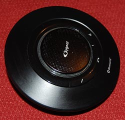 Back to my Sygnet Bluetooth Handsfree Carkit model BTS600. We
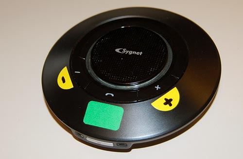

 crew them.
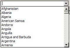 Take the image at right, the list you have to go through to select a country for a new contact in Outlook and other applications: it opens on a list of ten countries, of which one – Argentina – may be even remotely likely to be inhabited by business contacts of yours. You can scroll down, of course… and in the next ten you find even greater concentrations of business partners, like the entry for the
 Everyone knows that the


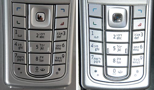
 The third photo shows what happens in lower ambient light. There is an intermediate light level when the transition from dark numerals on bright silver to white backlit numerals on dark silver just evens out, and the numbers become almost invisible. In fact, since the backlight source is localized, different keys reach this point at different light levels; in the photo the “7” is in day mode, the “0” is in night mode, and the 5 is barely visible – just like the oil spot on those old books.
