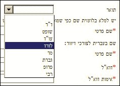
 Here is a screenshot from the form you fill to join the El Al Frequent Flier club. The form has the usual fields (take my word for it, you to whom Hebrew is Greek), but the one that drew my attention is the Title field preceding the first name. This uses a drop-down box, which presents a very comprehensive set of options: there’s Mr and Mrs, There’s Dr, there’s Prof and Rabbi (hey, this is El Al), and there’s even Adv and Judge. But the one highlighted in the screenshot is – get this – Lord.
Which is really amusing… for one, El Al is Israel’s airline and we have no Lords in our system here. Nor do we have a flood of British nobility flying in and out all the time; I’m sure some Lords may fly El Al on occasion, but hardly enough of them to justify such consideration. In any case, if we have Lord, why not Earl, Baron, Marquess, Viscount, or – more useful – a plain generic Sir? And why stop at British noblemen – surely a traveler might be a Graf, or an Alderman, or a Fellow of the Royal Society?
And, while they’re at it, what about Lady?
Recently Elite, a major manufacturer of chocolate, candy and coffee in Israel, launched a campaign to prepare us all for “the same beloved familiar taste in a new packaging”. Every instant coffee can had a sticker heralding the change, then the new cans came out with stickers extolling it.
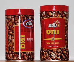 Now actually, the change is minimal and mostly unimportant, as you can see in the photo of the old can (at left) and the new. They have a slightly modified graphic design, but it’s the same good ol’ coffee we’re all addicted to. But there is one change that caught my eye: the new can is noticeably taller. Since both contain 200g of the same powder, you’d think it was also thinner; and in a sense it is, but not at the base; in fact the bottom and top are of identical diameter. The new can, however, has a “waist” in the middle.
 So what? So, canned goods have to be stored, transported, and stocked. They therefore need to be packed close together; ideally you’d want them hexagonal, as the bees had discovered long ago. But even with round cans, you need to try and minimize wasted space. In the home this means minimizing shelf footprint, or base area; you want to be able to put as many of these on a shelf as possible. For shipping and storehouse space you also care about height, of course. But what you really don’t want is to have this sexy curvaceous can that maintains the same footprint but adds height by wasting unusable empty space in the middle.
Oh well, at least they have a new font in their logo.
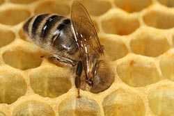
Honeycomb photo source: Richard Bartz, via Wikimedia commons.
Back from NYC… I already reported on the big stuff I saw there; and here is a small but annoying thing I also saw.
My hotel room had a drip coffee maker, a standard item in American hotel rooms (and much better than the old dependence on Room Service). But this one had one unusual feature. Instead of the usual plastic basket that you put a filter bag into, this one had no built in basket. The brew basket came in the filter pack – and was disposable.
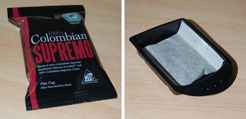
You can see the content of the pack in the photo: the black plastic tray has a hole in the bottom, and you throw it out with the soggy filter bag after one use. The old system with a reusable basket was perfectly good – whatever gave anyone the idea that we need more trash on this planet?!…
And ironically, the packaging has the green “Rainforest Alliance” logo at the top which asserts it is environmentally friendly. Yah right!
My friend Jeff pointed out to me a novel implementation of a coffee-to-go carrying device, in use in a coffeeshop chain in Germany. The assembled device in use is actually less elegant than the usual little tray-with-handle cardboard carriers we’ve had for a long time; in fact you can’t even plop this one down on a tabletop at destination; you have to unload it with care. What makes this one worthy of mention in the elegant design category is a different aspect.
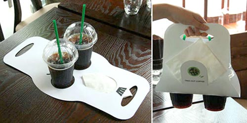
I refer of course to the extreme simplicity of assembly and disassembly – just two folds in a flat piece of cardboard, and you’re good to go; and at destination, if you’re green-minded, you can “disassemble” it by just flattening it out, and store it for future re-use with minimal fuss. The slit for paper napkins is another nice touch…
Sinn-Frei, via Oh Gizmo!
I was at this coffee shop and saw the two machinettas. Of course I didn’t buy one – as coffee lovers, we have all the machinettas we need at home – but I did notice how the pair represents two different solutions to a small but important design bug that the classic machinetta had subjected coffee drinkers to for ages.
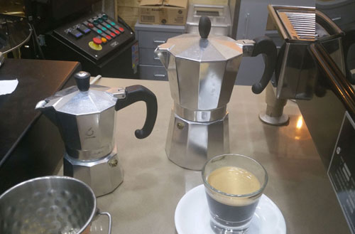
The problem is seen below. The original design from Bialetti, who invented this useful little coffeemaker, had the metal block that the handle is bolted to, marked by the red arrow in this photo. This block was just the right size and place to scald your finger when you grab the handle.
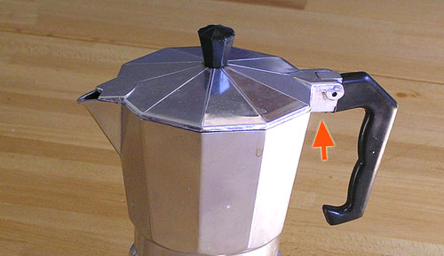
Photo credit: Dan-Martin Hellgren under CC license on Wikimedia Commons.
The two machines I’ve sighted solve this problem in two different ways frequently seen these days: the one at the left below leaves the offending hot block in place but provides a dent in the plastic to keep the finger away from it; the one on the right covers the metal with plastic all the way.
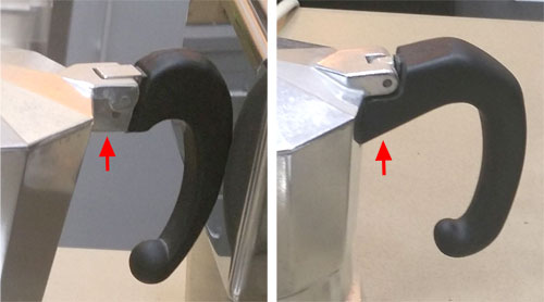
I can’t think how many times I got burned before someone at the factory decided to spare the users this pain…
Was on a United flight enjoying my coffee (such as it was), when I noticed the text on the paper cup.
Nice cup:
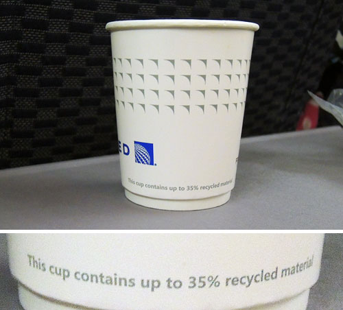
Makes them feel very ecological, no doubt… someone in Marketing must’ve though it a good point to brag about.
Except that it’s completely meaningless, of course. This statement remains true even if the cup contains zero recycled material.
Sigh…
One seldom gives much thought to the humble sugar packet seen in coffee shops (unless one is a sucrologist, at any rate) but there’s an interesting observation related to its design.
A few years ago the age-old form factor of these packets – a rectangle some 7 by 5 cm in size – was supplemented by a new format, a long paper tube about the size of a finger:
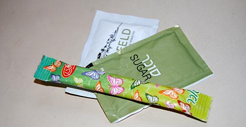
So – which of these is a better form? At first glance, it hardly matters. But actually the new tubular packaging is superior to the old.
Here’s why:
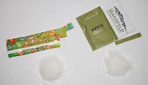
Taken apart and flattened out, you can see that while both packets carry the same 5 grams of sugar, the new form uses about 40% less paper!
This is clearly visible at the right where the two exploded packets overlay each other. Admittedly it’s only a tiny scrap of paper, but multiplied by the volume of packets used around the globe this can save quite a few trees for sure.
Oh, and the tubular packet has a bonus advantage: it can be used, in a pinch, to stir the coffee!
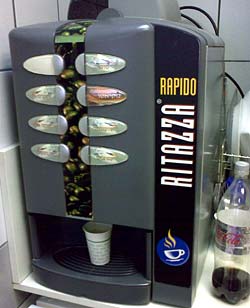 We all know these automatic coffee machines: you place a paper cup under the nozzle, hit a button, and out comes a flow of some sort of coffee or chocolate drink. The machine at right is a good example.
The problem with such manual cup placement is that you risk misaligning the cup to the nozzle hidden in the machine’s innards; that’s why the surface you place the cup on is a grille, to allow any spilled liquid to collect out of sight. The machine in this photo has such a grille, elegantly formed into an ellipse. But it has a glaring design flaw…
Below you see two such grilles from two other machines. Both have a circle showing you the target, the optimal location to place your cup in; one even has the targets for either one or two cups.
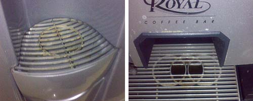
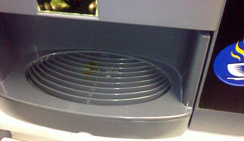
But the machine shown at the top of this post has no such target – or rather, it does have a tagret arrangement of sorts – concentric ellipses – which has nothing to do with where to place a cup. And indeed, when I snapped it it had a nice coffee stain to show for this design oversight…
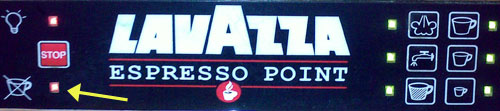
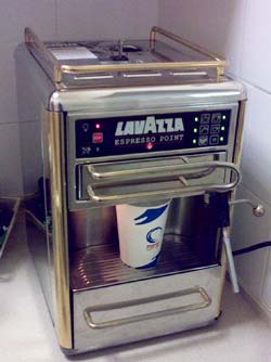 I was visiting an office where they had one of these delightful Espresso machines, an Espresso Point by Lavazza, and tried to make me a cup.
I put in a paper cup and a coffee cartridge, pushed the button at the right of the panel next to the size I wanted, and instead of that steaming coffee, I got a blinking red light at the left (marked below with an arrow).
I tried to puzzle the meaning of this light. It had the icon you see, with a coffee cup and an X. What did it mean? Obviously in a large beverage dispensing machine it would stand for “I’m out of cups”; but this machine did not store cups. It might mean “You forgot to put in the cup” – only I hadn’t. What else? “Smash a cup before I agree to make coffee”?
After much futile experimentation a local came and said “Oh, the machine is out of water”, and she proceeded to pour some in at the top. I could finally enjoy my coffee.
But what a stupid design choice… the cup with the X has no relation to missing water; and indeed, the fact that the cup looks identical to those in the icons at the right side of the panel only reinforces the mis-interpretation.
Shame on you, Lavazza designers!
These days vendors have become masters of trivial warnings, as seen in coffee cups that warn us their content is hot, and countless other examples. Recently I ran into an amusing case.

The little piggy is yet another form of the classic kitchen timer. What makes it interesting is the inscription on its base: “Not dishwasher safe” – in two languages too, not to take any chances.
I suppose there may actually exist people silly enough to try and dunk this along with the dishes… it’s a large planet. Still…

