The photographic camera is one of the great inventions of the 19th century, and is quite a simple idea: take a light sensitive surface, put a lens in front of it, add the ability to control exposure time and aperture, and you’re all set. And for more than a century, that’s what cameras were all about. But not anymore.
During my life I’ve owned maybe a dozen cameras. The first (discounting a plastic Kodak Brownie I had as a child) was a Kowa SE SLR (Single Lens Reflex) I had in my teens. The latest is this Canon EOS 800D I recently bought. Both Japanese; both relatively inexpensive entry-level SLRs. But there the difference ends.
Both cameras have a light sensitive surface (film in the first, CCD in the latter), a lens, and controllable exposure time and aperture.
However:
- The Kowa allowed you manage this setup with 8 physical controls (including the film advance lever), and its instruction manual was 26 pages long.
- The Canon provides 27 physical controls and 14 screenfuls of menus (most of them with sub-menus), and its manual is 486 pages long.
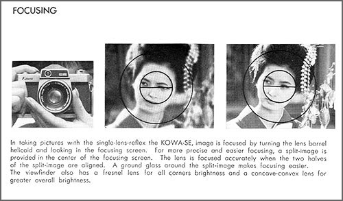
- The instruction manual of the Kowa devotes one page to focusing, where it says things like:
Image is focused by turning the lens barrel helicoid and looking in the focusing screen. For more precise and easier focusing, a split-image is provided in the center of the focusing screen. The lens is focused accurately when the two halves of the split-image are aligned.
- The instruction manual of the Canon devotes 24 pages to focusing, and says things like:
In [7:Auto AF pt sel.:Color Tracking] under [4: Custom Functions (C.Fn)], you can set whether to perform AF by tracking colors. If [1:Disable] is set, focus is achieved based only on AF information (p.393).
Now, let me be clear: I am no luddite, and I realize that the modern camera has many advantages. Many of them are nice-to-haves, but some are significant, like shooting video and the vibration-cancelling lens, both unthinkable back in the day. And I’m sure today’s lenses, being computer-designed, are much better in terms of reducing optical aberrations. When I got this new camera I was full of admiration for the triumph of innovation and miniaturization it represents.
And then I started using it, and I realized that this triumph involves such a huge degree of overkill that the user experience is severely impacted.
Consider:
- Having countless options leads to the “embarras de choix”, the mental information overload from too many choices.
- A camera is for taking photos. Many of the features of this Canon camera are actually post-processing best left for Photoshop, where they can be done in the comfort of a large screen UI optimized for the task.
- Most features in this camera will never be used by the average user (remember, it’s an entry level camera; someone who really needs to “disable AF by tracking colors” – and who is willing to flip to page 393 of a manual to figure this out – would buy a more expensive professional camera).
But most importantly: the experience of shooting with that Kowa SE was far superior, because although you could only control three parameters (focus, aperture and shutter speed), you had direct control over them. You twisted the focus ring around the lens, and you had immediate feedback by seeing that split image come together into focus. You set your aperture and shutter speed, peeking at the light-meter needle in the viewfinder, and you knew exactly what effect that would have, because there weren’t dozens of other parameters being tweaked behind your back by algorithms in the camera’s “brain” – it had no brain, so you had to use yours. In fact you learned to use it well, because with a film camera any error would only be discovered days or weeks later when the prints were developed.
Incidentally, the Kowa SE was not my best SLR – in the 1980s I owned a Minolta X700 film camera. This had 17 physical controls and a manual of 62 pages, and was at about the sweet spot in the features vs usability equation. It had added the automatic exposure mode that today’s cameras have, which was useful at times, but not being computerized, it was still a straightforward camera. And it had the split-image focusing screen that was effective and fun to use.
And then came Digital cameras, bless them, and the creeping featurism that today allows me to shoot images made to look like watercolor paintings, or like low-quality toy camera photographs. And a zillion other things (see pages 129–165, 311–337, and 426 – or whatever).
Oh well…