Category: Bad design

Instances of bad design

The degradation of the clothespin

The humble clothespin is a ubiquitous item that has been with us for generations; and it is simple enough that you’d think it’s reached the point if utmost reliability. And yet, it seems that it is in fact very unreliable: clothespins break, they fall apart, they need constant replenishing… but I seemed to remember that long ago, when the world was young (well, at least when I was), this wasn’t the case.

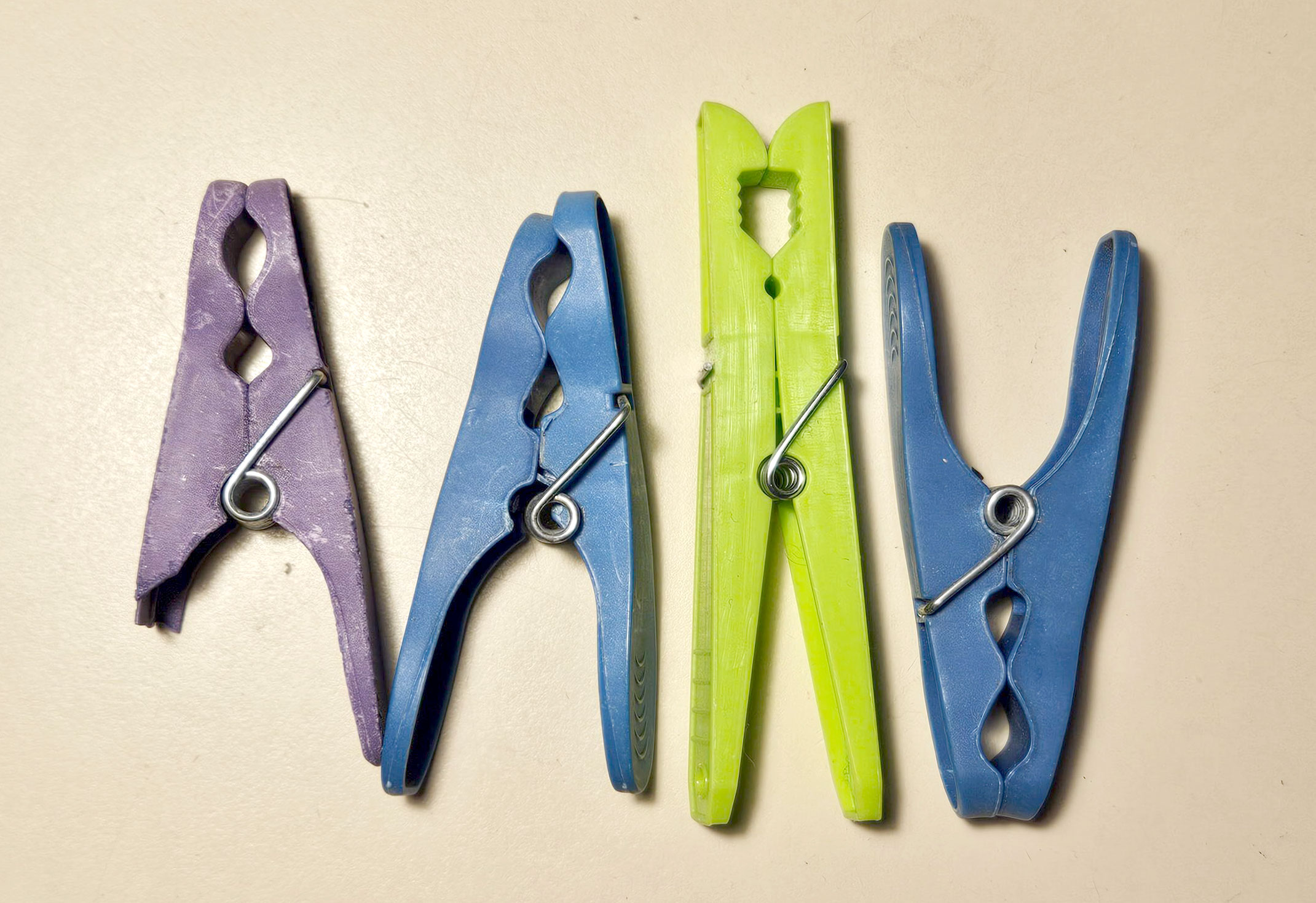
The clothespins we have these days are usually made of plastic, and are all variations on the “two prongs, a fulcrum and a coil spring” design invented in 1887 (thus says Wikipedia). But the plastic used today (unlike the wood of my childhood) is deformable and breakable. Here are some I picked from our clotheslines:

Plastic clothespins

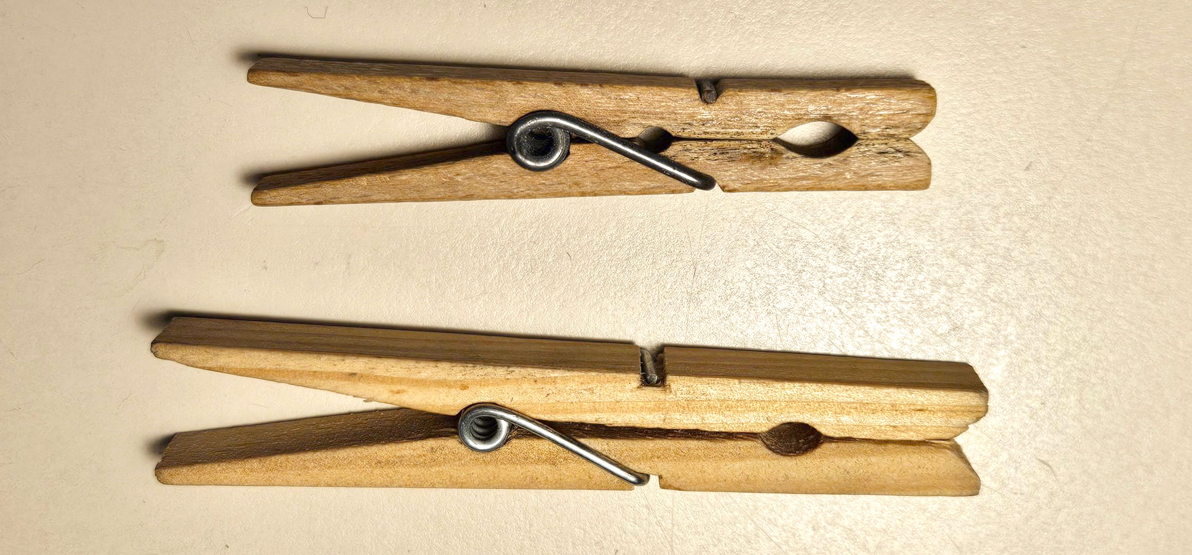
Imagine my delight when I found in some shop a set of wooden clothespins hailing (like everything else these days) from China! I bought them right away, and we put them to use — only to discover that they don’t break but they do snap apart. We use these alongside the plastic ones, since both types are equally bad.

21st century wooden clothespin

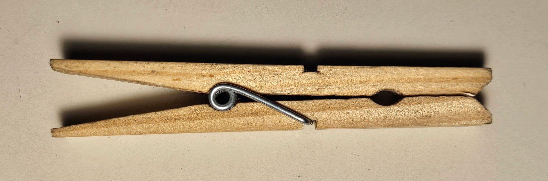
And then I serendipitously found a wooden clothespin that I’ve had in one of my drawers of old technology and everyday items (yes, I collect those too). This one goes back at least 50 years. I hurried to compare it to its modern counterpart.

Here you see the two items, the shorter being the older one.

Wooden clothespins from the mid-20th and 21st centuries

And here is what I found in the comparison:

  • The old clothespin has a thicker metal wire in its spring, making for a stronger grip force. Indeed, you can feel the difference when pinching the tails against the spring (even at the same distance from the fulcrum).
  • The old pin has a shorter jaw, making for better leverage of the (already stronger) spring’s force.
  • The old pin has a more precise and more elaborate pattern (in side view), giving a better grip for the spring’s coil and for the clothesline.
  • in the old pin the spring ends sit tight in a fitted semicircular groove and cover the width of the wooden prong; in the new one the groove is square and too wide, and the metal is some 2/3 the width of the prong.
Wooden clothespins from the mid-20th and 21st centuries

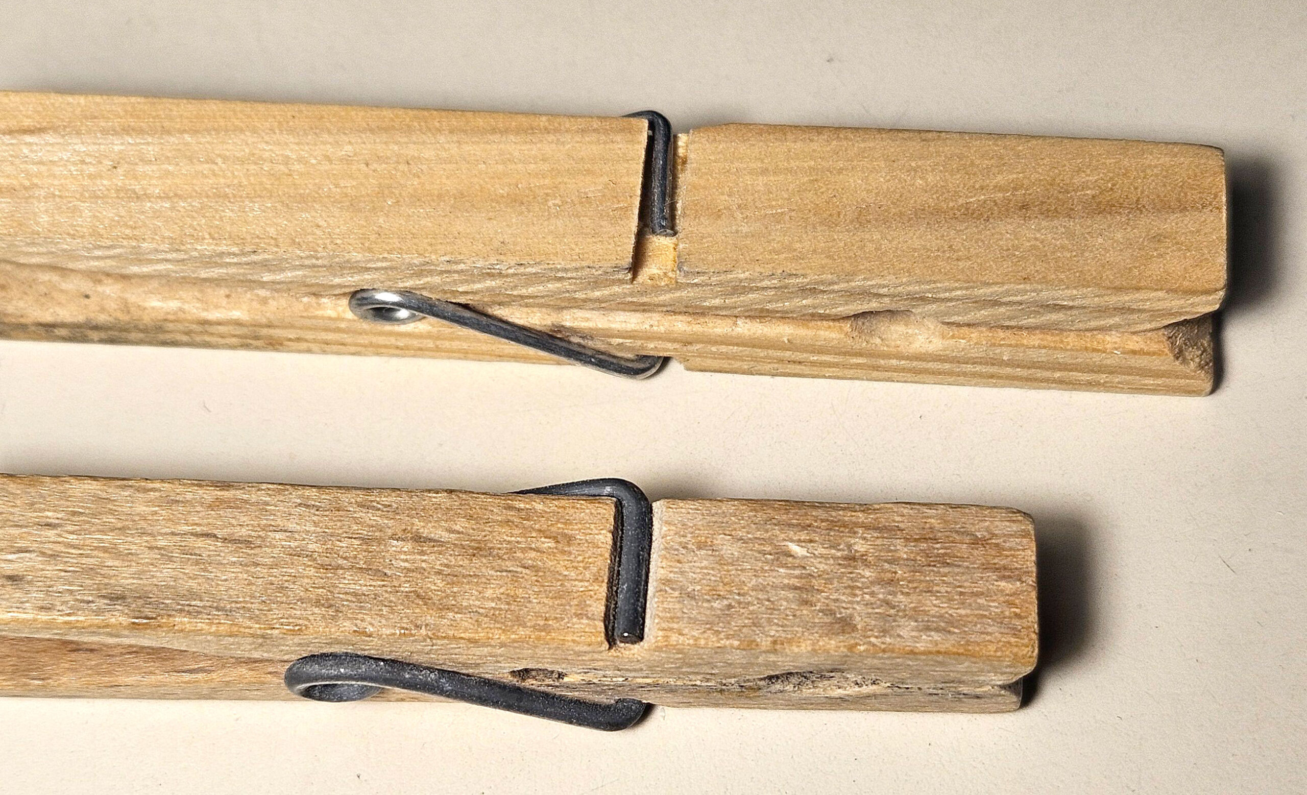
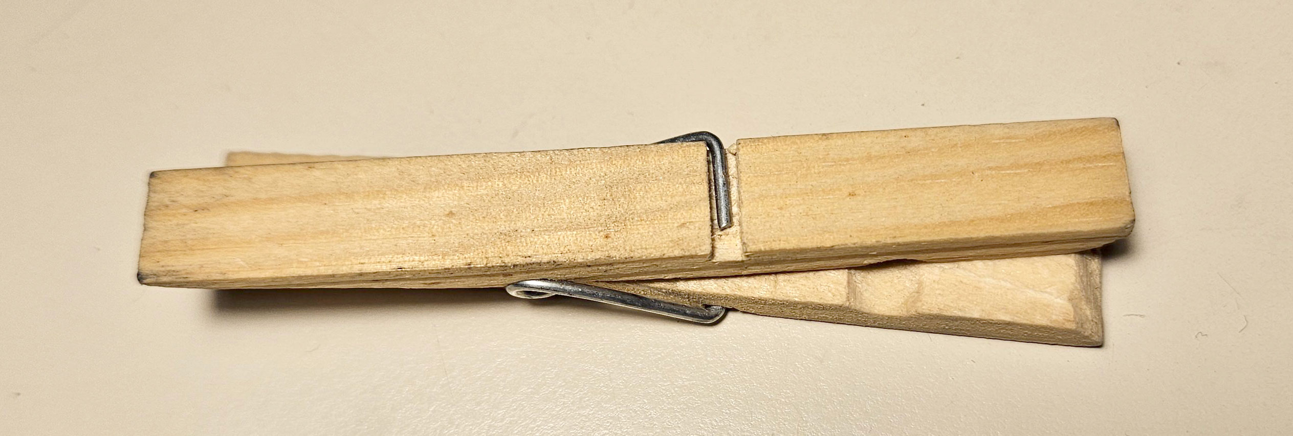
The last point turns out to be the reason the Chinese clothespin falls apart so easily: it is very easy to twist the two prongs apart as in the photo below, since the loose wire ends don’t resist this action.

21st century wooden clothespin

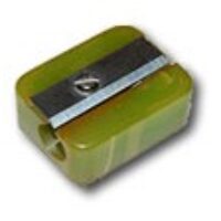
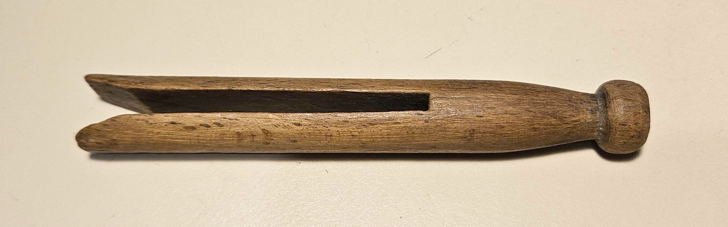
Lastly, here is an alternative design from earlier in the 19th century: the one piece clothes peg (also called a Dolly peg). This one has no spring, can’t fall apart, and is sturdy enough to resist a lot of use. I found this one at a flea market long ago.

19th century dolly pin

So how do all these variants fare in their single task, gripping cloth onto a clothesline? I tested them by attaching a damp rag to a line and trying to pull it down forcibly. I found that all the new pins – be they plastic or wood – did not hold: the cloth would pull out from under them. The two older wooden ones, however, held fast. Since they cover the two designs — the dolly peg and the springed one — it is clearly not that the springed design is inferior; it’s all in the implementation, the choice of materials, dimensions, spring strength… the small details that always differentiate quality products from trashy ones.

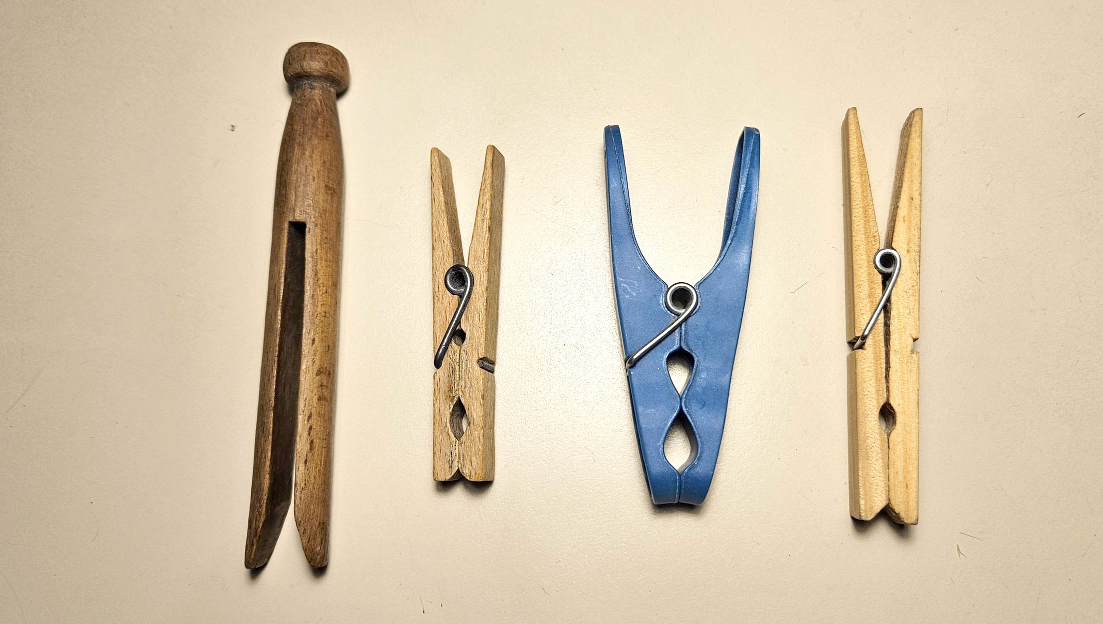
So – here are 200 years of clothespins in historical order from left to right… and clearly, their durability and performance have only gone down over time. If there’s a lesson there, surely it’s a sad one…

Clothespins from the past two centuries

Form, function and confusion

See this water tap.

Water tap - closed

Now when you want to turn it on, what do you do? What I did, is grab the handle and try to turn it anti clockwise, around its vertical axis. And nothing happened, it refused to budge.

Here’s how you turn the water on with this tap:

Water tap - open

You see,  it has one of the modern mechanisms where you raise the handle, rather than rotate it.

Nothing wrong with that, but in this case the design sends a conflicting and confusing message, for two reasons: first, the handle definitely looks (when in the off position)  like it’s supposed to rotate; and second, the ornate brass look suggests the vintage design paradigm, from before the modern form came in.

Confusing!    🙁


Go ahead, confuse us all!

Here are two boxes of vitamins I take, separated by a few months in production time, newer version on the right.

Quantum multivitamins

Same product, one change:

Quantum multivitamins

The original version is marked “Age 50+“, denoting the people it’s optimized for: those aged 50 and above (“+”).

The new version is marked “SLVR+“. After some thought I figured “SLVR” may stand for Silver, meaning people with gray hair. Of course this renders the “+” unnecessary and confusing.

Bottom line: some marketroid had a stupid idea to take a perfectly clear caption and make it confusing as hell.

Bad, bad marketroid!


Bad, bad UI design!

Here is a screenshot from my Lenovo ThinkPad computer. The computer was running a self-test using the incorporated Lenovo utility, and I tried to abort this test by exiting that utility.

And then I got this dialog box:

Dialog box of a Lenovo utility

Read it carefully:

If you continue, all the tasks … will be canceled. Are you sure?

And you have two buttons to choose from:

YES    [Which means Yes — I’m sure, do exit]

or

NO, EXIT    [Which means I’m not sure, do not exit].

Obviously the second button is intended to mean “Exit this dialog, not the utility” — but this is confusing as hell, since exiting the dialog and exiting the utility are opposite actions.

Would it kill them to use a simple “CANCEL” on the second button?

Slide rules for a new century

The Tavernier-Gravet company was France’s premier scientific instrument maker at the end of the 19th century, and it stayed abreast of the latest developments in slide rule design and production when it entered the 20th century. In this this new article on my History-of–Computing site I illustrate some of their problems and solutions as they transitioned into the new century.

Tavernier-Gravet Slide Rules

Three Controllers – and their Grandpa!

A few years ago I sighted on eBay a set of three German circular slide rules of the Controller brand. There was a big one, 20 cm in diameter; a midsized one 11 cm across; and a small one at 7.5 cm. They all looked pretty much the same except for their sizes, and this reminded me of those three bears in the Goldilocks story — a thought that amused me enough to push me into buying them. So now I had a Father Controller, a Mother Controller, and a Baby Controller.Three Controller circular slide rules
Actually this type of slide rule is fairly common, and is often seen on eBay. But then, one day, I saw an auction for what can only be described as Grandfather Controller: a truly large slide rule 30 cm across, and still identical in design to the Three others. This one is anything but common; in fact I’ve never seen anything like it, nor can I find any mention of it on the web. Naturally, I added it to my collection post haste, and now there were four!

Four Controller circular slide rules

Read the full article about this mysterious giant Controller on my HOC web site.

Solving the machinetta’s bug

I was at this coffee shop and saw the two machinettas. Of course I didn’t buy one – as coffee lovers, we have all the machinettas we need at home – but I did notice how the pair represents two different  solutions to a small but important design bug that the classic machinetta had subjected coffee drinkers to for ages.

Macinettas

The problem is seen below. The original design from Bialetti, who invented this useful little coffeemaker, had the metal block that the handle is bolted to, marked by the red arrow in this photo. This block was just the right size and place to scald your finger when you grab the handle.

Machinetta - bad design

Photo credit: Dan-Martin Hellgren under CC license on Wikimedia Commons.

The two machines I’ve sighted solve this problem in two different ways frequently seen these days: the one at the left below leaves the offending hot block in place but provides a dent in the plastic to keep the finger away from it; the one on the right covers the metal with plastic all the way.

Machinetta handles

I can’t think how many times I got burned before someone at the factory decided to spare the users this pain…

Mind the footprints!

An important element of everyday product design that is all too often ignored is the footprint of an object.

I mean, look at these two electric kettles, which are very common kitchen appliances. They serve the exact same purpose; they use the exact same technology; they have the same water capacity.

Electric Kettles

But there’s a big difference: the one on the right has a sensible, compact cylindrical form. The one on the left, by Kennedy, flares at top and bottom, so its footprint – the counter-top area it requires – is some 45% grater than for the Graetz kettle beside it. Kitchen counters can never have too much free area; the designers at the Kennedy company have wasted some of that area for no good reason at all, simply to show off their “artistic originality”.

I see this cavalier attitude to footprint in many products, and it always annoys me… why can’t these people think of their users?


Russian Roulette!

Clearly marking tool and instrument controls is always a good idea, but it becomes vital where safety is at stake. And if there is one control where safety is definitely at stake, it is the safety catch!

Like this one, on a rechargeable jig saw from Taiwan:

Jigsaw with unmarked safety lock

See the switch clearly marked “Safety Lock”? Very informative… but there is not a hint as to which position is the locked one. There is a picture that may try to indicate this, but it is quite ambiguous.

So – this is really a weird implementation of Russian Roulette. But hey, at least it’s rechargeable…

The ancients had it right

These days the preference for shoddy, cheap, use-and-discard products is all over the place. Here is an example:

Street sign

This sorry street sign in Jerusalem has taken on a very “artistic” look – because it is made from a blue layer of stick-on plastic sheet over a metal plate. Over time the plastic started to shrink and curl, with this amusing result.

And it occurs to me that the ancients who lived in our city had a better method. Take this stone, which was part of the temple enclosure parapet in the second temple period (around the time of Christ). It too carries a Hebrew inscription, identifying the location of “the house of trumpeting” – the location where the priest stood who blew the ram horn to announce the entry of the Sabbath.

The house of trumpeting inscription, Temple mount, Jerusalem

This stone took a big fall when the Romans destroyed the temple, but the lettering on it is crisp and legible after two millennia.

Sigh…


Copyright © 2025 Commonsense Design

Theme by Anders NorenUp ↑