Tag: User Experience

Bad, bad UI design!

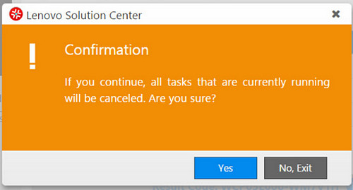
Here is a screenshot from my Lenovo ThinkPad computer. The computer was running a self-test using the incorporated Lenovo utility, and I tried to abort this test by exiting that utility.

And then I got this dialog box:

Dialog box of a Lenovo utility

Read it carefully:

If you continue, all the tasks … will be canceled. Are you sure?

And you have two buttons to choose from:

YES    [Which means Yes — I’m sure, do exit]

or

NO, EXIT    [Which means I’m not sure, do not exit].

Obviously the second button is intended to mean “Exit this dialog, not the utility” — but this is confusing as hell, since exiting the dialog and exiting the utility are opposite actions.

Would it kill them to use a simple “CANCEL” on the second button?

Creeping featurism: SLR cameras, yesterday and today

Page from Kowa SE camera manual

The photographic camera is one of the great inventions of the 19th century, and is quite a simple idea: take  a light sensitive surface, put a lens in front of it, add the ability to control exposure time and aperture, and you’re all set. And for more than a century, that’s what cameras were all about. But not anymore.

During my life I’ve owned maybe a dozen cameras. The first (discounting a plastic Kodak Brownie I had as a child) was a Kowa SE SLR (Single Lens Reflex) I had in my teens. The latest is this Canon EOS 800D I recently bought. Both Japanese; both relatively inexpensive entry-level SLRs. But there the difference ends.

Both cameras have a light sensitive surface (film in the first, CCD in the latter), a lens, and controllable exposure time and aperture.

However:

  • The Kowa allowed you manage this setup with 8 physical controls (including the film advance lever), and its instruction manual was 26 pages long.
  • The Canon provides 27 physical controls and 14 screenfuls of menus (most of them with sub-menus), and its manual is 486 pages long.
  • The instruction manual of the Kowa devotes one page to focusing, where it says things like:

Image is focused by turning the lens barrel helicoid and looking in the focusing screen. For more precise and easier focusing, a split-image is provided in the center of the focusing screen. The lens is focused accurately when the two halves of the split-image are aligned.

  • The instruction manual of the Canon devotes 24 pages to focusing, and says things like:

In [7:Auto AF pt sel.:Color Tracking] under [4: Custom Functions (C.Fn)], you can set whether to perform AF by tracking colors. If [1:Disable] is set, focus is achieved based only on AF information (p.393).

Now, let me be clear: I am no luddite, and I realize that the modern camera has many advantages. Many of them are nice-to-haves, but some are significant, like shooting video and the vibration-cancelling lens, both unthinkable back in the day. And I’m sure today’s lenses, being computer-designed, are much better in terms of reducing optical aberrations. When I got this new camera I was full of admiration for the triumph of innovation and miniaturization it represents.

And then I started using it, and I realized that this triumph involves such a huge degree of overkill that the user experience is severely impacted.

Consider:

  • Having countless options leads to the “embarras de choix”, the mental information overload from too many choices.
  • A camera is for taking photos. Many of the features of this Canon camera are actually post-processing best left for Photoshop, where they can be done in the comfort of a large screen UI optimized for the task.
  • Most features in this camera will never be used by the average user (remember, it’s an entry level camera; someone who really needs to “disable AF by tracking colors” – and who is willing to flip to page 393 of a manual to figure this out – would buy a more expensive professional camera).

But most importantly: the experience of shooting with that Kowa SE was far superior, because although you could only control three parameters (focus, aperture and shutter speed), you  had direct control over them. You twisted the focus ring around the lens, and you had immediate feedback by seeing that split image come together into focus. You set your aperture and shutter speed, peeking at the light-meter needle in the viewfinder, and you knew exactly what effect that would have, because there weren’t dozens of other parameters being tweaked behind your back by algorithms in the camera’s “brain” – it had no brain, so you had to use yours. In fact you learned to use it well, because with a film camera any error would only be discovered days or weeks later when the prints were developed.

Incidentally, the Kowa SE was not my best SLR – in the 1980s I owned a Minolta X700 film camera. This had 17 physical controls  and a manual of 62 pages, and was at about the sweet spot in the features vs usability equation. It had added the automatic exposure mode that today’s cameras have, which was useful at times, but not being computerized, it was still a straightforward camera. And it had the split-image focusing screen that was effective and fun to use.

And then came Digital cameras, bless them, and the creeping featurism that today allows me to shoot images made to look like watercolor paintings, or like low-quality toy camera photographs. And a zillion other things (see pages 129–165, 311–337, and 426 – or whatever).

Oh well…

A truly uncool armrest design

Back from vacation, having flown a Boeing 737. This lacked the personalized screens seen in longer haul craft but it had a headset jack and a set of volume and channel controls for each passenger. The controls were set in the armrest, in easy reach of the passenger, like this:

Boeing B-737 armrest audio controls

Cool, huh?

Not cool. The two rocker switches for the volume control and channel selector are flush with the surface of the armrest. This means that if you rest your arm on the thing – or if your neighbor in the next seat does – your channel is bound to skip up or down every few minutes. If you watch a movie this can get truly aggravating.

And all they had to do was recess the controls a couple of millimeters under the surface…

Android vs. Palm: the lost art of keeping it simple

Back then we had the Palm Pilot. It had a gray lo-res screen and minimal capabilities. No wireless, no GPS, no games, just basic PDA funcfions. Compared to the android phone I use now it was like a stone ax. And yet, that old Palm had a key attribute that is long lost: simplicity of use.

Palm PilotA prime example: the “EDIT” button. Take the common task of modifying a memo or appointment. In Android, you have to open the item, and then hit EDIT to enter a mode where you can make your changes. And when you’re done you hit SAVE. Makes sense? Not really. In PalmOS you opened the item and just started typing. Edit mode and View mode were one and the same. Just like a sheet of paper: you can read it and you can write on it as you wish.

It may look like simple matter, but all those extra clicks do add up and clutter the user experience; what’s more, they detract from elegance – that intangible element which calls for keeping it simple!

Only a smile

I wrote before about the impact of a cheerful nature on the customer service experience. Well – here is another example.

We were visiting the Museum für Naturkunde in Berlin (recommended! A 200 year old Natural History museum, like the one at Dublin I wrote about once, but artfully modernized and with some really big dinosaurs thrown in!)  It being in winter, we obviously headed first for the cloakroom where we dumped a few kilograms of insulation; and we started on the task of deciphering a sign on the wall  to figure the fee we’d have to pay.

At which point the young lady at the counter, perceiving our linguistic struggle, said to us in English: “It costs only a smile!” …  and she proceeded to illustrate with a charming one of her own, invoking a return in kind.

What a lovely welcome!

One key to great customer support

This morning my notebook’s battery died an ignominious death, and I had to hurriedly procure a new one. Not a good start for the day.

I called the vendor’s customer support center, and plodded through the Interactive Voice Response (IVR) menu, fully expecting a harrowing experience. Instead, I was routed to a service rep who gave me the information I needed (well, it was not rocket science after all) but did it in a manner that completely undid the bad mood I was in. It’s hard to put a finger on it, but she was cheerful, confident, friendly, and really conveyed the feeling that she was proud to be able to solve my problem, and solve it fast. Basically this woman was transmitting good service vibes, and the positive mood was contagious.

I suppose it goes to this particular rep’s character and style, but the difference from service reps I usually talk to anywhere was impressive. The others were polite (or not) and doing a job; this one was enjoying it. What a difference this can make in the user experience!

Let’s add Interrupt capability to customer support systems

I’m sure this happened to you: you call the support number of your bank/phone company/whatever, go patiently through all the Interactive Voice Response (IVR) menus, get shunted to an “all agents are currently busy” music, waste long minutes listening, and finally get a human to talk to. You explain your request, and the agent politely says “Let me put you on hold while I find out the information”. Before you can protest, you’re back on the music!

Which goes on and on, and you have no idea whether the agent is really digging up the information, or he had a heart attack, or he simply forgot about you… the music just drones on. Doubt starts gnawing: should you hang up and start over? Maybe he’s just seconds from picking the line again? Anguish, anger, and unhappiness fill you. And if you’re in the middle of some bank transaction you don’t want to abort, and you have a meeting starting in 3 minutes, you really need to ask the agent what’s going on – but he’s just out of your reach. This is definitely not a good customer experience.

So, what can we do about this? What is needed is a protocol we used to have when I was an amateur radio operator. Back then, people would speak in turn on the radio waves: …AB1CC, this is XY7ZZ, over! Roger XY7ZZ, this is AB1CC… But we had a mechanism for getting a word in sideways if something urgent came up, say another ham with an emergency communication: you could wait for a pause between words and say “Break-break!” and the talking party would shut up and listen. We had an Interrupt capability.

This capability is what we need in those service desks: a mechanism – say, some key sequence on the phone – that would cause the line to go back from hold to the agent that parked it there. Even the knowledge that you could, if you wanted to, get the agent back and ask how much longer is he going to take – would make you feel a lot better, much less helpless and frustrated.

Take note, my dear bank – give us back some control!

IVR woes: good idea – poor execution

I was trying to reach the customer service of a company just now. There I was, listening to the endless music of an IVR system, punctuated by the usual happy reminders that I am oh-so-appreciated by them and they’ll get to me real soon (liars!), when something happened. The recording declared that they were very busy so if I could leave my name and number they’ll get back to me. No option to keep waiting.

To their credit, the next step was done professionally – the IVR had me state my name, then key in my phone number, then confirm it when it read it back to me – so I have good reason to believe they will really get back to me. Which is actually better than the silly music. So giving me this way out is a good idea.

The bad part is, if they knew they were busy (and, assuming it’s a FIFO queue, they had the necessary information – my place in line – as soon as they picked up my call) – why wait for long minutes of stupid music before switching to the leave-your-name-and-number routine? They’re giving the customer the combined worst of both solutions!

Standardization of charge indicators (Not!)

These days we all have at least half a dozen gadgets whose batteries require charging, and they each come with their own charger (incompatible with all the others, of course). Now, I won’t push for standardizing the chargers – can’t aim that high – but here is a more modest goal: can we please standardize the status indicator LEDs on them?

Nikon camera battery chargers

Here are two chargers that came with my two Nikon cameras, the old point and shoot and the newer DSLR. No, they are not interchangeable, even though the batteries are both Li-Ion and of the same voltage. Both have a LED indicator that blinks during charging and stops blinking when done; however, in one it stays lit when there’s no battery inserted, and in the other it stays unlit.

Nikon D40 battery charger closeupBut the bigger problem is remembering what’s what when you come back later and the light is stable. You see, in these, this means charge complete; but in my cordless shaver it means that it isn’t; there, blinking indicates a full charge. Different vendor, and they probably just flip a coin at design time…

My own solution was documenting it all on a post-it note stuck near these chargers; but then Nikon must have realized that this is an issue, because in the later camera – my D40 DSLR – they labeled the charger itself to remove any doubt. Good move!

No, I don’t know anyone in the Ashmore Islands!

Two of the least pleasant-to-use GUI controls are the scrollable list box and its cousin the drop-down list, especially when they have many items listed. Of course, that’s exactly when they are indispensable… you can’t use radio buttons for 50 choices, so if you need to let the user choose a state of the union, a drop down list is inevitable. Likewise for countries of the world, or for their currencies.

But the way these geographic-oriented controls are implemented in software and web sites is really annoying.

Drop-down List of countriesTake the image at right, the list you have to go through to select a country for a new contact in Outlook and other applications: it opens on a list of ten countries, of which one – Argentina – may be even remotely likely to be inhabited by business contacts of yours. You can scroll down, of course… and in the next ten you find even greater concentrations of business partners, like the entry for the Ashmore and Cartier Islands, which are a group of small uninhabited tropical islands in the Indian Ocean!

Not that I have anything against the inhabitants of Ocean islands, or of Angola, Antigua, or Anguilla, but given the statistics, why should I have to scroll past them – and past Cook Islands, and Namibia, and Nauru, and Palmyra Atoll, for that matter – on my way to find the US, or the UK, where I really have many more contacts and affairs?

Or look at the next screen grab, from a web site for computing currency exchange rates. Do I really need to have Equatorial Guinea’s CFA Franc, the Eritrean Nakfa, and the Ethiopian Birr pushing down the Euro and the US Dollar farther away from the British Pound, just because of the accident of alphabetic order?

List Box of currencies

Obviously, the people of Estonia do care about the Kroon (and I care about the Israeli Shekel, also far from the heart of global finances). But what is needed is a list that gives the most common choices – the Dollar, the Pound, the Euro – by default at the top of the list, where 99% of users will benefit. And then we need personalization, so each of us in the rest of the world can put their country, or those they deal with, at the very top.

This can be done in many ways. One’s home country can be extracted from Windows Regional settings and put up front. Web sites may use cookies to remember which currencies you converted last time. Local software tools can keep my choices in the Windows registry. Smarter tools may learn from your past choices and bump them up the list in future. The techniques exist; it’s just that someone should step out of the silly box and dump the alphabetic order in favor of what makes users more productive and less annoyed!

Copyright © 2024 Commonsense Design

Theme by Anders NorenUp ↑