Tag: Handheld

One comment on the Samsung vs. Apple litigation

Now, I hate litigation, and like many would rather have companies focus on innovating for the greater good; also, I happen to like Android a lot. Nevertheless, I think many criticizers of Apple in its recent victory over Samsung are missing a key point.

The argument goes, Apple sued Samsung for producing smartphones that are rectangular and with rounded corners – how lame is that?!

iPhone

Yes, that is lame. But Apple also sued about many other alleged infringements, including the application in a handheld device of multi-touch gesture input – the now ubiquitous  “pinch to zoom, flick to scroll” kind of user interface that we all love. And that is a whole different story – one that is hardly lame…

I remember well my first encounter with an iPhone. I remember the feeling of wonder, the ecstasy of experiencing this incredible UI paradigm. It was a  revelation, a true revolution, on a par with the first appearance of the mouse-based WIMP interface (which, as an ironic aside, Apple seems to have copied from Xerox for the Lisa and Macintosh computers in the early 80s). It was pure innovation, and with it Apple enabled the very concepts of Mobility and Computing that we all benefit from today.

And that is what Samsung – and Android – had taken from Apple. The overall concept, the basic paradigm, that the iPhone embodies. And yes, I too would have preferred that Apple adopt a more open mind about sharing their technology, but that is not my choice to make.  Until they do, let no one say that they’re a bunch of spoiled, un-innovative, litigious whiners suing about the rectangle with round corners. I really think we all do owe them more respect than that!
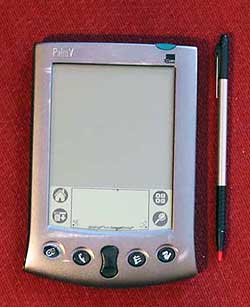
Photo credit: William Hook under CC license on flickr.

Android vs. Palm: the lost art of keeping it simple

Back then we had the Palm Pilot. It had a gray lo-res screen and minimal capabilities. No wireless, no GPS, no games, just basic PDA funcfions. Compared to the android phone I use now it was like a stone ax. And yet, that old Palm had a key attribute that is long lost: simplicity of use.

Palm PilotA prime example: the “EDIT” button. Take the common task of modifying a memo or appointment. In Android, you have to open the item, and then hit EDIT to enter a mode where you can make your changes. And when you’re done you hit SAVE. Makes sense? Not really. In PalmOS you opened the item and just started typing. Edit mode and View mode were one and the same. Just like a sheet of paper: you can read it and you can write on it as you wish.

It may look like simple matter, but all those extra clicks do add up and clutter the user experience; what’s more, they detract from elegance – that intangible element which calls for keeping it simple!

Apple World Domination: the iPhone Refrigerator

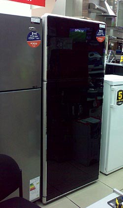
Amcor A7BC refrigeratorApple Computer’s incredibly talented design team has had a major influence on the design of contemporary mobile electronics: just visit a cellular phone store and you’ll see how all the companies are scrambling to copy the iPhone’s sleek look and feel, both the hardware and the software.

Well, apparently this influence goes beyond mobile devices. Today I was at a home appliance store, and to my amazement I saw the apparition in this photo. It is, clearly, a refrigerator; but its front looks exactly like an iPhone, from the black glass of the doors to the brushed metal band around them.

Apple is certainly not stopping at dominating the cellphone and computer markets. One must wonder what will come next? iPhone-like cars? Or maybe iPad-like Buildings? 🙂

Polaroid photography is back from the dead!

I recently saw  the movie Memento, whose protagonist had his ability to form long term memory destroyed by a brain trauma. The guy remembers his early life but any new memory fades in minutes. Unfazed, since he is out on a mission of vengeance, he compensates by writing notes to his future self on scraps of paper and as tattoos on his body; and when he meets a person he takes out his Polaroid camera, produces a photo, and – before he forgets – writes on its back notes like “Don’t believe his lies” or “He’s the one. Kill him!”

It’s a fascinating movie, and makes you think a good deal about issues of memory, mind, and self; one other thought that came to me was that if he’d been doing it today, the hero would be at a loss – because Polaroid instant photography gear production died with a whimper last year, a victim to Digital Cameras.

Apart from amnesiac vigilantes, the demise of Polaroid cameras was a loss to us all. Sure, digital cameras are great, and have added many fascinating usage models to our life (think snapping a shot on a cellphone and sending it to a friend in a jiffy), but crowding with the friends you snapped around a tiny LCD screen is a far cry from the excitement of passing a high-resolution hardcopy photo around…

Polaroid PoGo cameraSo I was delighted to see here the news of the Polaroid PoGo 5 Megapixel camera. Going with “if you can’t beat them, join them”, Polaroid is releasing this month a digital camera that produces instant color prints on its patented ZINK paper. I doubt that this will become widely used – for one thing, it’s bound to be rather expensive – but at least the instant usage model will be available to those who need it, or who just enjoy the fun. And there’s a kind of justice in it being Polaroid corporation that is making this heir to its past flagship product…

The confused calendar of my E71

Here then is my sleek Nokia E71, and I really like it overall. But nobody’s perfect, right?…

Nokia E71 smartphoneTake the calendar application that came on this handheld. It has a number of shortcomings (more on these later) and one amusing quirk: most of the time when you click the calendar button it displays an empty screen with the phrase (no entries) at the center. Then, less than a second later, the actual entries for the day (in my hectic life, alas, there are always entries…) show up.
Obviously there are two routines involved, one to query the database for entries, the other to display “no entries” if there are none. It would take a minute to code it so the second routine would wait for the first to complete before shooting its big mouth off… and it would take the most rudimentary QA to discover this issue.

Sloppy!

Standardization of charge indicators (Not!)

These days we all have at least half a dozen gadgets whose batteries require charging, and they each come with their own charger (incompatible with all the others, of course). Now, I won’t push for standardizing the chargers – can’t aim that high – but here is a more modest goal: can we please standardize the status indicator LEDs on them?

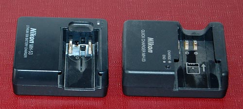
Nikon camera battery chargers

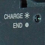
Here are two chargers that came with my two Nikon cameras, the old point and shoot and the newer DSLR. No, they are not interchangeable, even though the batteries are both Li-Ion and of the same voltage. Both have a LED indicator that blinks during charging and stops blinking when done; however, in one it stays lit when there’s no battery inserted, and in the other it stays unlit.

Nikon D40 battery charger closeupBut the bigger problem is remembering what’s what when you come back later and the light is stable. You see, in these, this means charge complete; but in my cordless shaver it means that it isn’t; there, blinking indicates a full charge. Different vendor, and they probably just flip a coin at design time…
My own solution was documenting it all on a post-it note stuck near these chargers; but then Nikon must have realized that this is an issue, because in the later camera – my D40 DSLR – they labeled the charger itself to remove any doubt. Good move!

Nokia E71: 40 years of progress in handheld devices

I just got me a Nokia E71 smartphone. It looks like a particularly well-constructed gadget, though I reserve judgment until I’ve used it a while – stay tuned!

However, I can already share one observation: the incredible amount of technology crammed into this tiny device. A few years ago we’d marvel at its slimness if it were only a cellphone; but it isn’t only a cellphone. It’s a cellphone, and it’s a PDA, and it’s a GPS, and it’s an MP3 player, and it’s a video player, and it’s a recorder, and it’s a radio, and it’s a web browser, and it has bluetooth, and it has WiFi, and it has Infrared, and…

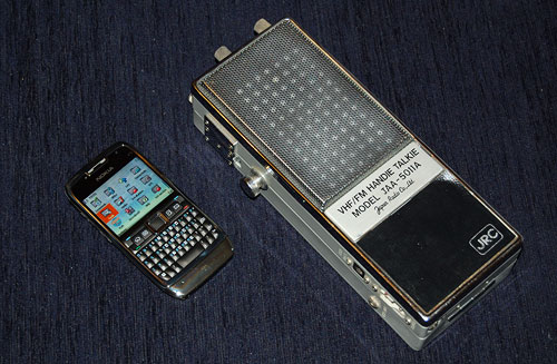
Nokia E71 smartphone and JRC VHF transceiver

You get the idea: this device has everything under the sun, and it’s still tiny. So for comparison, I present it here next to another 2-way communication device, a VHF transceiver made by the Japan Radio Co., Ltd., sometime in the sixties. I won this at a raffle in the annual meeting of the Israel Amateur Radio Club in the early seventies; and at the time I had to get a special license for it, it was such a big deal. It was also considered very miniaturized, since it used transistors and could be held in the hand – just like the Nokia beside it; however, this JRC was not a PDA, and it wasn’t a GPS, and it wasn’t an MP3 player, and it wasn’t a video player, and it wasn’t a recorder, and it wasn’t a radio, and it wasn’t…

You get the idea: back then it was all they could do to pack a radio transmitter and receiver into this 9 inch long box; today, the sky is the limit. And so, one can safely state, we’ve come a long way… and I can’t help but think that, with all respect to Kubla Khan and his stately pleasure dome, it is Nokia’s engineers who should be credited for giving us a miracle of rare device !

Where have all the cradles gone?

In the early years, when portable electronic devices were considered wonderful miracles of technology, they used to come equipped with cradles. These would at a minimum charge them – the case with the “dumb” cellular phones of the day – and later also provide cabled connectivity to a computer, as in the early Palm Pilots. The cradles were meticulously designed to be functional as well as good looking; I remember a cellphone I had that had a two-slot cradle – one for the phone, the other for charging a spare battery. And it was indeed utterly convenient to plop or push the device into the cradle before bedtime and forget it until the next morning.

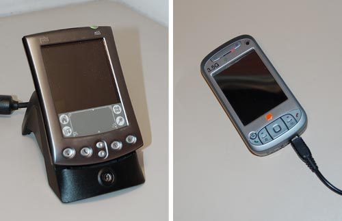
So where have all these cradles gone? These days, even the smartest devices charge through one cable and connect through another; connecting a cable is no major problem, but it is still less comfortable than dropping a device into a slot, and it leaves the device flopping about on one’s desk with much less dignity than the cradle afforded. Some manufacturers do make cradles as accessories, or you can get them from third party manufacturers, but they are much less common today.

Palm PDA in a Cradle and HTC smartphone with a charger's cable

Of course, a cradle is less portable; when I had my Palm V I had to buy a separate “travel kit” that replaced the cradle with a cable and plug arrangement. But when I would return home from a trip I’d be greeted by the more permanent arrangement, hooked up to my notebook’s docking station.

I was never certain whether the cradles of yesteryear were eliminated to reduce manufacturing costs, or because users preferred the flimsier cable system. What is your view on this choice?

Backlit cellphone keys – not such a good idea!

Have you had the experience, as a child, of discovering the optical properties of oiled paper?

I remember it well… I was an avid reader as a kid, and when a smudge of oil from some snack would get onto my books I’d notice that the translucent oily spot that looked darker than the paper would become lighter when you held the page up to the light. Before long it occurred to me that if the shade of oiled paper can go from darker to lighter as you raised the page, there must exist an intermediate position where the spot would become invisible as its shade became identical to the dry paper’s. Sure enough, so there was!

We met the hard to read keyboard on my Nokia 6230i before. Well, apparently the keyboard designers at Nokia were also trying to emulate the oil/paper experiment from my childhood…

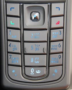
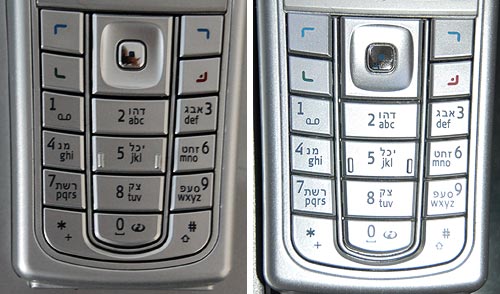
Nokia 6230i keys in daylight

Like many handheld devices these days, the keyboard on this phone is backlit. The numbers are translucent, and a strong white light can shine through. Seemingly a great idea, for night time use. Now in bright daylight this works fairly well. The backlight gets washed out in the sunlight and although the transparent digits are of a lower contrast than a black ink would have provided, you can see them well in dark gray on silver (since the keys are silver and reflect ambient light in unpredictable ways, the contrast admittedly varies, as seen in the photos; I’ve already commented on the advisability of plain black on white for optimal viewing). But once evening starts to fall…

Nokia 6230i backlit keys in low ambient lightThe third photo shows what happens in lower ambient light. There is an intermediate light level when the transition from dark numerals on bright silver to white backlit numerals on dark silver just evens out, and the numbers become almost invisible. In fact, since the backlight source is localized, different keys reach this point at different light levels; in the photo the “7” is in day mode, the “0” is in night mode, and the 5 is barely visible – just like the oil spot on those old books.

Now imagine trying to distinguish these keys while driving, with the phone in a hands-free cradle, where you can’t touch-type and you need your attention on the road.

So, what can we do about this? Well, we could prefer black keys with white digits – then the day and night contrast would be the same so there would be no crossover point of invisibility. Another good idea (which I recall seeing on some devices) is to make the backlight come on only in truly low light conditions. And of course, we should test the devices we buy in all situations, not just in the bright showroom where we normally make buying decisions…

Copyright © 2024 Commonsense Design

Theme by Anders NorenUp ↑