Tag: Automotive

A really poor choice for a freeway logo…

The Menachem Begin expressway is one of the better engineering projects built in Jerusalem in recent years, providing a rapid path for driving across much of the new city. It has cut my commute time to work by 70%…

Begin Expressway, Jerusalem

Image: Adiel lo, via Wikimedia Commons.

There is only one minor detail about it that I always find amusing yet annoying. The builders picked a logo for it, which is prominently displayed on the signs leading to it. And here it is on the left.

Begin Expressway Logo     Freeway Sign

Now, at first glance it seems highly appropriate for an expressway, showing lanes and an interchange. But when you look closely, you notice:

  1. The symbol is pretty tangled, like a knot really. Hardly the image of a freeway, where the main concept is that you zip right through. The standard freeway road sign, at the right, does a far better job of conveying this idea.
  2. There is no way to travel this path on a freeway interchange. At first I thought you might do it in the UK, where they drive on the wrong side of the road, but even that is not true – there, the road on the logo would cause cars coming from both directions to collide in the middle of the bridge.

What were they thinking!? 🙂

The tachometer – the most useless car component…

Modern car dashboards have numerous indicators and controls. Some are necessary: without a fuel gauge, for instance, we’d be in frequent trouble. Others are optional but quite useful: the rear collision warning beeper is a good recent arrival. But one indicator is totally unnecessary, yet present in a great many car models: the Tachometer, or engine RPM indicator.

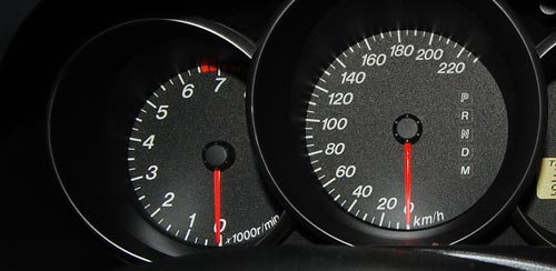
Car Tachometer and Speedometer

This meter is very impressive, to be sure, and on a race car would be quite useful to help the driver wring the ultimate performance without destroying the engine. But this meter, at left in the photo, is not from a Formula 1 car; it’s from my faithful but mundane Mazda 3, with which I navigate the congested roads daily to get to work. You think I constantly glance at the tachometer to set the gears so my engine’s not redlining, when I’m stuck in traffic jams half the time? Even if I were so inclined, this car has an automatic transmission!

Fact is, nobody uses this indicator on a family car; yet the manufacturers put them in – adding just a little bit extra to the waste of energy and resources needed to produce the car. I suspect this is another of the cases where fashion, vanity and marketing get together to override commonsense design – we get this meter because it looks flashy, fashionable, macho… hey, I have an RPM gauge like the race track pros!

Millions made – none needed 🙁

The other side of those Road Reflectors

We all know the raised reflector buttons on the lane divider lines of a freeway. They have white or yellow retroreflectors embedded in their edges, so that at night they shine right back at you in the light of your car’s headlamps. Safety and beauty in the same simple device.

But what many may not realize is that they have another design feature, also safety related, and far more ingenious. At least in some freeways – California’s, for sure – the buttons’ other edge – the one facing away from oncoming traffic – has red reflectors in it. Why put reflectors on the side you never shine a light on, the side you can’t even see?

Precisely because of the one circumstance when one would be seeing it: when they drive on the freeway in the wrong direction, having entered via the off ramp instead of the on ramp by some colossal mistake – think DUI, for instance. Now you have a drunken driver going in the wrong direction at night; traffic is sparse, but any moment disaster may strike unless this fool notices his mistake. And now those reflectors return the investment – for this driver will see long lines of red lights shining ahead to infinity; so unusual as to immediately alert him that something is wrong.

And if, like me, you never did that, you can still see the effect if you drive facing straight into the sun when it is low in the sky; you can then see the red reflectors, shining back the in the sunlight, in your rear view mirror!

Automatic car window controls

Electric car windows have become the norm these days; and one feature on them is “Auto”, where you can open or close a window all the way with only a momentary push on the actuator button. A useful feature, too.

What I find strange is the stinginess with which this feature is applied. In most cars, you only get it on the driver’s window, sometimes only for opening it. My Mazda 3 is of the rare few that have two-way (open and close) Auto on the driver’s switches for all 4 windows. Why is this useful? because it allows you to close all windows when you leave the car with two 2-finger clicks!

Speaking of which, we could use a “close all windows” button – a very useful function that I have yet to see on any car (I did see cars where the windows close automatically when you lock the car, but that can be a safety issue, I suppose).

A brush with Ford’s Human Machine Interface (HMI)

We rented a Ford Galaxy minivan for a day. Nice car, if you need the space. And such sophisticated controls… way too sophisticated for its own good, or for its users’, if you ask me.

Ford is very proud of its latest Human Machine Interface:

Human Machine Interface (HMI) -An upgraded instrument cluster plus a new steering wheel including toggle switches … take vehicle ergonomics to a new level. …
HMI is standard on all Ford S-MAX and Galaxy models. It is simple and intuitive to operate. It follows strict, straightforward and logical rules and combines critical areas of ergonomic development to optimize the interaction of the driver with the comfort and entertainment systems. …
The system enables a controlled dialogue between the driver and various support systems – radio, navigation system, Adaptive Cruise Control, and mobile phone.

Ford Galaxy minivan

So, my experience as a new user (remember, “intuitive” means a new user can figure it out without recourse to a manual): I wanted to zero the trip kilometer counter readout. After looking in vain for the standard push-rod near the odometer, I tried the 5-button toggle pad on the steering wheel hub, which turned out to control a multi-level menu system that eventually – after drilling maybe 3 levels down – let me clear the readout (not before forcing me through an ‘are you sure?’ confirmation). Pushing a standard button while driving is one thing; operating a complex multi-step interface, one which is different from car to car, is as silly as it is unsafe. I haven’t located the cruise control submenu, but the standard buttons on the wheel would certainly have been faster to use…

I suspect I may have figured it out wrong, and maybe there is a faster way to achieve this result via a different sub-menu. But then, I’m an experienced technologist; if I couldn’t do better at first try, your average driver would likely have done worse.

Another case in point: in this car, if you switch on the turn signal and change your mind, clicking the lever back to the center position will leave the signal on for 2-3 extra cycles. Not sure whether this is due to some ill-conceived “strict, straightforward and logical rule” the Ford designers applied, or whether the car’s computer is so busy doing other feats (polling the trip counter reset action?…) to respond faster. Either way, we were better off when the lever simply actuated a switch that directly controlled the blinking lamp.

Take note, Ford: you make excellent cars – please keep them simple to use!

Photo source: Wikimedia commons

Communicative alarms

I already shared my animosity towards car alarms. Since these are not going away anytime soon, the question becomes, how can we improve them to reduce the pain they cause the general populace? Same thing for house burglar alarms, that have the tendency to trigger – rigthly or wrongly – when the owner is on vacation in Hawaii…

The key problem is that when one of these monstrosities starts wailing, there is no one to call. Some house alarms have a sign indicating a security company that is in charge; in these cases you can try their number. But a sensible general solution would be to require all alarms to bear a “here’s what you can do to get me to shut up” indication. A name and cellular number of the owner would be a good starting point; a second, backup contact number would be useful as well. This is a matter for legislators; serious fines on owners of alarms failing to share this information would be useful. Until then, people can do it on a volunteer basis…

Car parts designed to smash up, take II

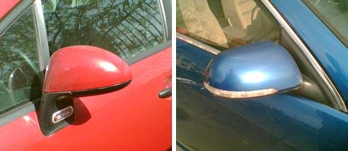
We saw how Our car had a turn indicator lamp in the side trim, where it was vulnerable to damage. Even more interesting is the turn signal on some newer cars, which is put on the most smash-worthy part of any automobile: the side rear view mirror. And not at the base of the mirror like in this red Citroen C4; but at its outer edge, as in this blue Mercedes!

They used to speak of “Planned obsolescence”; looks like today’s automakers are unwilling to wait for their parts to wear out, so now they’re actively soliciting breakage by design…

Side mirrors with turn signals

Intelligent freeway signage

In recent years the freeway system in Israel is applying some pretty good leading edge technology (including truly transparent wireless toll collection that is still missing in many countries I visit).

One interesting system can be seen in the Ayalon highway in Tel Aviv. This road has electronic signs that give precise real time information of the driving conditions ahead, including which lanes are jammed and how fast the traffic moves (when it does). Perhaps most impressive are the signs that give a taste of the despair lying ahead, as in “Traffic jammed through La Guardia exit”… not that there’s much you can do about it, admittedly, but at least you know!…

Ayalon Highway in Tel Aviv

Photo: Wikimedia commons.

Of course, behind this capability lies a network of sensors and cameras, and an expert system that integrates them and recommends to the human operator at the road’s control center what messages to send to the signs (I thought the system was entirely automatic, but actually it does give a human final override). The information on the signs and the video from the cameras are also accessible on the Internet: the traffic flow conditions are updated every few minutes, and you can click the camera icons to see the real time video stream – and mouse over the “i” icons to see what text appears on each sign.

Mazda 3 evolution, take 1: Sometimes they listen!

Recently I replaced my old Mazda 3 with the new model. The two are practically identical – why mess with a good thing? it’s a fine car! – but there are some minor differences, and I’ll be blogging them now and then… they afford us a peek into the design team’s thinking processes.

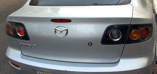
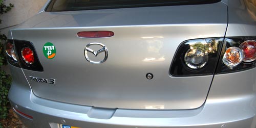
Here is the trunk door on the previous model. The problem is, it is not spring loaded; to open it you had to press the lock button and then claw it open by trying to pry up the bottom edge, which is a tight fit to the bumper below it (on most cars the door at least has some depression, perhaps for the license plate, where you can grasp it; this door is smooth and lacks any such grab point).

Old Mazda 3 trunk door

Quite annoying, and a lovely bit of poor usability. In fact, I saw one of these cars on the road whose enterprising owner had screwed a handle – from a kitchen drawer, by the looks of it – onto this door!

So here is the same door on the new model. Same door – one key difference: now there is a depression in the bumper to allow you to grasp the door.

New Mazda 3 trunk door

People must have been complaining – and the design team at Mazda had been listening. Better late than never!

Mini, Maxi, Silly

As a conscientious techie I do what many car owners don’t: I chCoolant reservoireck the oil and other fluids in our cars once a month, rain or shine. But our latest car, the 2007 Renault Clio, seems determined to foil this good intention.
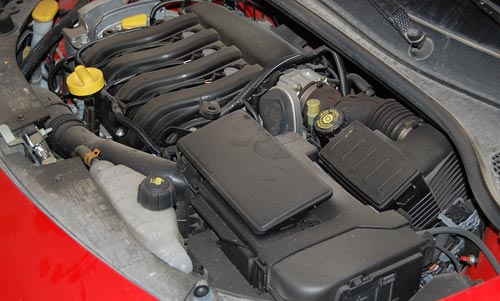
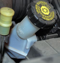
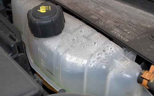
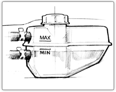
It used to be simple: A fluid would either have a straight dipstick with marks for Max and Min, or a clear reservoir with lines marking these two limit levels. The new Clio, however, abuses these age old concepts.

Renault Clio 2007 Engine compartmentRenault Clio 2007 Brake fluid reservoir

Like most modern cars its engine compartment is as densely packed with systems as an animal’s belly is with entrails; and the clear reservoirs for coolant and brake fluid are so positioned that there is no way on earth you can see all the level lines without either a dentist’s mirror or X-Ray vision. You can see the Maxi lines, but the Minis are hopelessly hidden (see photos).

As Obelix would’ve said: Ils sont fous, ces ingenieurs!

Renault Clio 2007 coolant reservoir

Copyright © 2024 Commonsense Design

Theme by Anders NorenUp ↑