Category: Bad design

Instances of bad design

Paying all over again: non-transferable accessories

I upgraded recently to a Lenovo Thinkpad T61, from an IBM T42. Good road warrior that I am, I had the T42 accessoried to the hilt, notably with a bunch of extra batteries to last me through the long flights across the Atlantic. Since the new machine was also a Thinkpad, you’d think I would simply reuse the accessories in the new machine, right?…

Thinkpad Batteries

Wrong. The power supply can’t be used because it has a different output voltage – you can’t argue with that. The 3M privacy screen can’t be used because the screen’s a different size – fair enough. But the batteries?!!ThinkpadBatteries2

The batteries are very similar, but their plugs differ. Intentionally.

Look at the photos to compare the Bay Batteries of the two machines; exactly the same dimensions, same voltage too… but the plug is just different enough to prevent reuse. Hard not to harbor cynical thoughts about the reason…  🙁

Whatever happened to black ink?

When Johannes Gutenberg gave us the printing press in the 15th century, he also invented a suitable ink to go along with it. His ink was a glossy black, and the idea of printing books in black on white paper has remained ever since, because that is by definition the highest contrast you can get, hence easy to read. Millions of books have appeared since Gutenberg, spanning a huge range of subjects and world views, but they did not differ in ink color one bit as the centuries came and went.

Lately, however, I notice a worrying trend as I browse the shelves in the bookstores I frequent. A small but growing number of books are published in all sorts of smart-aleck color schemes. Ignoring the ones on colored paper – where the color schemes are intentionally artsy – we see books in gray ink, blue ink, brownish ink, all on white paper. And not just a sidebar or special page; the entire book is printed this way, as if the publisher said to himself “Hmmm… how can I improve the reading experience? Ah! Let’s use a lower contrast ink than we might. Sure, gray ink may cost more than the standard black, but what’s a little money compared to the pleasure of giving my readers eye strain headaches?”

Bad, bad idea. Give us books in good old black on white!

Fighting back against shrieking car alarms

A particularly heinous bit of bad product design are ear-shattering car alarms.

The underlying thought was good, I’m sure: let’s make the car raise an unholy racket when someone messes with it, and we’ll put a stop to car theft! Of course, this failed miserably, both because of high false alarm rates and because in the case of a true alert most bystanders will prefer to mind their own business rather than confront a possibly violent thief. In fact the New York City Police Department claims that car alarms actually contribute to making the crime problem worse; and every urban dweller is familiar with their harm to quality of life in the city (for more data, see this report).

Now, car alarms come in many forms, and not all are harmful to our sanity; there are silent alternatives that will alert the owner wirelessly without raising a ruckus; there are immobilizer devices that can prevent theft in various ways; and so on. But many manufacturers still use the useless, maddening audible alarms, and a few design ones that will not shut themselves down after a minute or two – the designers of these deserve to be drawn and quartered…

So, what can we do about this? As a society we can certainly do much, if only we’d try (Terroncito has some interesting thoughts on this). I can tell you what I did. I used to have a car with a particularly nervous alarm, which got in the habit of treating my neighbors to minute-long blasts a few times a week. I tried to have it fixed, but to no avail. So I called my insurance agent, whose policy insisted I have this option in the car. I told him either the alarm goes, or his customer goes. Guess what – the insurance company wouldn’t budge, but the agent, after some diligent search, found another who was willing to accept a silent immobilizer. End of problem.

Remember: you can, and should, refuse to be told by some insurance company to torture your neighbors!

Smartphone Holsters can stop time!

I got this new Smartphone recently. A couple of weeks later, I find my analog quartz watch is off by five minutes. I take it to have the battery replaced; a week later, same problem: it’s a few minutes out of whack. I send it to be repaired (it’s a good quality Seiko under warranty), and switch to an El Cheapo spare watch I have, which at first seems to work fine; but in a few days, it’s also off. I try another watch – Swiss, this time – same problem duly appears after a while.

Then it hit me: these malfunctions started only after I switched phones. So I thought, maybe the device emits some radio waves that mess with the watches’ electronics? A few tests of draping the watch on the Smartphone overnight (Hey, I’m a physicist, ain’t I?) ruled this out.

PDA holster with magnets in flap

And then, I realized what was going on. The new phone came with a beautiful leather holster. This held the device horizontally on my belt at the left of my body, and closed it with a wide flap that snapped into position with an assertive magnetic click (which has a very nice feel, I must say). It was the magnet all along. This was easier to prove than I thought – hold an analog watch next to the flap, and its second hand stops immediately. With my left wrist brushing the holster randomly, you can see what was happening.

So, what can we do about this? As users, we can switch to non-magnetic pouches, ones with a zipper or Velcro closure; or we can move the device to the non-watch side of the belt. But as pouch designers, we can actually do a lot. The offending holster was designed with two magnets in the flap and two in the body, four in all, and the top ones right at the surface of the holster where the watch could touch it. Other pouches I see around have the magnet in the body, and the outer flap has a passive iron counterpart; thus, in the bad design the outside surface is magnetic (you can snap a screwdriver to it!); the better design is neutral on the surface. Take note, designers!

Alternative holsters

Don’t forget the Remote Control’s usability!

When you see an ad for a piece of consumer electronics, you seldom see a close up of its remote control. In fact, most people ignore the lowly R/C when making a buying decision. Yet this little item is the main way we interact with our TVs, VCRs, and so on; and a its usability, or lack thereof, is going to impact our user experience many times every day.

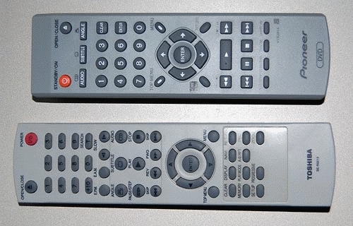
Remote control usability comparison
Look at these two R/C units, from two similarly priced DVD players, one mine, one my parents’. See the difference? In the one at the top the important buttons – play, FF, Rew and Stop – are prominent, visible, obvious… in the other, they are hidden among a confusing jumble of similar small buttons. And this means slower operation and frequent errors when you hit the wrong button by accident. We can assume the two arrangements cost exactly the same to manufacture; this is not about cost, it’s about attention to usability in the design stage.

So, of course, the better one is mine, because I always check this when making a buying decision? Well… err…

The ultimate clarity

Adding clear instructions is part of good product design, right?

So: I went to get a flu shot (I still get the flu each winter, but maybe I’d be getting it twice without this?) As the nurse prepared her syringe, I noticed a cardboard box of disposable vinyl gloves on her table. On the side of this box was a printed statement, which I copied verbatim:

“Intended use: A medical glove is worn on the hand of health care and similar personnel to prevent contamination between health care personnel and the patient’s body, fluids, or environment. This glove also serves for non-medical purpose usage”.

I was so relieved that the manufacturer had had the foresight to instruct the nurse in these enlightening facts. Who knows, without this instruction she might have assumed the gloves had to be stuffed up my nose or something?

Clear instructions are good. Superfluous ones are silly. I don’t trust silly vendors…

Can’t they hire ONE Englishman to proof their manuals?

Everyone’s had their laughs with instruction manuals written in Engrish; indeed, they can get quite hilarious. What bugs me, though, is the fact that these are seen not only in low quality products from second-rate or nameless producers. I can understand how a product that costs a couple of bucks would not have a manual written to the editorial standards of the Britannica… but what about leading vendors that produce expensive, top-quality consumer products?

I mean, look at the note below, which came as an insert in the instruction manual of my Lenovo Thinkpad docking station. That’s from the vendor IBM passed its notebook business to. And they tell us their product is “for use only”? And “not portable device”?

Lenovo manual insert

These are serious people, heaven knows. They make incredibly sophisticated machines that I’m proud to use. They have a company that is the fourth largest personal computer maker in the world, with 19,000 employees – so can’t they hire one single English speaker among them, to proof read their manual copy? Or do it remotely with someone living in the West, who’d get the copy in the mail and edit out the more blatant errors in a matter of hours? (Make me an offer, Lenovo guys!)

Invisible buttonware

One evening a neighbor knocks on my door. She just got a new cellular phone, and she has a basic question: which key does she press to accept an incoming call?

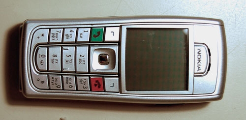
Now this lady is not a youngster, but she’s used cellphones before; surely she must know that you press the key with the green handset image? Well, yes, she knows, but she can’t figure out which key that is. I think, Huh??? … But then I look at her instrument, and I see what she means. What used to be an image of a handset has degenerated into a tiny thin squiggle, similar to other tiny thin squiggles on some other keys. And yes, perhaps she could discern that this squiggle is a bit greenish, especially if she had a magnifier…

Cellular phone key comparison

The problem is all too visible in the left photo, which is of my own Nokia 6230i: the four keys at the top have identical looking thin marks, and the colors of the bottom two, though red and green, are very hard to discern at a glance (which is the way they should be discerned; especially when you’re driving with the phone in a hands-free cradle). Compare this to the other photo, from a different model. That’s what good human engineering should provide!

So, what can we do about this? If you work at a cellphone manufacturer, by all means have a word or two with your design department… I don’t, so all I could do was fix my own problem. Here is what I did to my Nokia. Problem solved.

Nokia cellphone with stickers

Copyright © 2024 Commonsense Design

Theme by Anders NorenUp ↑