Author: Nathan Zeldes

http://www.nzeldes.com

Retrograde evolution of Post-it note packaging

Everyone uses the 3M Post-it note, and it’s often used as an example of the role of serendipity in product development – and of the wisdom of maintaining a corporate culture that encourages and empowers the pursuit of such serendipity.

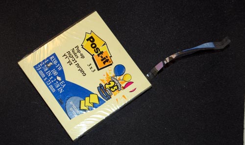
But the Post-it note story has another interesting lesson, and it has to do with the degradation of the design of its packaging. The original version of the ubiquitous 100-note packet was wrapped in cellophane, with the highly original trick that you could open it by grabbing the packet with two hands on opposite sides, and cracking the cellophane open with a single rapid twist, rotating the two ends in opposing directions. This was by design; in fact, I recall it said so explicitly on the packet. It was the fastest, easiest way to open a cellophane wrapping that I ever saw; and whenever I did the little twist I felt a twinge of admiration for its designer (and perhaps a bit of triumphant gloating over the cellophane, a wrapping material noted for its unfriendliness – think “CD Jewel Case”).

3M Post-it note package

So guess what? A few years ago 3M did away with this method. Now they provide the usual thin strip whose end you need to pry loose and pull. Sure, it’s no big deal; but the new method is more complicated to manufacture, slightly harder to use, and, above all, is less elegant .

I’m disappointed in 3M: when you got a good thing, you shouldn’t mess with it. But if you must mess with it, can’t you go forward, not backward, in simplicity and functionality?

Fighting back against shrieking car alarms

A particularly heinous bit of bad product design are ear-shattering car alarms.

The underlying thought was good, I’m sure: let’s make the car raise an unholy racket when someone messes with it, and we’ll put a stop to car theft! Of course, this failed miserably, both because of high false alarm rates and because in the case of a true alert most bystanders will prefer to mind their own business rather than confront a possibly violent thief. In fact the New York City Police Department claims that car alarms actually contribute to making the crime problem worse; and every urban dweller is familiar with their harm to quality of life in the city (for more data, see this report).

Now, car alarms come in many forms, and not all are harmful to our sanity; there are silent alternatives that will alert the owner wirelessly without raising a ruckus; there are immobilizer devices that can prevent theft in various ways; and so on. But many manufacturers still use the useless, maddening audible alarms, and a few design ones that will not shut themselves down after a minute or two – the designers of these deserve to be drawn and quartered…

So, what can we do about this? As a society we can certainly do much, if only we’d try (Terroncito has some interesting thoughts on this). I can tell you what I did. I used to have a car with a particularly nervous alarm, which got in the habit of treating my neighbors to minute-long blasts a few times a week. I tried to have it fixed, but to no avail. So I called my insurance agent, whose policy insisted I have this option in the car. I told him either the alarm goes, or his customer goes. Guess what – the insurance company wouldn’t budge, but the agent, after some diligent search, found another who was willing to accept a silent immobilizer. End of problem.

Remember: you can, and should, refuse to be told by some insurance company to torture your neighbors!

Smartphone Holsters can stop time!

I got this new Smartphone recently. A couple of weeks later, I find my analog quartz watch is off by five minutes. I take it to have the battery replaced; a week later, same problem: it’s a few minutes out of whack. I send it to be repaired (it’s a good quality Seiko under warranty), and switch to an El Cheapo spare watch I have, which at first seems to work fine; but in a few days, it’s also off. I try another watch – Swiss, this time – same problem duly appears after a while.

Then it hit me: these malfunctions started only after I switched phones. So I thought, maybe the device emits some radio waves that mess with the watches’ electronics? A few tests of draping the watch on the Smartphone overnight (Hey, I’m a physicist, ain’t I?) ruled this out.

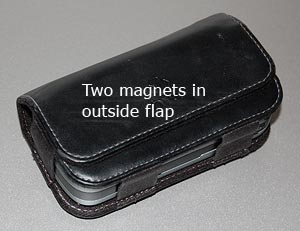
PDA holster with magnets in flap

And then, I realized what was going on. The new phone came with a beautiful leather holster. This held the device horizontally on my belt at the left of my body, and closed it with a wide flap that snapped into position with an assertive magnetic click (which has a very nice feel, I must say). It was the magnet all along. This was easier to prove than I thought – hold an analog watch next to the flap, and its second hand stops immediately. With my left wrist brushing the holster randomly, you can see what was happening.

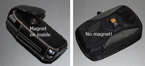
So, what can we do about this? As users, we can switch to non-magnetic pouches, ones with a zipper or Velcro closure; or we can move the device to the non-watch side of the belt. But as pouch designers, we can actually do a lot. The offending holster was designed with two magnets in the flap and two in the body, four in all, and the top ones right at the surface of the holster where the watch could touch it. Other pouches I see around have the magnet in the body, and the outer flap has a passive iron counterpart; thus, in the bad design the outside surface is magnetic (you can snap a screwdriver to it!); the better design is neutral on the surface. Take note, designers!

Alternative holsters

I managed to browbeat an Interactive voice response system!

Interactive voice response (IVR) systems are notoriously annoying. As the joke goes, “For a list of all the ways that Technology has failed to improve the quality of your life, please press 3″…

Some IVR systems are better than others; the best will make allowance for the user’s need to get around them. I ran into a good one today. I called Continental Airlines to do a seat assignment, and this IVR setup gives me a bunch of options that don’t include what I want.

On a hunch, I said loudly: “I want to talk to an agent!”
System: “I think you said you want to talk to an agent. But if you give me your flight details first, I can help the agent serve you faster” (or something to that effect).
I play along and give the flight details to the machine.
System: “OK, your flight is confirmed, as follows […] You can hang up now”.
WTF?!! Hey, it promised! So I say, firmly and loudly:
“I want to talk to an agent!”
System: “OK, I’ll transfer you now”.

Got it? I took a stand and the system capitulated! Have to hand it to them, though: they never mentioned the option to talk to a human, but they included the speech recognition to identify when I ask for it. Good job! [well… almost. I was euphoric for of the three seconds until the system helpfully added: “your waiting time will be approximately 25 minutes”. And it was good at its word this time].

Hats off to a cardboard box

And now, a moment of respect for a truly elegant bit of intelligent design: The humble but ubiquitous cardboard boxes in which we buy chewing gum and candy – the ones that latch closed so they won’t spill their content when we leave them in our pockets, purses, or glove compartments. The trick is in the flap A, which latches into the depression B in the photo below.

Latching cardboard box

Folding a cardboard pattern to make a box is trivial, and we learned to do that as children; making it have a hinged lid is not too hard; but making the box have a self-latching arrangement, all from a single piece of cardboard, is a neat trick.

Latching cardboard box - flattened

No idea who invented this originally; can’t find a patent for it, though there are a number of US patents for folding and filling the boxes on a production line (e.g. United States Patent 6223507). Anyway – well done, unknown inventor!

Incidentally, that Wrigley’s Winterfresh chewing gum is one great way to stay awake when you’re drowsy… it is hot enough to wake the dead!

Don’t forget the Remote Control’s usability!

When you see an ad for a piece of consumer electronics, you seldom see a close up of its remote control. In fact, most people ignore the lowly R/C when making a buying decision. Yet this little item is the main way we interact with our TVs, VCRs, and so on; and a its usability, or lack thereof, is going to impact our user experience many times every day.

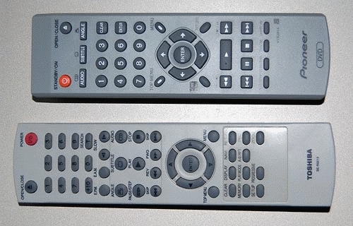
Remote control usability comparison
Look at these two R/C units, from two similarly priced DVD players, one mine, one my parents’. See the difference? In the one at the top the important buttons – play, FF, Rew and Stop – are prominent, visible, obvious… in the other, they are hidden among a confusing jumble of similar small buttons. And this means slower operation and frequent errors when you hit the wrong button by accident. We can assume the two arrangements cost exactly the same to manufacture; this is not about cost, it’s about attention to usability in the design stage.

So, of course, the better one is mine, because I always check this when making a buying decision? Well… err…

Mighty Mouse: the best XY input device out there!

So many XY pointing devices have been developed over the years… I’ve used light pens, graphic tablets, trackballs, touch screens, joysticks, touch pads, trackpoints, even that weird HP desktop machine, the HP-150 from 1983, where you pointed at the screen and your finger intercepted IR beams crisscrossing the raised screen bezel (this last failed miserably – how could they ignore fatigue from repeatedly raising the arm to touch the screen?!)

But the king of all XY input devices is without question one of the earliest: the Mouse. Only the QWERTY keyboard has greater tenacity (unfortunately, in this case). Invented in 1963 by Doug Engelbart and later commercialized by Xerox PARC, the mouse remains the most popular device in the family, and this is (IMHO) because it is simply the best – it maps extremely well to the brain-hand-screen-eye-brain closed loop, making its action so intuitive as to be transparent. It just doesn’t get any better than that. And interestingly, the exact shape of the mouse is unimportant: almost like cars, they went from blocky to streamlined as time went by, but are just as good in any shape. It’s the basic “movable box with buttons under the fingertips” that is the winning factor; the rest is window dressing.

Here’s kudos to a great design!

Mice (computer and porcelain)

The ultimate clarity

Adding clear instructions is part of good product design, right?

So: I went to get a flu shot (I still get the flu each winter, but maybe I’d be getting it twice without this?) As the nurse prepared her syringe, I noticed a cardboard box of disposable vinyl gloves on her table. On the side of this box was a printed statement, which I copied verbatim:

“Intended use: A medical glove is worn on the hand of health care and similar personnel to prevent contamination between health care personnel and the patient’s body, fluids, or environment. This glove also serves for non-medical purpose usage”.

I was so relieved that the manufacturer had had the foresight to instruct the nurse in these enlightening facts. Who knows, without this instruction she might have assumed the gloves had to be stuffed up my nose or something?

Clear instructions are good. Superfluous ones are silly. I don’t trust silly vendors…

Can’t they hire ONE Englishman to proof their manuals?

Everyone’s had their laughs with instruction manuals written in Engrish; indeed, they can get quite hilarious. What bugs me, though, is the fact that these are seen not only in low quality products from second-rate or nameless producers. I can understand how a product that costs a couple of bucks would not have a manual written to the editorial standards of the Britannica… but what about leading vendors that produce expensive, top-quality consumer products?

I mean, look at the note below, which came as an insert in the instruction manual of my Lenovo Thinkpad docking station. That’s from the vendor IBM passed its notebook business to. And they tell us their product is “for use only”? And “not portable device”?

Lenovo manual insert

These are serious people, heaven knows. They make incredibly sophisticated machines that I’m proud to use. They have a company that is the fourth largest personal computer maker in the world, with 19,000 employees – so can’t they hire one single English speaker among them, to proof read their manual copy? Or do it remotely with someone living in the West, who’d get the copy in the mail and edit out the more blatant errors in a matter of hours? (Make me an offer, Lenovo guys!)

Invisible buttonware

One evening a neighbor knocks on my door. She just got a new cellular phone, and she has a basic question: which key does she press to accept an incoming call?

Now this lady is not a youngster, but she’s used cellphones before; surely she must know that you press the key with the green handset image? Well, yes, she knows, but she can’t figure out which key that is. I think, Huh??? … But then I look at her instrument, and I see what she means. What used to be an image of a handset has degenerated into a tiny thin squiggle, similar to other tiny thin squiggles on some other keys. And yes, perhaps she could discern that this squiggle is a bit greenish, especially if she had a magnifier…

Cellular phone key comparison

The problem is all too visible in the left photo, which is of my own Nokia 6230i: the four keys at the top have identical looking thin marks, and the colors of the bottom two, though red and green, are very hard to discern at a glance (which is the way they should be discerned; especially when you’re driving with the phone in a hands-free cradle). Compare this to the other photo, from a different model. That’s what good human engineering should provide!

So, what can we do about this? If you work at a cellphone manufacturer, by all means have a word or two with your design department… I don’t, so all I could do was fix my own problem. Here is what I did to my Nokia. Problem solved.

Nokia cellphone with stickers

Copyright © 2024 Commonsense Design

Theme by Anders NorenUp ↑