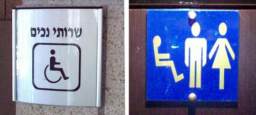
People who design signs ought to be careful, because thoughtless signage can so easily lead to confusion…
Public restroom signs are a case in point, because people who see them make assumptions. For instance, as someone once pointed out, if one sees a WC sign of the opposite gender and the one for one’s own use is not next to it, one can go seek it at the opposite end of the same floor, or in the same position on the floor above or below… there is rarely a sign to tell you which is the case.
And here is another example in this domain: I saw the sign on the left near the door to a single restroom in a large building lobby. The immediate assumption of the user is that this is a handicapped-only room, and they go looking for the Gents’ or Ladies’ room. Which is not there, because this is the only restroom in the place. The intent of the sign, no doubt, was to indicate “here is the restroom, and it is wheelchair-enabled”.

The sign on the right is far better – it is again a single facility, but there is no mistaking the fact. Though it is interesting that the fellow on the left seems to be levitating… 🙂

Leave a Reply