An important element of everyday product design that is all too often ignored is the footprint of an object.
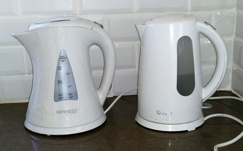
I mean, look at these two electric kettles, which are very common kitchen appliances. They serve the exact same purpose; they use the exact same technology; they have the same water capacity.

But there’s a big difference: the one on the right has a sensible, compact cylindrical form. The one on the left, by Kennedy, flares at top and bottom, so its footprint – the counter-top area it requires – is some 45% grater than for the Graetz kettle beside it. Kitchen counters can never have too much free area; the designers at the Kennedy company have wasted some of that area for no good reason at all, simply to show off their “artistic originality”.
I see this cavalier attitude to footprint in many products, and it always annoys me… why can’t these people think of their users?

Leave a Reply