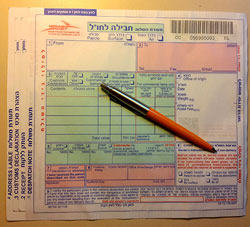
So we had to ship some parcels overseas, and we were given these forms to fill at the post office.
Not surprisingly, the form had four copies, and asked for a lot of shipping and customs information. what was surprising, however, was the incredibly poor functional design of the form’s layout.
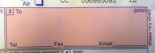
Most obviously silly was the layout of the field for the recipient’s address, which you can see in the photo below:

The small area provided would barely accept any respectable street address, but then they ask you to add telephone, fax and email on the indicated lines. Forget about a.very.long.email.address@long.host.domain.com – you couldn’t even fit short@gmail.com on that tiny line! Same thing for any respectable phone and fax numbers. Nor can you try your hand at miniature calligraphy, because to mark the four copies you must push very hard on the pen…
Every day hundreds of people in the country struggle with this form. Won’t anyone at the PO take pity on us?

Leave a Reply