Today we have a guest post from our loyal reader George Trudeau of Hyannis, Massachusetts.
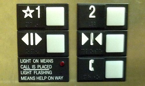
George sent me this photo:
And here is the story:
I went to a Doctor appointment and took the elevator up to the second floor office by pressing the great big 2.
When I left the office, I was still thinking more about my appointment than how to operate an elevator, so I pressed the button under the 2, the doors closed, and I returned to my thoughts. Eventually I realized nothing was happening so I pressed the button under the 2 again… It even has arrows pointing to it.
If I wanted to go sideways I might have pressed the right button the first time.
Nice catch! Not only is the up/down direction represented sideways, but the line in the “Close doors” icon does look like a “1” in the same style of the “2”. Of course, you have to be distracted to make this mistake… but usability is about ensuring proper user interpretation even when distracted!


Leave a Reply