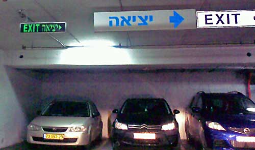
Those depressing multi-story parking structures are an unavoidable part of a driver’s life… and they can get quite annoying when you need to find your way out of one. Sure, there are signs. Here, for example, is one garage that takes no chances on our missing the exit, and advertises it bilingually and redundantly:

The only problem is, it fails to say whose exit it is to the right: pedestrians or cars? This is a very common sort of confusion in such car parks, since cars and people exit them from quite different places.
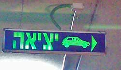
 So here is the right way of doing it! The sign to the right (found on another level of the same car park, strangely enough) leaves no doubt whatsoever: cars should exit to the right. I don’t remember if they had a similarly unambiguous sign for pedestrians, though those are usually marked with a running person for safety reasons. Anyway, isn’t this simple sign design convention something that every parking structure in the world should have?

Leave a Reply