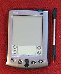
Back then we had the Palm Pilot. It had a gray lo-res screen and minimal capabilities. No wireless, no GPS, no games, just basic PDA funcfions. Compared to the android phone I use now it was like a stone ax. And yet, that old Palm had a key attribute that is long lost: simplicity of use.
 A prime example: the “EDIT” button. Take the common task of modifying a memo or appointment. In Android, you have to open the item, and then hit EDIT to enter a mode where you can make your changes. And when you’re done you hit SAVE. Makes sense? Not really. In PalmOS you opened the item and just started typing. Edit mode and View mode were one and the same. Just like a sheet of paper: you can read it and you can write on it as you wish.
It may look like simple matter, but all those extra clicks do add up and clutter the user experience; what’s more, they detract from elegance – that intangible element which calls for keeping it simple!

Leave a Reply