It’s hard to speak ill of Adobe Photoshop. Even its painful price tag is well justified by this application’s incredible power, which I’ve been barely scratching in my many years as a faithful user. Still, there is one inexplicable sin its designers have committed.
Tastes vary, which is why Microsoft have included in their Windows OS the ability to customize the GUI’s elements. For my part, I do three things whenever I install Windows for my use: get rid of that incongruous green hill on the desktop, revert to the more businesslike classic (“Windows 95”) look, and make the menu font easier on the eyes by turning it Bold and, on high-res screens, enlarging it by a point. Since the whole idea is that this font tweak affects all programs running under Windows, I’m all set.
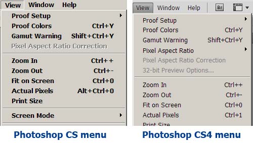
So what happens when I upgraded from Photoshop CS to version CS2? The menus are a tiny, skinny Normal font. The good folks at Adobe decided to violate the basic guideline that all apps must comply with the Windows UI preferences. The user’s preferences. My preferences. “So why do we care”, they say, “if you get a headache from peering at a tiny font? That’s none of our concern!”

But that’s not the end of the story; because in CS2 they also added the option, in Photoshop’s Preferences, to choose the UI Font Size! What Adobe hath taken away, Adobe now giveth back! Hallelujah! I select Large, restart the application as directed, and… various elements of the UI – Palette captions, for instance – are indeed larger. Except the menus. They remain tiny. Looks like they applied this “UI Font Size” setting to only part of the UI but not to the one they initially messed with.
And now I moved ahead to CS4, and I was hoping they’d seen the error of their ways and given us back control over our menus, one way or another. So I was hoping… but of course they hadn’t.
Take note, Adobe… that is bad, bad programming practice.

October 30, 2009 — 1:03 pm
Adobe Photoshop is the best photo editing tool in my opinion.Photoshop has been my bread and butter software on my current job which involves a lot of photo editing.
November 15, 2009 — 7:39 pm
I, too, am suffering from CS4’s text and icon minimalitis. I agree – Adobe got this one wrong.