We discussed the recent trend that is eliminating the optimal resolution in notebook computer screens. Another undesirable trend is the move to widescreen displays. These days it is almost impossible to buy a notebook PC with the traditional 4:3 screen form factor; all new models boast a “wide” screen with a 16:10 form factor such as WXGA (1280×800) and WSXGA (1680×1050). In fact Lenovo, makers of the Thinkpad I use, have just proudly declared that they’re dropping all 4:3 screens in their new line of notebooks.
And what are they proud of? What’s so cool about giving us less effective screens?
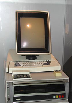
 16:10 is a perfect choice if you want to watch movies, which come increasingly in wide formats. However, business notebooks are not intended primarily for this enjoyable purpose. They are meant to do business on, primarily word processing, email, presentations, and the like. And for this purpose, widescreen is totally inadequate. Documents are invariably taller than they are wide, like the paper pages they emulate; even presentation slides have a 4:3 aspect ratio. That’s why the venerable Xerox Alto (at right), sporting the granddaddy of all of today’s Personal Computer interfaces, had a “portrait” form factor screen: because you could process a whole page at once.
Now ideally, a wide screen might accommodate two pages side by side; and that works fine with a large external monitor. But Notebook screens are kept small for portability, and there is no way you can comfortably read two pages on a 14″ or even a 15″ screen. So you have to use the screen for one page, and since these screens are shorter (top to bottom) for a given diagonal size than the 4:3 type, you end up seeing less lines on a document at a given page width. You get more area at the edges of the screen, which you don’t need, and less height, which you do.
Like I already said, something is very wrong…

October 9, 2008 — 2:19 am
Completely agreed, Nathan. While the widescreen makes for a nice form factor for carrying around (a full width keyboard without unnecessary depth), it doesn’t help if you spend much of your day reading or editing. Spreadsheets are great, but documents are not.
I wonder when manufacturers that are truly designing for business vs. personal applications of these machines will look past the hype of how cool widescreens “look.”
October 11, 2008 — 9:59 am
No one is more business oriented than Lenovo (ex-IBM) Thinkpads… and they’re all wide screen from now on. The strange thing is that large business customers take this lying down.
October 4, 2015 — 10:13 pm
Yes. Cool trends seems to be more important than practical solutions. I have the same thoughts as you do. Around 2010-2014 trend for glossy laptop screens is another stupidity.