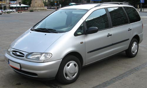
We rented a Ford Galaxy minivan for a day. Nice car, if you need the space. And such sophisticated controls… way too sophisticated for its own good, or for its users’, if you ask me.
Ford is very proud of its latest Human Machine Interface:
Human Machine Interface (HMI) -An upgraded instrument cluster plus a new steering wheel including toggle switches … take vehicle ergonomics to a new level. …
HMI is standard on all Ford S-MAX and Galaxy models. It is simple and intuitive to operate. It follows strict, straightforward and logical rules and combines critical areas of ergonomic development to optimize the interaction of the driver with the comfort and entertainment systems. …
The system enables a controlled dialogue between the driver and various support systems – radio, navigation system, Adaptive Cruise Control, and mobile phone.

So, my experience as a new user (remember, “intuitive” means a new user can figure it out without recourse to a manual): I wanted to zero the trip kilometer counter readout. After looking in vain for the standard push-rod near the odometer, I tried the 5-button toggle pad on the steering wheel hub, which turned out to control a multi-level menu system that eventually – after drilling maybe 3 levels down – let me clear the readout (not before forcing me through an ‘are you sure?’ confirmation). Pushing a standard button while driving is one thing; operating a complex multi-step interface, one which is different from car to car, is as silly as it is unsafe. I haven’t located the cruise control submenu, but the standard buttons on the wheel would certainly have been faster to use…
I suspect I may have figured it out wrong, and maybe there is a faster way to achieve this result via a different sub-menu. But then, I’m an experienced technologist; if I couldn’t do better at first try, your average driver would likely have done worse.
Another case in point: in this car, if you switch on the turn signal and change your mind, clicking the lever back to the center position will leave the signal on for 2-3 extra cycles. Not sure whether this is due to some ill-conceived “strict, straightforward and logical rule” the Ford designers applied, or whether the car’s computer is so busy doing other feats (polling the trip counter reset action?…) to respond faster. Either way, we were better off when the lever simply actuated a switch that directly controlled the blinking lamp.
Take note, Ford: you make excellent cars – please keep them simple to use!

July 30, 2008 — 9:59 am
It’s not the same car!
While in general, I tend to agree with your criticism of overly sophisticated interfaces in the automotive industry, I have to point out that the car in the picture is not the car of which the press release speaks. The one in your photo (I assume its the one you drove) is an older model. Hopefully, ford have fixed some of the issues you mentioned.
Another aspect of this, though, is that car makers (and makers of other technology), often try to come up with new design ideas which, while taking some time to get accustomed to, do eventually improve the usability of their product. It takes time to get used to such things, and renting such a car can be a frustrating experience, because you do not have this time.
Oh, and the turn signal – it’s a feature, not a bug. When you just push the lever – without going past the “click” – it will start 3 cycles of indicating. This is so that you can indicate when changing lanes, without having to either hold the lever in place, or push it back to its neutral position afterward.
July 30, 2008 — 1:41 pm
Hi Amitai,
Of course it isn’t the same car… ours was black! 🙂
Seriously, the photo is a public domain one, not the one we drove, which had only 10K KM on it, so must’ve been the 2007 or 2008 model. I now added the photo source to the post.
I agree some progress is for the better – although I tend to notice they often make two steps forward, then weed out the bad ideas and take one step back. Like when one automaker introduced that seat belt that strapped you in automatically…
The turn signal feature sounds good, though I distinctly recall in our minivan it also worked when you clicked the lever fully then back. Maybe the switch has some jitter?
September 1, 2008 — 8:52 pm
The car pictured is a Mk1 Ford Galaxy, which was introduced in 1995(!) and discontinued in 2000. It’s far too old for that sort of thing!
September 1, 2008 — 9:06 pm
Yep… I admitted to the error in my previous comment, after Amitai pointed this out.
March 27, 2009 — 12:25 pm
Ford the best car 🙂