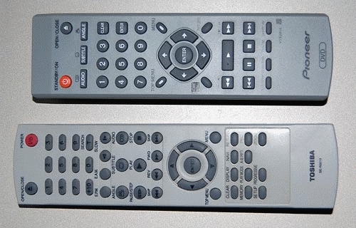
When you see an ad for a piece of consumer electronics, you seldom see a close up of its remote control. In fact, most people ignore the lowly R/C when making a buying decision. Yet this little item is the main way we interact with our TVs, VCRs, and so on; and a its usability, or lack thereof, is going to impact our user experience many times every day.

Look at these two R/C units, from two similarly priced DVD players, one mine, one my parents’. See the difference? In the one at the top the important buttons – play, FF, Rew and Stop – are prominent, visible, obvious… in the other, they are hidden among a confusing jumble of similar small buttons. And this means slower operation and frequent errors when you hit the wrong button by accident. We can assume the two arrangements cost exactly the same to manufacture; this is not about cost, it’s about attention to usability in the design stage.
So, of course, the better one is mine, because I always check this when making a buying decision? Well… err…

March 26, 2008 — 11:59 pm
The best ergo remote I ever used was the TiVo “peanut” remote. It was curved to fit the hand, and the most used buttons were larger and positioned to be easiest to manipulate. It was a thing of beauty.
http://www.weaknees.com/tivo-directv-peanut-remote.php
March 27, 2008 — 8:08 am
Hey Jeff, I love the YES and NO buttons on this Peanut remote!