Compare this to Photoshop: powerful and feature rich, but its UI is simple, with minimalist icons in monochrome…
 I found this so distracting that I went and downloaded another shareware product, FastStone Capture (Ver. 6). Check the utterly simple UI to the right:
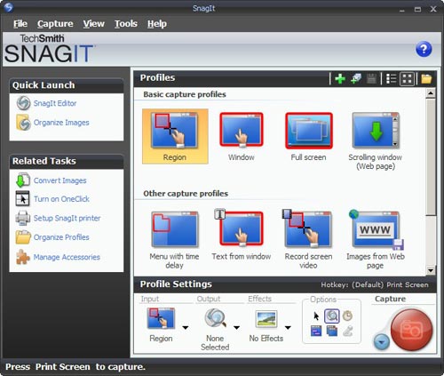
Note that 99% of the time, these few icons (including “Scrolling window”) cover all you need; the rest is accessible but unobtrusive in a drop down menu at the right, where it can’t distract you. Click a button on this tiny floating toolbar and the capture begins. The same icons exist in the Snagit window, but actually, once you click one there you then need to click the big red round button – which may make you feel powerful, but is a redundant action. Of course it’s a single extra click, but it’s also double the number of clicks required in FastStone.
Interestingly, the development team at Snagit have a blog where they share their thoughts (commendable!) and there I read that “… we felt that the interface shouldn’t be competing for attention, but should fade away and allow people to focus on their content”. Sorry… good thought, but I can’t endorse the execution on it. Nothing about the baroque UI they built brings the word “Fade” to mind. Just compare it to the tiny toolbar of the FastStone tool.
Simpler is better, nowhere more so than in tools you use daily.

October 13, 2008 — 11:55 pm
The previous version of SnagIt isn’t so Fisher Price, but offers just as many options (er, complications). It did take me a while to get used to the app and frankly, I use the same 2-3 functions every time.
If they weren’t giving away the old version for free when I got it, I’d not have paid for it. I might have a look at FastStone6 – thanks.
November 17, 2008 — 7:16 pm
Hi Natan – Here is another screenshot utility I came across. Haven’t tried it, but for a freebie it looks pretty nice. Might be worth checking out. http://www.donationcoder.com/Software/Mouser/screenshotcaptor/index.html
June 19, 2012 — 1:35 pm
FastStone is IMHO the better solution as it goes with a faster/more lean UI. And yes, it loads much faster 🙂