Tag: Workplace

A loop of helpful helplessness

I called someone in the US and he wasn’t at his desk; the system helpfully informed me that the guy was not available but that I could

…please leave a message – or, during business hours, press zero for assistance.

It was during business hours.

I pressed zero.

The system cheerfully told me:

Please hold! Someone will be with you shortly!

It was, technically, right. Quite shortly afterward, a nice woman picked up and I told her who I needed to talk to. She said:

All I can do is transfer you to his line, sir.

Which is exactly where I came from.

Whoever designed this flow spared no effort to  integrate humans and machines into a single loop of helpless helpfulness. Or is it helpful helplessness?…
The considerate envelope

I was interviewed recently by the Columbia Journalism Review for an issue they were putting together about Information Overload, and as promised was then mailed the hardcopy magazine in a manila envelope.

I was heartened to see the stamp in the photo on the envelope.
Stamp on envelope from CJR

Obviously this did not apply in my case – The entire issue was of interest to me, so the page number was not filled in – but I love the idea. Telling the recipient where to look in something mailed to them is a key concept of good email etiquette that I’ve been teaching for years: if you send someone a presentation with 70 slides (which, alas, many do in the corporate world) at least add in the email body “Check slides 45-47, they contain info related to your project”. The CJR uses hardcopy, but they evidently apply the same concept there. Good thinking!

Elegant design in the back of a Remote Control

Sometimes one runs into elegant design in humble places…

I was sitting in a meeting and fiddling idly with the remote control of the NEC LCD projector. After toying with the laser for a while, I pushed out the battery cover on the back. As expected, it unlatched and slid open, like these things always do. But there was a twist…

NEC LCD Projector remote control The cover slid off, but stayed connected to the unit by a thin rubber ribbon. We’ve seen so many R/C units missing their cover – well, not this one! The only extra part required was the rubber ribbon, which clips into a slot on the R/C itself. Simple, elegant, professionally designed. Good job!You can see in the photos how this works:NEC LCD Projector remote control

NEC LCD Projector remote control

NEC LCD Projector remote controlNEC LCD Projector remote control

How to complicate instructions

We already saw how overuse of pictorial instructions can be confusing. Well, I just ran into a wonderful victory of this trend. I passed a large office copier – the Konica 7222 – and here is what I saw on its document feeder:

Konica 7222 Copier - Document feeder

These guys spared no effort in their belt-and-suspenders approach: there is large text, and tiny text, in every language you could desire; there are pictures, and icons, and arrows all over the picture… isn’t it just wonderful? Especially given that no office worker would need any of it except the “Face Up” bit?

One hand!

Here is an absolutely trivial product feature that turns out to be very nice. This is the latch release for the more recent IBM (now Lenovo) Thinkpad notebook computers.

I’ve been through more models of Thinkpad than I remember, and until the T4x series they all had two latch releases on the front edge of the lid. Then came the T40, and it only had one, on the right, which actuates both latches through an inner linkage. When I first saw this I was disdainful: who cares, after all? But when I started to use a T41, I realized how useful this feature is. These days we mobile users run around the workplace from meeting to meeting with our notebook; and until someone comes out with the secondary displays we’ve seen on futuristic promotional videos (but never in reality), we often have to open the notebook to check details of our coming meeting while walking towards an elevator… and with the single-latch arrangement, you can hold the machine in your left hand while opening its screen with the right.

Like I said, a trivial detail, but it really is useful. A nice piece of design from IBM!

Where old projectors go to die

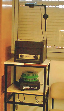
overhead projectorsI was visiting a hospital, and passed by a seminar room where my eye caught the items in the photo, sitting on a custom stand in the corner.
Remember these? Used to be, they were so ubiquitous that they were instantly recognizable: an overhead foil projector and a circular magazine slide projector.

These days, no one uses them anymore… it’s been years since I even saw one of these. It’s PowerPoint everywhere. In fact this seminar room had a new LCD projector fixed to the ceiling. But these academic institutions are conservative: they throw nothing out. These useless devices may well linger there for years. And so, we are afforded a peek into a not all that distant past..

An uncommunicative printer

We got this new HP LaserJet M5035 multifunction printer/copier at my workplace that is very sophisticated and capable. It has a high res touch screen that it uses to accept our commands and to tell us what’s going on.

So today it had a fault and advised me to cycle its power, which I did. The printer then went into a boot sequence, complete with whirring sounds and flashing lights, that took long minutes… very long minutes. 🙁

And all through it, its wonderful display screen showed an HP logo growing larger and smaller, larger and smaller… endlessly. Very neat, but didn’t it occur to the designers of this machine that the user would much prefer a simple text message like “Machine warming up… should be ready in X minutes“?

Water cooler improvement – just don’t cool!

Many times, a small change in a design makes a product a lot better.

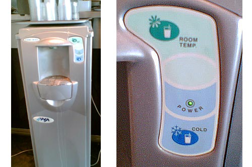
You know the modern version of the office water cooler: a vertical unit that dispenses cold (and in many models, also hot) water into disposable cups. Well, I’ve just seen one that made my day. The unit in the photo, a new model from Tami (a.k.a. Tana Water), has a small but smart addition: the button marked “Room Temp”.

Tami Bar 4 water cooler

What’s the big deal? Well, in most models, you push the button and get ice-cold water. This must be very attractive if you’ve just jumped off a camel at a desert oasis on a scalding summer day; but in most offices, which are air conditioned, you don’t need it to be ice-cold, and some prefer it not to be. Their solution in the past was to either try to add a little boiling water, or to sip slowly. So now Tami have added the Room Temp button – you can get the same clean, filtered water, without the extra cooling. A tiny redesign, leading to a better product.

Buildings designed for Software Engineers

With the wonders of Google Maps at our service, we can get some interesting insights. Take the photo below, also viewable here. This is the older part of the Microsoft campus at Redmond, where much of the software in the computer I’m writing this on was developed.

Microsoft buildings at Redmond

Notice how the buildings all have cross shapes visible in their plans. This is not because of a religious bias in the company’s management. It is, I was told when I visited there, because Bill Gates had decided when he started the company that an effective software engineer needs the peace and quiet made possible by an office with a door. Indeed, while myriads of hi-tech engineers (yours truly included) work in cubicles in the noisy open space made famous by the Dilbert comic strip, Microsoft coders all have their own individual offices with real doors to block out the world when they need to concentrate. Of course such an office requires a window too, or it gets claustrophobic… which explains the shape of the buildings – with a need for so many windows, they had to be made with a convoluted outline, to maximize surface-to-bulk ratio.

For my part, I admire the tenacity – Microsoft moved to Redmond in 1986, and 22 years later they still resist the temptation to compress their engineers into cubes. They have a good thing, and they stick to it!

Copyright © 2024 Commonsense Design

Theme by Anders NorenUp ↑