Tag: Sundries

Can you guess what this device does?

They say that form follows function. So – take a look at the form of this strange device, which stands about a meter tall. Can you guess its function?

Smell Display Device at teh Potsdam Biosphere

No, it isn’t a trashcan with dreadlocks.

I saw this thing in the Biosphere at Potsdam. This pleasant museum is smaller and less ambitious (should I say, less pretentious?) than the one in Arizona, and serves very well to exhibit different ecosystems to the visiting public.

The item you see here is a display device for displaying smells. You sniff the end of a tube to get a whiff of the plant shown on the round image below it.

Did you guess?…

Watch the beauty!

These days, every product and service come with scary warnings intended to cover the maker’s back side in case you harm yourself. Electrical appliances warn you not to drop them in water (Duh!), restaurant menus tell you you can die by eating their food (not here, thank God, but in the US they do), coffee cups tell you their content is hot, an so on ad nauseam.

But the strangest, and strangely endearing, manifestation of this must be the sign we saw at the entrance to the Baha’i gardens on the slopes of Mt. Carmel in Haifa. Here is the sign:

Bahai Gardens sign

What they tells us is that the beauty of the gardens is such that we might be distracted into not watching our step and falling down one of the hundreds of steps that take you downhill!

And I must hand it to them… they aren’t exaggerating. These gardens are mind bogglingly serene and beautiful, though the risk is probably from trying to snap photos instead of looking where one is walking. The photo below shows only a small portion of the gardens, with the shrine of the Bab, a prophet of the Baha’i religion, in the background, and the port of Haifa even farther out.

The Bahai Gardens in Haifa

This small photo can hardly do justice to what we saw there, but may give you a hint. The real thing is simply breathtaking!

Babylonian memory technology

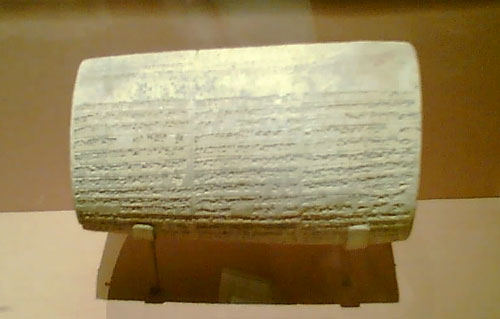
A gem I saw in a museum recently: this is a large cuneiform-inscribed cylinder, maybe 3-4 inches thick, which describes the building activities of king Nebuchadnezzar (better known in the bible for his opposite exploit when he destroyed Jerusalem in 587 BC).

Babylonian Cuneiform Cylinder

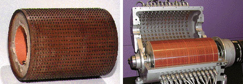
Anyway, in one of those moments of associative memory, it struck me how similar this looked to the contact-studded drum memory devices of the ABC, or Atanasoff-Berry Computer, one of the earliest electronic computers (1941), pictured below at the left. One is also reminded of the magnetic drums that served computers for memory in the 1950s, like the one to its right.

Computer Memory Drums

The idea of using a drum for computer storage makes good sense in terms of allowing it to be scanned easily by rotating it; but the Babylonians probably used this form because it allows you to cram much text (and many construction exploits, if you’re a busy king like Nebuchadnezzar, he of the hanging gardens of Babylon) into a relatively compact object.

Also worth noting: The king’s memory cylinder is still readable after more than 26 centuries; so, can you read your 5-1/4 inch floppies any longer?

Hi-Tech Toothbrushes

The first mass-produced toothbrush was made in England by William Addis in England, around 1780. His idea was to attach bristles to a stick, and make a little brush with a long handle, to allow one to brush one’s teeth. You’d think that’s all it takes; you’d think the toothbrush would remain just that, a brush on a straight stick…

Toothbrushes on display

Think again. Today, any drugstore has a wall full of toothbrushes, and not one of them is as simple as Addis had envisioned. In fact there are so many types, such a riot of colors and designs, that it’s hard to buy a new brush that looks just like your old one. AndToothbrushes to compete with each other, the different makers dream up the weirdest configurations, with multicolored, contorted handle shapes that remind me of sports shoes (another area where form totally diverges from function in the interest of marketing hype), and with heads that must’ve taken real genius to design. The underlying ideas are impressive – brush heads with multiple bristle types sticking every which way to better remove bacteria from every cranny in the target dentition… all seemingly very important, very convincing, lest the consumer remember that a brush is a brush is a brush, and would work just as well if it had a simple monochrome handle and a straight head. The bacteria wouldn’t mind…

Speciation and Competition in Berlin’s traffic lights

Speciation, in evolutionary biology, is the splitting of a species into two different sub-species that cannot interbreed; it is one of the engines powering evolution. One mechanism responsible for this is the appearance of a physical barrier that cuts part of the species off from the rest, as when tectonic activity creates an insurmountable rift or mountain range, or an island breaks off from the mainland. The creatures on either side of the barrier evolve independently, resulting in such wonders as the dwarf elephants that used to exist on mediterranean islands, or the diverse finch species of the Galapagos.

During my recent visit to Berlin I was amused to see the same phenomenon, of sorts, happen to man-made objects – namely, pedestrian traffic lights.

Pedestrian crossing Walk/Don’t walk signals vary between countries, but in each country they usually have one standard design. In Europe they usually follow the European standard of a red standing man and a green walking man.
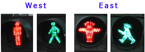
Now this is also the case in Berlin, except that there they have two designs. In West Berlin, the little men are skinny and utilitarian; but in East Berlin they are stylized, chubby and humorous: the famous Ampelmännchen.

Berlin walk signals

The Ampelmann design was developed in the GDR in 1961, and was used in East Germany while the barrier of the Iron Curtain prevented design standardization with the West. When the Berlin Wall became history, the citizens of that fascinating city had two different signal types; for a while you could tell which part of town you’re in by observing the one in use.

And when a barrier comes down and the two species mix again, it is possible for one to wipe out the other. In Berlin, there were plans to replace the Ampelmann with the EU standard of the skinny, businesslike version. Fortunately this planned extinction of the eastern variety met with a public outcry, and now the funny man in the hat is a protected species; in fact I heard they plan to replace the western version with Ampelmännchen, since they’ve become a kind of city mascot. In one pedestrian crossing I even saw the two little men – East and West – eyeing each other uneasily across the street…

Ultimate clarity, take 2

Remember those gloves with utterly superfluous instructions? Here is a new contender for “most unnecessary instructions”.

Frito-Lay Sunflower Seeds

This package of sunflower seeds, from the USA, bears the directive:

Eating instructions: crack open shells, discard shells, enjoy the seeds!

Nice try, Frito-Lay, but – Uh-oh! – you might still get sued by someone: you forgot to Frito-Lay Sunflower Seeds instructionstell them to chew before swallowing the seeds!

Actually, this one is so silly that I really can’t make up my mind whether they did it because of the usual rampant CYA, or whether someone at Frito has a sense of humor and is taking a jab at the trend of assuming we consumers are idiots. Any opinion?

Lick-and-Stick stamps endangered?

In 1840 Sir Rowland Hill introduced postage stamps to the world, giving us an effective postal system, and a fascinating collecting hobby. The Penny Black, of course, had to be licked to affix it to letter – it was a stamp, wasn’t it? That’s how a stamp should behave!

Self Adhesive Stamps

Well, not any more. These days we see a growing incursion of self-adhesive stamps; in other words, stamps that are in essence peel-off stickers.

These were introduced in Sierra Leone in 1964, apparently to solve problems of sheets sticking together in the tropical climate there. That, at least, is a good reason. But now we see a growing number of countries playing with the new stamps-that-are-not really-stamps…

So is that a problem? Well, there are bigger problems, but note that these stamps waste twice the paper, since their backing has to be discarded, and besides, the lick-and-stick operation was somehow an integral part of letter mailing (not that anyone writes letters these days either, unless they’re bills, it would seem). Also, stamp collectors are pretty unhappy – these stamps can’t be removed by soaking the envelope in water, and the adhesive can cause deterioration in the stamps over time.

I read somewhere that the US postal service refuses to see the collectors’ complaint as an issue, since long term collectability of stamps is not part of their product specification. Now, isn’t that heartless? Isn’t the whole purpose of stamps to enable this lovely obsession that has given pleasure to tens of millions of people, young and old, for well over a century?

Polymer banknotes are here!

Until now, we had paper money, and we had plastic – which meant credit cards. Well, now the distinction is blurred: as of April, Israel joined a growing list of countries that have plastic paper money!

Polymer Banknotes

See the two 20 Shekel banknotes above. The one on the right is the trusty ol’ paper banknote, showing the late Moshe Sharet. The other showed up in April, amazing many citizens and confounding countless vending machines. It is made of a tough polymer, and looks exactly the same except for the transparent window in the star of David at top left – a transparent area that is continuous with the paper itself, a superb anti-forging device. Polymer Banknote detail

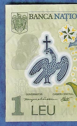
There is also a watermark of Mr. Sharet below the star, but in a resolution unheard of in ordinary paper watermarks. This did not scan well, but you can get the idea in the detail from a Romanian polymer note that fell into my hands – note how the transparency feature here is interleaved with opaque lines in the eagle, and see the bearded man in the watermark, visible only because the scanner shone a light through the thickness of the plastic paper.

These Polymer banknotes were originally developed in Australia, and have the advantage – in addition to making forgers miserable – of resisting the severe wear and tear that paper money must endure far better than their predecessors. They are entering service in a lengthening list of countries, and although at first they complained that they are strange to the touch, I already see people getting used to their unaccustomed smooth texture.

Aesthetics and Design: Boeing’s LAR rule saves the day

Passing through an airport I bought the book “Boeing 777: the technological marvel” by Norris and Wagner. This gives many fascinating insights into the novel design methodologies that went into the 777, my favorite jetliner. It also introduced me to one of the ugliest airplane designs ever to disgrace a designer’s sketchpad.

Boeing 767X - the Hunchback of Mukilteo

The Boeing folks were looking to build a plane larger than a 767 and smaller than a 747; one idea they tried was to graft half the cabin of a 757 on the rear half of the larger 767. You can see how endearing the result looks; in fact it earned the nickname “Hunchback of Mukilteo”, after a town near the Boeing facility.

There were many reasons why this version never proceeded off the drawing board, not least among them the disgusted derision of potential customers. But what I like best is that a key reason, according to the book, is that the design failed Boeing’s “LAR rule” – which stands for “Looks About Right”. If that is indeed their guideline, they are a smart company indeed: good design has an ineffable elegance to it, and no engineer should be forced to build something that offends their aesthetic sense.

The Ear and the iPod: a perfect fit!

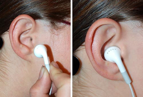
The wonders of the natural world are many, and the living body includes countless amazing features (and, admittedly, some not-so-amazing ones as well). Today I give due homage to a piece of truly elegant design: the perfect match of the outer ear to the iPod’s earphones!

iPod Earphone

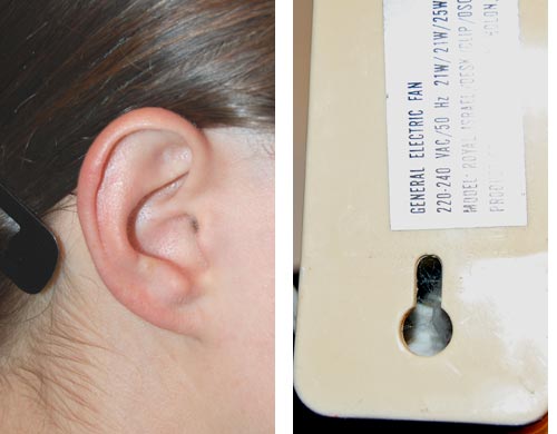
The earphones’ convenient usage stems from the presence of those details of ear anatomy that form a perfect keyhole structure to hold the earbud in place just against the opening of the ear canal. The structure echoes (after a 180 degree turn) that seen on the backs of many wall-mounted household objects, like the fan seen in the photo below.

Ear and KeyholeOuter Ear Anatomy

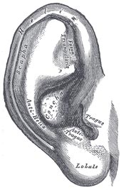
In case you wondered, the small folds in the outer ear’s convolutions that make this possible are called the Tragus and Anti-Tragus, as seen in this detailed illustration from Gray’s Anatomy. They hold the earphone’s round body in a snug fit against the suitably sized Concha.

We humans may not have the most impressive ears (just ask a bat, or a rabbit, or an elephant) but we certainly come pre-customized to hear our favorite music on the go!

Copyright © 2024 Commonsense Design

Theme by Anders NorenUp ↑