Tag: Sundries

Newark airport signage… one more time!

We saw that Newark Liberty International airport has some serious problems keeping its electronic signs straight… here, and here. Well, here’s a third and (for now) last installment.

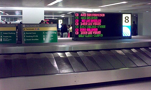
Baggage claim sign at Newark

This is the baggage claim area at the Continental domestic terminal where I landed coming in from San Francisco.

See the nice colorful sign identifying this baggage carousel, number 8,  as the one where luggage from flight CO449 is about to appear.

See the nice empty belt on carousel 8.

See the nice people thronging carousel 7 further back.

They’re retrieving their luggage, newly arrived  from flight CO 449 from San Francisco.

How nice…

More silliness at Newark

We saw how the electronic boards at Newark Liberty airport made the ridiculous omission of adjusting for the Daylight Savings move. Evidently this is not an exception: something is very wrong with that airport’s electronic signage.

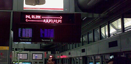
These guys have an “Airtrain”, an internal elevated light rail system for moving between terminals. The train has two parallel tracks, and there are electronic signs at the stations to indicate which is which. Thus, the sign in the photo indicates that the train on the left goes to terminals A,B, and Parking areas 1 through 3; the other train goes to P4 and to the train link to NYC.

Newark Liberty Airport Airtrain sign

Except that they also had a backup system. They placed a uniformed woman with a loud voice that announced repeatedly: if you want to go to terminals A, B, and P1-P3 you must take the train on the right. The signs, so convenient and visible, were displaying the wrong information.

You’d think the lady, who was no doubt equipped with a cellular phone, could set the error straight in a jiffy by calling some control room; but that didn’t occur to anyone. And after all, who are you gonna trust: a computerized board, or a well-meaning person of your own species?

Check out my new Infomation Overload blog!

Yep… I started a second blog, this time one dedicated to my work specialty and passion: fighting Information Overload. It’s called “Challenge Information Overload” and you’re most welcome to read it here.

I plan to continue posting here on the Commonsense Design blog, albeit possibly at a somewhat lower update rate (there are only so many hours in a day :-)).

The delight of postage stamps

Just got a letter from the UK, and it had this colorful stamp on it.

Postage Stamp

For an instant, I felt that special twinge of joy that an interesting stamp elicits; only after a moment did I remember that (a) I no longer collect stamps, not since I was a kid I don’t, and (b) none of my friends does, nor do they have kids that do that I might give the stamp to.

This is a shame, really, because postage stamps have a built-in ability to delight. They are often beautiful, they come from wondrous distant lands, they have a story to tell in their miniature image, and they are eminently collectible. In this way, every letter that you or your circle of friends and relatives received had the potential to surprise you with a “bonus”, a tiny capsule of serendipity where the stamps it bore could be boring or fascinating, depending on the luck of the draw.

All this may soon be over. I don’t know whether stamp collecting is on the decline (I suspect serious adult collectors do exist, but children may be more into video games these days). But the stamps themselves may soon be obsolete. People send less personal letters since the advent of email, and I’ve just read that the UK is planning postage stickers you can buy online and print out, and these have a bar code, not a picture (they also took out the queen’s ever-youthful profile we see in the stamp above, causing much consternation).

But meanwhile stamps still exist, and I know of one guy who makes full use of their joy-creating potential. He is a fellow History-of-Computing collector, and an eBay seller of slide rules; when I buy one from him it invariably arrives in an envelope covered with a mosaic of small-denomination stamps, each one different, all beautiful.

Postage stamps on envelopes

The riot of color is so cheerful that I collect these envelopes. What a nice way to delight one’s customers!
Couch potatoes vs. Movie theaters

One sign of the times is that movie halls are closing one by one around us, victims to the surge in electronic alternatives. We know this from direct observation – they really are closing – but I had an unexpected demonstration of this fact in a TV ad.

The ad was by the Hot cable company we subscribe to, and was aimed to convince us to use their Video on Demand service. It showed how difficult it supposedly is to get a movie without their VOD: it graphically showed how you need to go down 20 stairs to the street, walk a mile to the Videomat, check if it has a movie you want. No? Walk another mile to the video store, get the movie, walk back… you get the idea.

Nice ad, but what amused me is that 20 years ago they would’ve said “Go down 20 stairs, get in the car, ride downtown, and enter the movie theater”. These days, that just isn’t seen as a viable alternative! You’re expected to either slump on the couch in front of a cable movie, or rent a video and slump in front of that… and these guys want to deprive you of even the little exercise you’d get walking to the video store  🙁

FameLab again!

Last year I posted about FameLab, the science communication competition organized by the British Council in the Jerusalem Science Museum. Well, here it comes again, and today I’m a judge again. Like before, we get treated to a group of fine young students presenting diverse scientific subjects in only 3 (yes, three!) minutes each. Fascinating!

I also learned an interesting thing: the British Council is working hard to empower the winners to propagate science knowledge. Not only do they receive presentation skills training, they also get to attend international get together where winners from diverse countries meet face to face to exchange views, learn from each other, and figure ways to promote Science education. This is really a wonderful program!

Those conservative business cards…

Business cards have been around for a long time – very long, if you count visiting cards – so we should not be surprised if they tend to have an innate inertia to them. Still, business has changed so much in recent years – isn’t it time that the cards paid attention?

I was scanning a batch of business cards I got in a conference recently when I noticed an interesting fact: they may come in many designs and colors, but 90% of cards will have the contact information in the following order:

Physical address
Phone number
Fax number
Mobile number
Email address
Web site URL (if any)

Now this is interesting, because it has two attributes:

  1. It follows the approximate historical order the various technologies appeared in (first we had office buildings, then telephones, then faxes, etc.)
  2. It gives the items in reverse order in terms of usefulness, the least useful at the top: in today’s virtual, mobile, global world, we would most often use email to reach people, or a cellphone if they have one; faxes are not yet gone but may soon be, and physical addresses are only of marginal use in a “work anywhere” culture.

I had a friend, a master blogger and geek, who once said if he had his way he’d simply put on his card his name and “Google me!” – now that’s modern thinking for you! The closest you get to this are Moo minicards, those miniature cards that barely have room for a name, job role and email address.

Now that I noticed this I checked my own new card that I made after leaving Intel – and guess what, I had it almost right in terms of descending importance:

Name
Web site URL
Email address
Physical address
Mobile number (the only phone I use)
Fax number

Only the physical address stayed higher than it should be…

Holes, Honesty and Hand cream

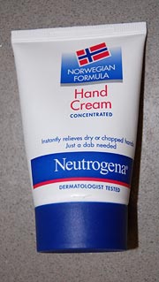
Neutrogena Norwegian Formula hand cream“Truth in advertising” sometimes seems an oxymoron, and the cosmetics industry is hardly where you’d expect to find much of it. So hats off to Neutrogena’s Norwegian Formula hand cream, whose statement on the tube that it “instantly relieves dry or chapped hands – just a dab needed” is absolutely correct. They claim it was devised from the experience of Nordic fishermen with the effect of fish oils; be that as it may, I can attest that this formula really can handle chapped skin that would laugh at your usual hand lotion.
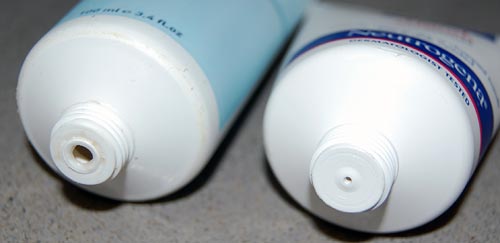
But more to the point, just a dab is really all it takes, and here the manufacturer did something really amazing: it designed the tube to ensure you don’t use more than that dab. Look at the photo below, which compares the tube of this fishy formula with another cream. The hole the cream comes through is barely a pinprick. Obviously, this spares the consumer’s money – at the expense of the vendor’s profit. Wow!

Neutrogena Norwegian Formula and another brand

Which reminds me of the story of the guy who came to a toothpaste company and proposed they give him a megabuck if they like his idea for increasing profits: he then told them to enlarge the hole at the end of the tube, since consumers measure out paste by length, not volume. The guy got his money (though I can find no confirmation that this ever happened – can you?) because the toothpaste manufacturer was not as honest as the makers of the Norwegian hand cream discussed here…

Copyright © 2024 Commonsense Design

Theme by Anders NorenUp ↑