Tag: Sundries

A cozy home for lost baggage

Every seasoned traveler knows the drill: you go to baggage claim, everyone’s bags arrive except yours, and you start running around to try and locate it. If you’re lucky, you end up finding your suitcase standing, forlorn and confused, with a few other bags in some corner or another. How it got there nobody can tell, and you don’t ask.

Lost Baggage

Imagine my delight when I saw, in Newark airport (if memory serves!) this elegant setup. All the orphaned bags were collected in one place, safely locked but visible to all, so you could claim them with ease.

Good idea!
Humorous details in everyday design… bless them!

Form, they say, follows function… which leads to many utilitarian everyday products. But every now and then you run into a design detail that shows inspired abuse of this principle: some unknown designer decides that the product also needs to be lovely, or unconventional, or humorous.

Here’s an example I’ve come across: a drain cover in a very basic drinking fountain.

They could have made this piece the usual way, with regular slits or holes. But the designer felt this circle of funny fishes trying to eat each other will be more pleasing to the thirsty user.

It was pleasing to me – and I wish the anonymous designer with the sense of humor all the best!

How not to design a sign

I came upon this well-meaning sign at a university guest house. Can’t fault its call for responsible behavior, but what were they thinking when they created it?

Poorly designed sign

It never ceases to amaze me how little attention people pay to creating text that is easy to read. You see PowerPoint slides with red text on a blue background, which is an incredibly poor choice for visual contrast. And here they were perhaps thinking that the visually cluttered garden in the background would make the lettering easy on the eyes!

Though,  to be fair, they probably weren’t thinking at all…

Indoor chair, outdoor chair

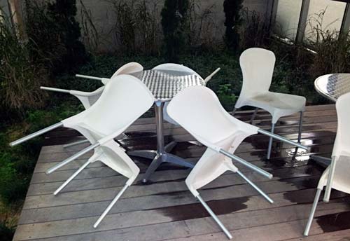
I was in the campus of the Academic College of Tel Aviv and l noticed a little courtyard with a nice deck and some garden furniture. What caught my eye was that the chairs were tilted against the tables.

DeckChairs1.jpg

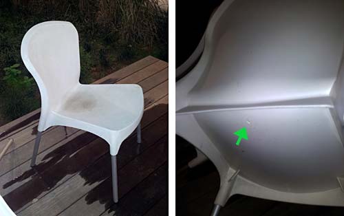
The reason became obvious when I saw one chair that had remained upright: it had a puddle of rainwater in its elegantly concave seat.

DeckChairs2.jpg

At first I was annoyed by what seemed an obvious design flaw: surely a small hole drilled in the middle of the seat would have solved this issue – what a stupid way to design an outdoors chair! Then I realized that these were no outdoors products. They were regular chairs that someone had probably repurposed for garden use in sunnier times, proving that one should be more careful with ignoring a product’s spec.

And then I noted a little round mark on the bottom of each seat, in just the location I would’ve drilled that missing hole in. Evidently, the manufacturer had foreseen the dual use of this plastic chair, and had prepared to provide for both uses. Still, the end user had used the wrong version – and had neglected to correct the problem, which a minute with a drill would have easily done.

Food labeling we’d like to see…

Most food products have nutrition information labels that tell you in minute detail what they contain, from calorie count to milligrams of Sodium. All very edifying, to be sure, but boooring!

So the other day I saw this box of cookies, and below the logo of the English Cake bakery it says – in Hebrew – “Very tasty“!

English Cake cookies

Isn’t this something they should add to every food label? We could have cookies labeled “Very tasty“, “Tasty“, “So-so“, or “Yecch!“, just like the “Hot”, “Medium” and and “Mild” on Salsa jars. Now, wouldn’t that be useful to us consumers? 🙂

Wayda go, Logan airport!

We veteran road warriors know the drill: go thru security, then hunt for a power outlet to recharge our computer at as we wait for our flight. This often involves scouting the terminal halls hoping to find the occasional wall socket intended for the janitor’s vacuum cleaner, hoping there would be a vacant chair near it. Of course, these are scarce, and as likely as not to be taken by a fellow traveler.

Power strip at Logan Airport

But on my recent trip to Boston I saw a much different approach to our problem. At Logan International airport, there are rows of seats at each gate with power outlets built right into them – lots of outlets, enough for all of us business travelers – and for those serene kids with iPods and ear buds…

Power strip at Logan Airport

Note the variety of sockets – 110VAC, 5VDC via USB… These guys have thought of everything! Add the hassle-free WiFi they have, and you have the most notebook-friendly airport terminal I’ve ever seen.

Wayda go, Logan!

A friendly sign

We all know the usual “Private Parking” no-parking signs: stark red and white, with wording in fat letters forming threats of the sorry fate – towing, usually – awaiting violators. They’re designed to jar and scare the thoughtless driver. Nothing pretty about these signs, and usually that’s exactly the intent of their owners.

Friendly No Parking SignBut  here you see a sign I saw in Jerusalem on the wall of a house, next to its private parking area. It too says “Private parking – unauthorized vehicles will be towed”. But it does it in a much more friendly way… because of the little rose engraved between the lines. No idea who had this strange idea. Perhaps the owner likes flowers, as attested to by the bed of geraniums right under the sign? I can’t recall ever seeing  a sign forbidding anything that left me in a cheerful mood, but this one  certainly did.

Friendly No Parking Sign close up

Design hidden in a Hanukkah lamp

Here is a brass Hanukkiah, a 9-candle Hanukkah lamp, that we got in the seventies. It was made by Maskit, the pioneering maker of folklore-inspired clothing and art items in Israel’s early years.

Hanukkiah by Maskit

It can accept candles or oil, and is as lovely as it is functional. However, what gets it a place in my design blog is the seemingly abstract pattern on its back plane. We’ve had it in our living room for some years before it suddenly hit me that this was not just an abstract shape. Do you see what it is?

What gave it away, for me, was the butts of the two lions, sticking up in the air. Suddenly I realized that I was seeing a traditional decorative pattern familiar in Judaica art, especially on Hanukkah lamps and on decorations on the Torah Ark in a synagogue: the two lions guarding the tablets of the law. You can see them in the two examples below:

19th century Hanukkiah

Image source

Lions decoration

Image source

The overlay below will help you see it, and then it’s obvious; but what I really admire in this piece is how the artist managed to capture so exquisitely well, in just a few lines, the anatomy of the two lions. Good job!

Maskit Hanukkiah and Lions pattern

Tomatoes and the laws of Thermodynamics

When we spent a while in the US in the eighties I was amazed and amused by the silly warning “serving suggestion” found on food packaging. I mean, what were they afraid of… a flood of lawsuits by people that opened the soup powder sachet and failed to extract a steaming soup tureen?…

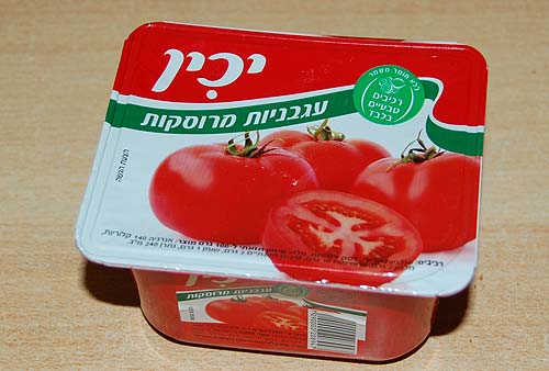
Like many a silly idea this practice hit Israel a few years later, and I stopped noticing it – until this caught my eye:

Yakhin crushed tomatoes

This has the ubiquitous “Serving Suggestion” in fine print; what makes it unusual is two incongruities:

  1. Slicing one tomato in half hardly counts as a serious serving suggestion.
  2. These tomatoes would require a Magician to be served in this way. You see, the caption on the green stripe says “Crushed Tomatoes”!

I don’t expect the marketroids at Yakhin food products to be fluent in the laws of thermodynamics and entropy, but even they must know that you can serve a whole tomato by crushing it, but you can’t make a crushed tomato whole again.

Bon Appetit!

Copyright © 2024 Commonsense Design

Theme by Anders NorenUp ↑