Tag: Kitchenware

Solving the machinetta’s bug

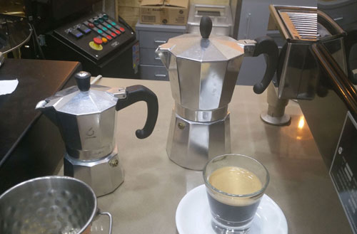
I was at this coffee shop and saw the two machinettas. Of course I didn’t buy one – as coffee lovers, we have all the machinettas we need at home – but I did notice how the pair represents two different  solutions to a small but important design bug that the classic machinetta had subjected coffee drinkers to for ages.

Macinettas

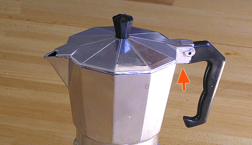
The problem is seen below. The original design from Bialetti, who invented this useful little coffeemaker, had the metal block that the handle is bolted to, marked by the red arrow in this photo. This block was just the right size and place to scald your finger when you grab the handle.

Machinetta - bad design

Photo credit: Dan-Martin Hellgren under CC license on Wikimedia Commons.

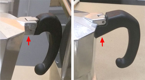
The two machines I’ve sighted solve this problem in two different ways frequently seen these days: the one at the left below leaves the offending hot block in place but provides a dent in the plastic to keep the finger away from it; the one on the right covers the metal with plastic all the way.

Machinetta handles

I can’t think how many times I got burned before someone at the factory decided to spare the users this pain…

Mind the footprints!

An important element of everyday product design that is all too often ignored is the footprint of an object.

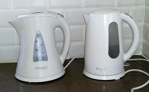
I mean, look at these two electric kettles, which are very common kitchen appliances. They serve the exact same purpose; they use the exact same technology; they have the same water capacity.

Electric Kettles

But there’s a big difference: the one on the right has a sensible, compact cylindrical form. The one on the left, by Kennedy, flares at top and bottom, so its footprint – the counter-top area it requires – is some 45% grater than for the Graetz kettle beside it. Kitchen counters can never have too much free area; the designers at the Kennedy company have wasted some of that area for no good reason at all, simply to show off their “artistic originality”.

I see this cavalier attitude to footprint in many products, and it always annoys me… why can’t these people think of their users?


Innumeracy in the skies

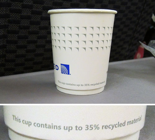
Was on a United flight enjoying my coffee (such as it was), when I noticed the text on the paper cup.

Nice cup:

Paper cup on United Airlines

Makes them feel very ecological, no doubt… someone in Marketing must’ve though it a good point to brag about.

Except that it’s completely meaningless, of course. This statement remains true even if the cup contains zero recycled material.

Sigh…

An amazingly ingenious retro kitchen item

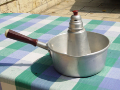
Here is an item I saw on the wonderful Nostalgia Online site. They have a large collection of vintage kitchen utensils, most of which I do recall from my childhood, and many of which I run into as I rummage in flea markets in search of computing history items. However, this one I’ve never seen before, and the ingenious way it solves a real problem simply blew my mind.

Milk heaterThis, folks, is a milk heater. The problem it solves is that whereas a watched pot doesn’t boil, the moment you turn your back on it it’s liable to boil over, which in the case of milk makes a real mess.

The solution is this: you put the milk in the outer pan, and a little water in the central cylinder. Since the water will boil a little before the milk (remember your chemistry!), it will activate the steam whistle at the top and alert you that the milk will boil in a moment.

I remember when raising a baby I also wanted to solve the boiling problem for baby formula, but as an electro-optics student my thoughts were along lines of detecting the steam above the liquid by its optical absorption (I never realized that over-complicated scheme). But the whistling pot seen here is way better, I think – and it did get used, evidently!

You can see this, and lots more retro items, here. If you can read Hebrew you can even read all about them! 🙂

A smart design in a lowly paper napkin dispenser

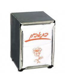
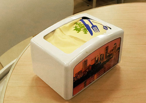
Paper Napkin DispenserWe’re all familiar with the spring-loaded paper napkin dispenser to the right. Every low-priced restaurant and diner has these; you’d think it has hit a sweet spot of stable cost and performance. After all, it works, doesn’t it?

And yet, recently I’ve run into a major improvement on the theme: a competing design that has a better user experience by far.

Here it is:

Paper napkin dispense
The main change is that the older design dispenses paper napkins at two opposite ends, and this one issues them at the top. Why is this important? Because in the more common design you need two hands to pull a napkin, holding the dispenser with your left and pulling at the paper with your right. In the top-loader  you pull the napkin up and gravity (and a heavy bottom plate) holds the dispenser down. This not only allows one handed operation, but also makes the dispensing action far more repeatable, so you’re less likely to end up holding a large bunch of multiple napkins.

Sure, there are more important design challenges out there… but in a world full of sloppily made products, no clever design should go unpraised!

Simplicity before Greed

Most cafeterias sell water to their thirsty customers in plastic bottles full of mineral water. The water is no better than the tap water in most countries, its environmental impact is dubious, and of course it turns a tidy profit for the business. As a customer I find it annoying to pay for one of the most common molecules on my planet, but hey, there are bigger problems and like all of you I pull out my wallet and forget about it.

So you can understand my delight when, while visiting the Science Museum in London, I saw this in their cafeteria:

Water pitchers at the Science Museum, London


Self-serve, free and simple… what a delightful practice!

And then there is the wonderful museum itself…  🙂

Weirdest napkin ring design ever?

I was at a fancy home and kitchenware store and saw the box in the photo here, containing – it says on the front – “Salt & Pepper Napkin Rings”. This sounded weirdly intriguing, like “Oregano & Thyme Spark Plugs”, so I took a closer look. Turns out this is one of the stranger design ideas I’ve had the pleasure of meeting.

Salt & Pepper Napkin Rings BoxNapkin rings, in case you haven’t dined in the fancy places that use them (I don’t, but my grandmother used to have them before paper napkins appeared), are used around linen napkins when setting a table. What do they have to do with condiments? Well, as you can see in the close up, each of these rings has two inner compartments that can be filled with salt and pepper, giving each diner a personal set of shakers… combined into one unit (a dubious idea IMO), integrated into the napkin ring (a terrible idea IMHO).

Salt & Pepper Napkin Rings

So why is this a bad idea? Many reasons, from the hassle of having to keep them all filled, to the inevitable spills when a ring is overturned, to the difficulty keeping one condiment in while pouring the other out… but primarily, because why on earth do it? A Swiss Army Knife has its benefits when you’re a Swiss soldier, or a boy scout… but not every set of disparate functions need to be designed into an uneasy coexistence!

Have to hand it to them, at least… if you ignore the two plastic stoppers, the ring is surprisingly elegant looking! 🙂

All shine, no legibility

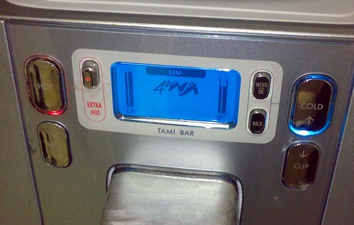
Here is the control panel of a counter-top cold/hot Tami 4 water bar. Push a button – you get hot water. Push another – here’s a refreshing cup of cold water.

But… which button?!Shiny buttons on a Tami 4 bar

Of course, that’s why the buttons – all seven of them, for there’s a lot more you can make this glorified water faucet do – are labeled! The problem is, only one – wisely perhaps, the one labeled “Extra hot” – can be easily read. The others have the label printed on mirror-like shiny surfaces in light gray, which means you need just the right angle of lighting and viewing to make the text out at all. See the photo – the legends on the right are visible (though at very low contrast) while of the two on the left the top one is just barely readable and the bottom one is totally invisible.

They say writing was invented in the fertile crescent in the 4th millennium BC… but we had to wait till our day and age to invent invisible writing.

Yuck!…

Target practice

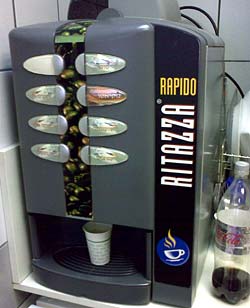
Coffee machineWe all know these automatic coffee machines: you place a paper cup under the nozzle, hit a button, and out comes a flow of some sort of coffee or chocolate drink. The machine at right is a good example.
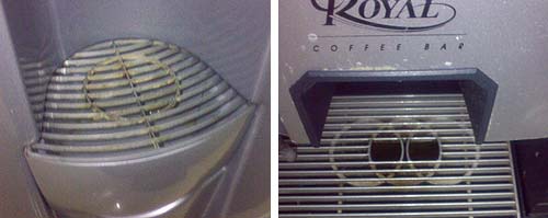
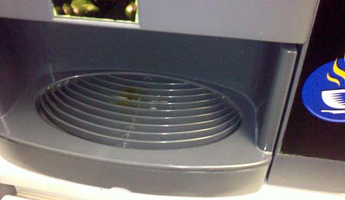
The problem with such manual cup placement is that you risk misaligning the cup to the nozzle hidden in the machine’s innards; that’s why the surface you place the cup on is a grille, to allow any spilled liquid to collect out of sight. The machine in this photo has such a grille, elegantly formed into an ellipse. But it has a glaring design flaw…

Below you see two such grilles from two other machines. Both have a circle showing you the target, the optimal location to place your cup in; one even has the targets for either one or two cups.

Coffee machine targets

But the machine shown at the top of this post has no such target – or rather, it does have a tagret arrangement of sorts – concentric ellipses – which has nothing to do with where to place a cup. And indeed, when I snapped it it had a nice coffee stain to show for this design oversight…

CoffeeTargets2.jpg

Lavazza’s confusion

Lavazza Espresso point machineI was visiting an office where they had one of these delightful Espresso machines, an Espresso Point by Lavazza, and tried to make me a cup.

I put in a paper cup and a coffee cartridge, pushed the button at the right of the panel next to the size I wanted, and instead of that steaming coffee, I got a blinking red light at the left (marked below with an arrow).

I tried to puzzle the meaning of this light. It had the icon you see, with a coffee cup and an X. What did it mean? Obviously in a large beverage dispensing machine it would stand for “I’m out of cups”; but this machine did not store cups. It might mean “You forgot to put in the cup” – only I hadn’t. What else? “Smash a cup before I agree to make coffee”?

After much futile experimentation a local came and said “Oh, the machine is out of water”, and she proceeded to pour some in at the top. I could finally enjoy my coffee.

Lavazza Espresso Point machine - control Panel

But what a stupid design choice… the cup with the X has no relation to missing water; and indeed, the fact that the cup looks identical to those in the icons at the right side of the panel only reinforces the mis-interpretation.

Shame on you, Lavazza designers!

Copyright © 2024 Commonsense Design

Theme by Anders NorenUp ↑