Tag: Internet

Generation Y Fruit!

Edible fruit have been on this planet since the Cretaceous, but they know how to move ahead with the times.

See the photo: this pear, recently arrived from our greengrocer, has a barcode on it!

Barcoded pear

Why does a pear need its own barcode? I could understand putting one on the crate, for easier shipping control and stock management; but nobody scans an individual pear, do they? In fact, people have been eating pears for ages (seven millennia, more or less), and for 99.9% of that time they managed just fine without a barcode, as you can see in this snippet from a botanical illustration from 1771.

Pears - illustration by Johann Knoop, 1771

Sticker on a pear
And our modern pear has more than a barcode: it has a logo, and it has a catalog number, and – wonder of wonders – it has a Web site! This is nicely done, chock full of pear lore and fun. I’d joke that at this rate it will soon have its own fruity Facebook account, but of course, it already does. And it’s on Twitter, too: @usapears.

These Generation Y pears sure are getting ahead in our hyper-connected world! 🙂

Headup wordpress plugin – add semantic browsing to your blog!

I’ve mentioned the headup publisher widget before. This nifty add-in identifies entities (places, people, companies, books, etc) mentioned in a site it’s installed on, marks them up with a dotted underline, and when you mouse over them a small pop-up comes up with information, news, photos and videos about that place/person/whatever.

That was then. Now Semantinet, the start-up in Herzliya where I work one day each week, has packaged the capability as a WordPress plugin, which means that a blogger can add the capability to any WordPress blog in a mere minute or two. If you have a WordPress blog, you can download the plugin here.

What’s more, the product had evolved, and it now includes a tab called “friends” in addition to the ones for photos, videos, and the rest. This tab – once you connect it to your Facebook account – shows you how the entity being viewed is connected to the people you know, like which of your friends live in the place or work at the company.

Pretty powerful capability – and easier than ever to include. Which is what I just did – mouse over the marked up words anywhere on this blog and see it in action!

Here, try the headup publisher’s widget!

I’ve blogged before about headup, Semantinet’s semantic search add-on for Firefox. Well, the creative folks at Semantinet are forever doing new things (one reason I like working there, despite the traffic jams between Jerusalem and Herzliya :-), and the latest is the headup publisher’s widget.

This tool uses the same semantic search technology in a much lighter package. It is intended for bloggers and news sites, who can use it to integrate the ability to bring in additional information about entities it recognizes – places, people, companies, books, bands, and the like – into their pages without any need for the user to install anything. The tool simply adds slight dotted-blue underlines under words it recognizes, and if you mouse over these and click the icon that appears you get a compact pop-up that brings you basic summary information, photos, videos and news items about the entity you clicked – whether it be Paris, Barack Obama, IBM, Haifa, or Roberta Flack.

So – since this tool is so easy to integrate in a blog (one line of code, that’s all!) I went ahead and put it into this post. Check it out, and give us feedback in the comments: is this useful to you as a reader? How can it be improved? Your comments are welcome – and can influence the course of this new product’s evolution!

Tweeting in a dream

Tonight I had a dream where I was going through some boring paperwork at some public office and the guy behind me in line asked me if I knew what Twitter is all about. Ever helpful, I took out my Nokia smartphone and showed him how I tweet. I don’t remember what I posted, and my Gravity client only displays outgoing tweets from the real world, so we’ll never know.

A few months ago I blogged about how blogging had crossed over into my dreams, and now Twitter followed suit.

We’re making progress here! 🙂

Tweet tweet, I’m on Twitter! (Oh, frabjous day!)

Yes – after a long time saying I draw my line at “real” blogging, I’ve taken the plunge and set up on Twitter.

Twitter BirdAnd guess what? It looks like it’s gonna be a good move in many ways. The “what can you possibly say in 140 characters” objection I’ve already taken care of when I became active on Facebook; The tools available, for the PC and for my mobile device, look excellent; many of my friends are already up there; and the interlinking of tweets, blog posts, facebook updates and even full length articles on my web site looks natural and promising.

We’ll see where this goes; will post updates here when I have some more insight. Until then, you can follow me (I’m nzeldes, not surprisingly).

Tweet!

Gotcha, Google translator!

I was checking some French using Google translator, and discovered that – contrary to my French teacher’s insistence  back in high school – “La langue Francaise” means “English language”!

Of course one doesn’t expect perfection from machine translation, but this was different than the usual silly mistakes: a translation program ought to know the meaning of the name of a language it translates, after all. So can it be that Google, in its staggering growth to encompass all knowledge, has finally reached true intelligence and reasoned that the above translation is correct on some higehr level – the way Douglas Hofstadter pointed out in his immortal “Godel, Escher, Bach” that “Borscht“, when translated from the Russian, may need to be converted to “Campbell soup” to convey its ubiquity in the respective culture?

Nah… not likely. I actually played a little more – for instance, “La langue Francaise” in Italian, according to Google, means “Lingua inglese“, not “Lingua Italiana“. I suppose by posing such questions to the program one could map where the problem lies in its cognitive functions, like one tries to localize brain damage in a patient by mapping input/output relationships in an interview. So is Google Translator a conscious entity after all, albeit a brain-damaged one?  🙂

A proud Wikipedian!

Yesterday I was at a meet of the Israel Innovation Forum hosted at IBM, and over coffee I notice this guy whose name tag reads

David Shay

Wikipedia

At first I thought he must be one of the few people who actually work at Wikipedia as employees; but he assured me there are only 15 of those, all in the US. No, he told me, he simply writes for the Hebrew Wikipedia. I asked whether he’s part of some special group appointed to manage the local version, and he said no, he simply writes and edits articles, like anyone else. I do that occasionally myself, but David does a lot more of it.

When we exchanged business cards I found that he actually has a regular day job at a regular company; he just felt good proclaiming himself on his badge as a Wikipedian. And maybe he’s right – though people seldom bother to check who wrote the article they are referencing, the impact you can make on humanity by writing online can be much greater than whatever you can do in a regular job (well, unless you’re a major inventor, scientist, or world leader, I suppose).

Wayda go, David!

Dumb icons

The idea with the use of graphic icons as controls in web pages and applications is the they are a compact, fast way to represent an action. And that they do, very effectively, subject to one condition: the icon’s image should represent the action in question (Duh!)

So, an icon that causes the page to print should have a small picture of a printer. It should not have a picture of a hippopotamus. Right?

Well – consider the web site of the Israel Discount Bank. A customer can log in and see their account, which is useful indeed. And there are icons like these:

IDB site icons

Surely you can tell what each of these is supposed to do.

But then, there are also these icons, right above the account activity table:

IDB site icons

Care to guess what they mean?

Actually, the middle one means “Select columns”. Not that there’s any likelihood you’d figure that on your first encounter, but at least in later visits you will be reminded of this meaning. So what does the icon on the right mean? From comparing it to the one next to it, it would seem to be “Delete column selection”? But no – it means “Cancel filtering of data”. Totally unrelated to the image.

And the leftmost icon is a beaut: it means “Show all accounts”. A hippopotamus would depict that sentiment just as effectively.

Can’t these people think?

My blogging passes the immersion test!

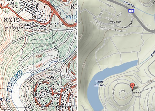
A few days ago I was at the IEC history of computing museum where they also exhibited their progress in map making – from old blueprints and paper maps to modern CAD and GIS software. They had there an old 1960’s map that caught my eye – a 1:50,000 topographic map by the Israel Survey Department. These were the best you could get when I was a kid hiking around the country; every house was correctly shown as a black dot of the exact right shape, and every hill and gully were visible in the contour lines.

I looked at the map and it struck me how much maps’ visual quality has progressed since then, with modern printing techniques. The stark colors used in the 60’s are replaced today with delicate pastels; the topography is enhanced by fine shading; the important details are not drowned out by the density of equally strong contour lines. The information of the old maps was perhaps perfect, but to the modern eye they look, well… old. Unfortunately, as far as I know the maps you can buy today at such a detailed scale use the same old techniques.

Then the next day I came to see a new Israel Survey Department map that was wondrous fine to behold, done in pastel shades and fine shading gradations, reminiscent of what you see in Google Maps but with all the detail of the maps of my youth. And my friend Gadi happened by, and I said unto him, lo, see this map, for it is very finely done, and only the other day had I wished such were made; and he looked upon the map and found it good. And I said to him, surely I should blog about this map and compare it to the older ones, and he said, verily thou shouldst. And I resolved to make it so. And then the matter passed from my mind until my alarm clock went off to wake me for my day’s labors.

The bad news is, evidently the Israel Survey Dept. has yet to produce the fine map I saw in my dream. The good news is, looks like my blogging has reached the point where it passes the immersion test. I’ve found long ago that when I really immerse myself in some practice or task, it makes its way into my dreams. As a forensic scientist, I would dream of Gunshot Residue Particles; as a Thin Films VLSI engineer I would examine LTO defects in dreamland; and when I took to developing software, I would dream at times of bugs – I remember once actually solving a particularly stubborn one in my sleep, a solution that turned out to be valid in real life. So now I dream of searching for stuff to blog about!
Topographic Maps

As for my resolution, I can’t show you the nonexistent topographic map, but I can and hereby do show you a comparison of an old ISD map and a detail of the same area from Google Maps (Terrain option) that illustrates the visual qualities I was dreaming of merging with it.

Intelligent freeway signage

In recent years the freeway system in Israel is applying some pretty good leading edge technology (including truly transparent wireless toll collection that is still missing in many countries I visit).

One interesting system can be seen in the Ayalon highway in Tel Aviv. This road has electronic signs that give precise real time information of the driving conditions ahead, including which lanes are jammed and how fast the traffic moves (when it does). Perhaps most impressive are the signs that give a taste of the despair lying ahead, as in “Traffic jammed through La Guardia exit”… not that there’s much you can do about it, admittedly, but at least you know!…

Ayalon Highway in Tel Aviv

Photo: Wikimedia commons.

Of course, behind this capability lies a network of sensors and cameras, and an expert system that integrates them and recommends to the human operator at the road’s control center what messages to send to the signs (I thought the system was entirely automatic, but actually it does give a human final override). The information on the signs and the video from the cameras are also accessible on the Internet: the traffic flow conditions are updated every few minutes, and you can click the camera icons to see the real time video stream – and mouse over the “i” icons to see what text appears on each sign.

Copyright © 2024 Commonsense Design

Theme by Anders NorenUp ↑